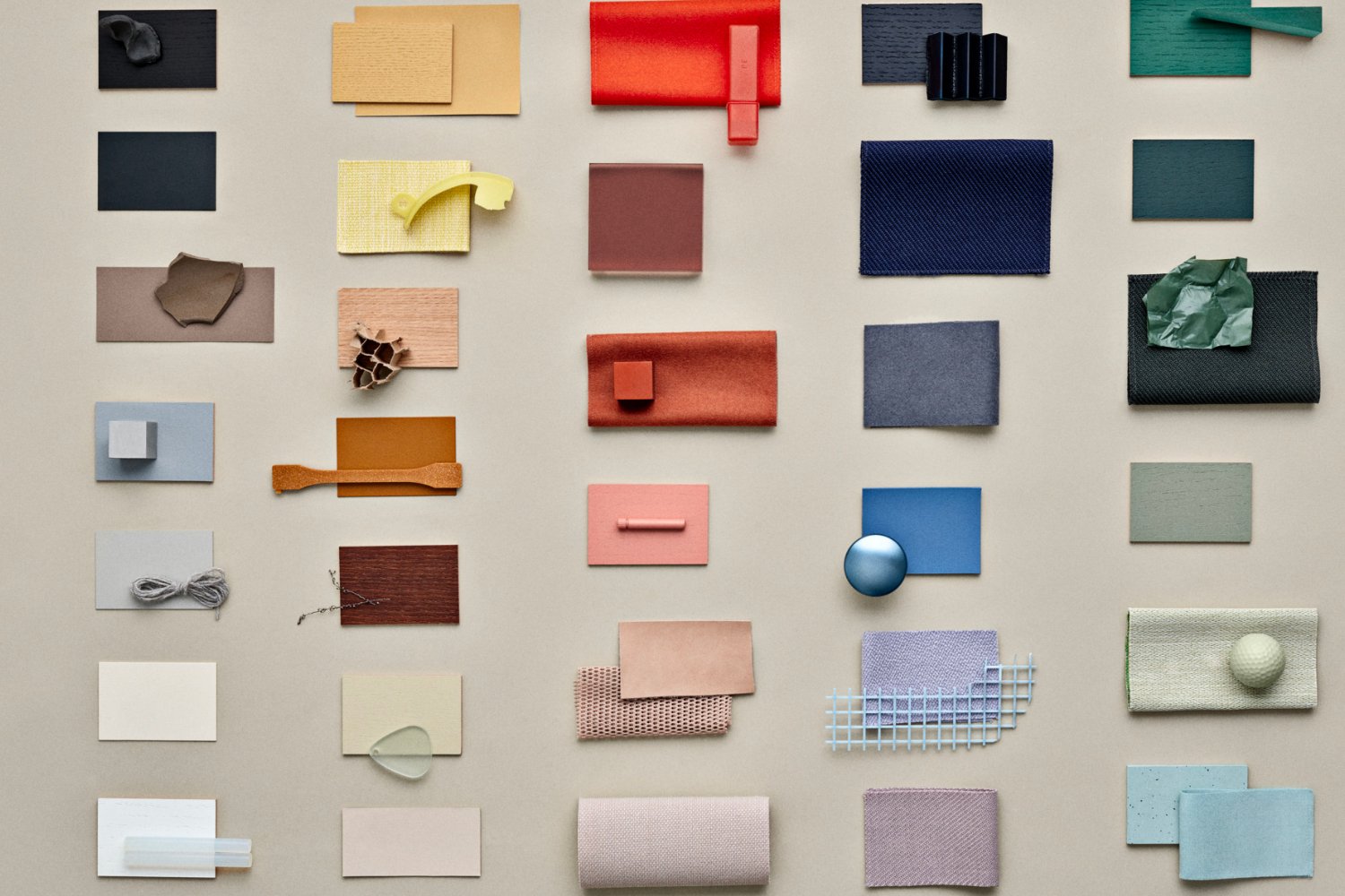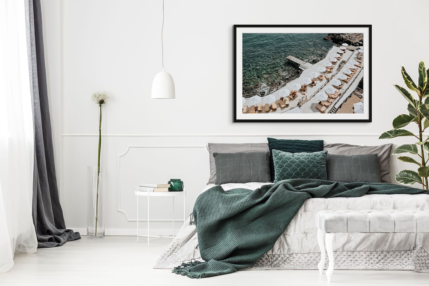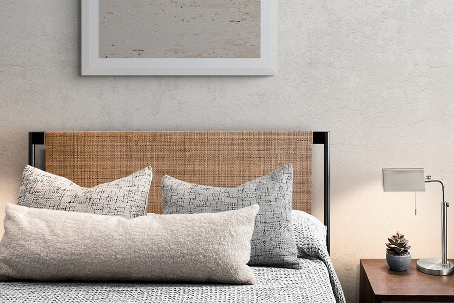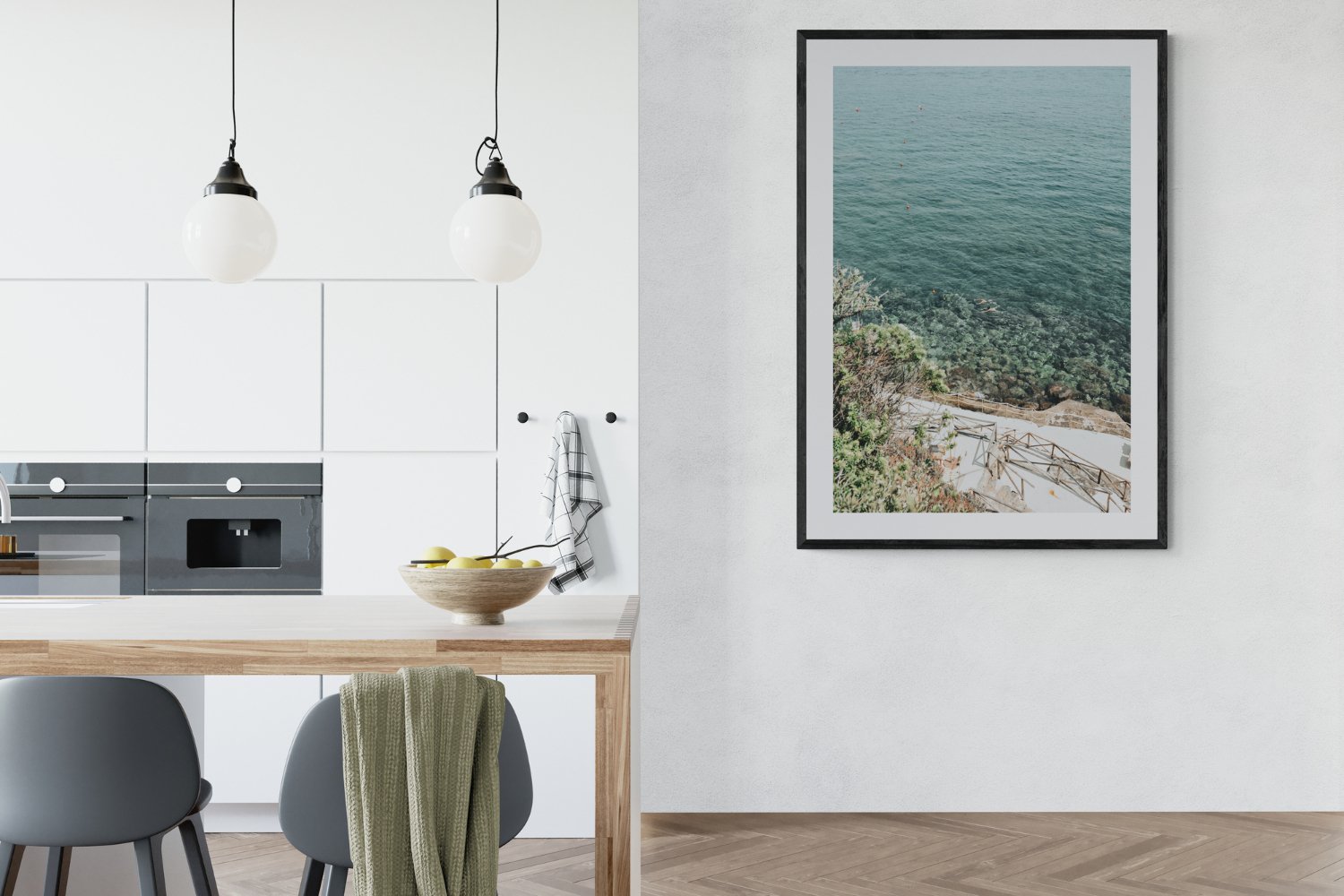

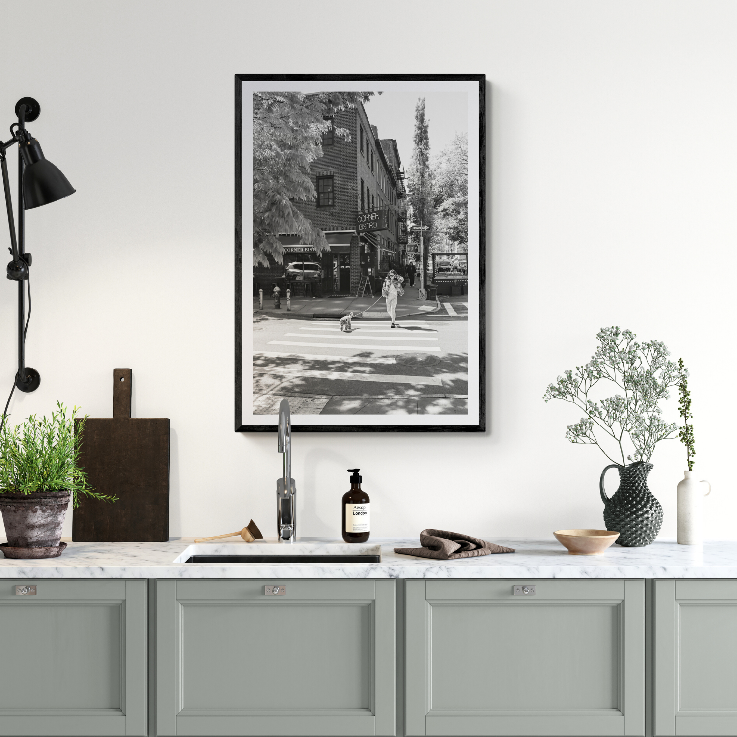
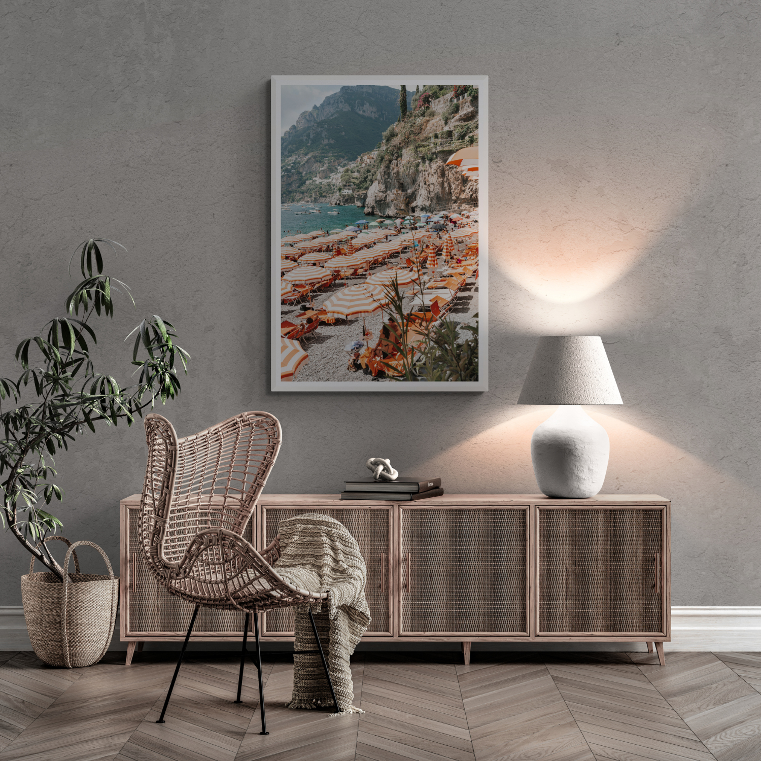
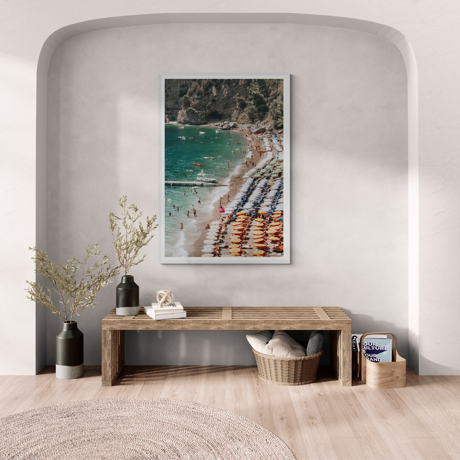
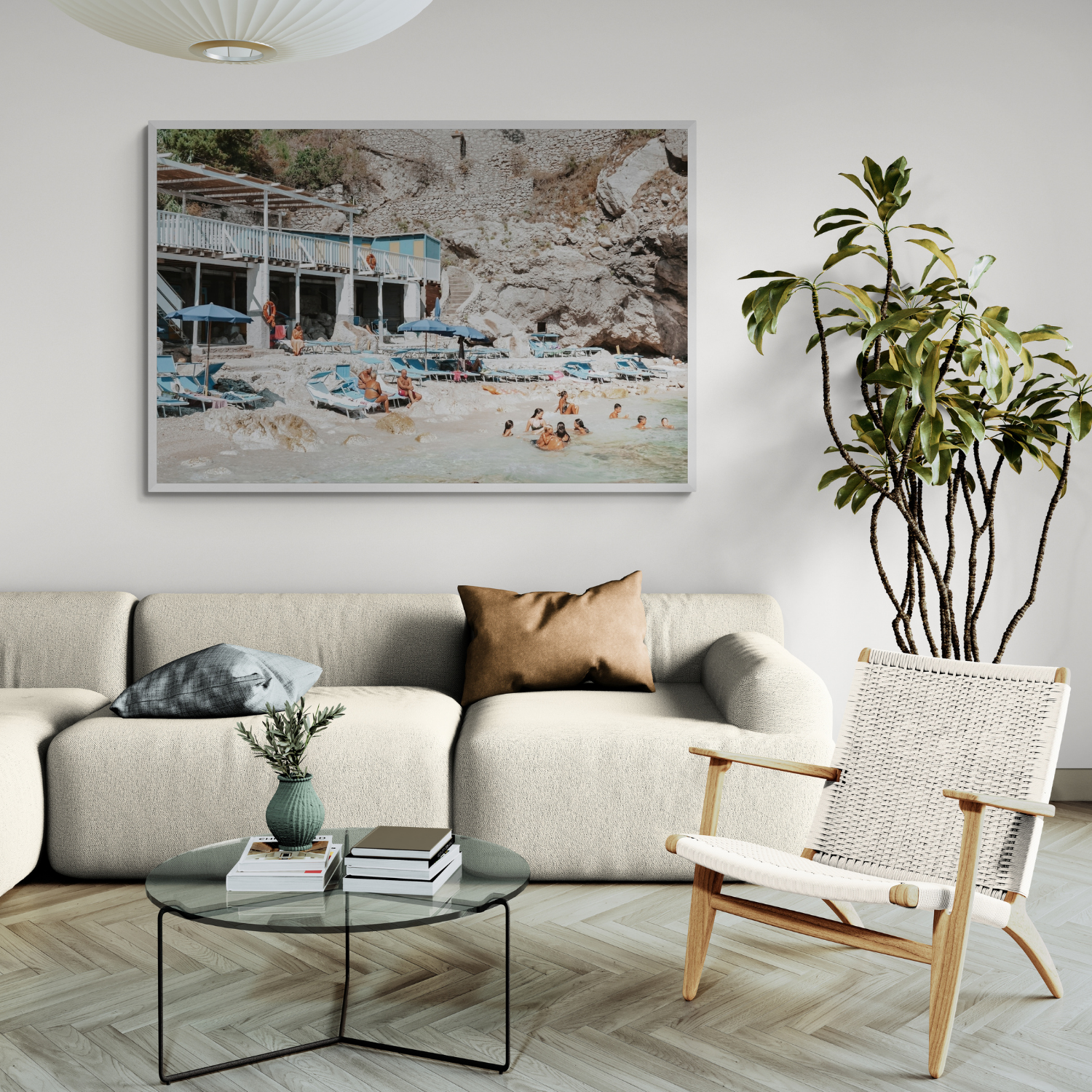
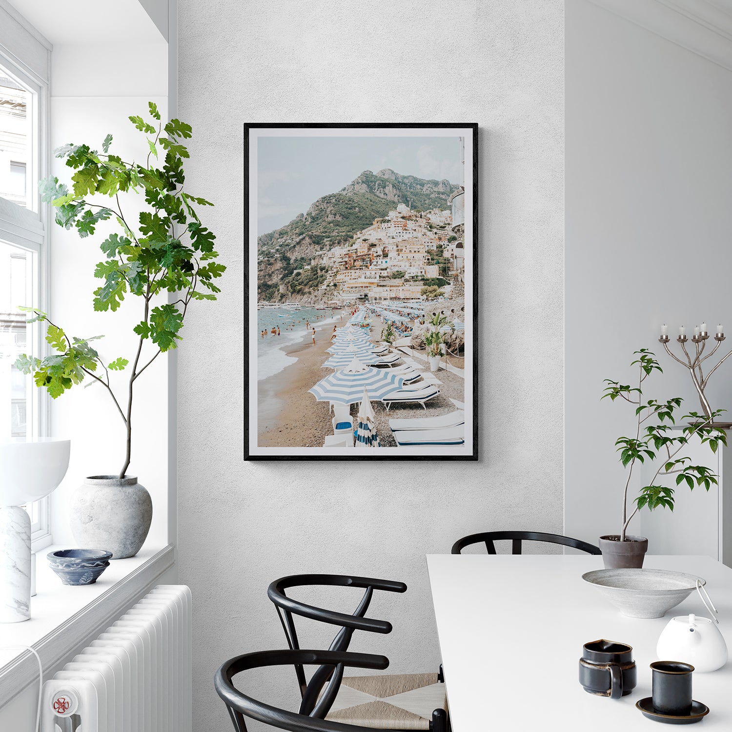
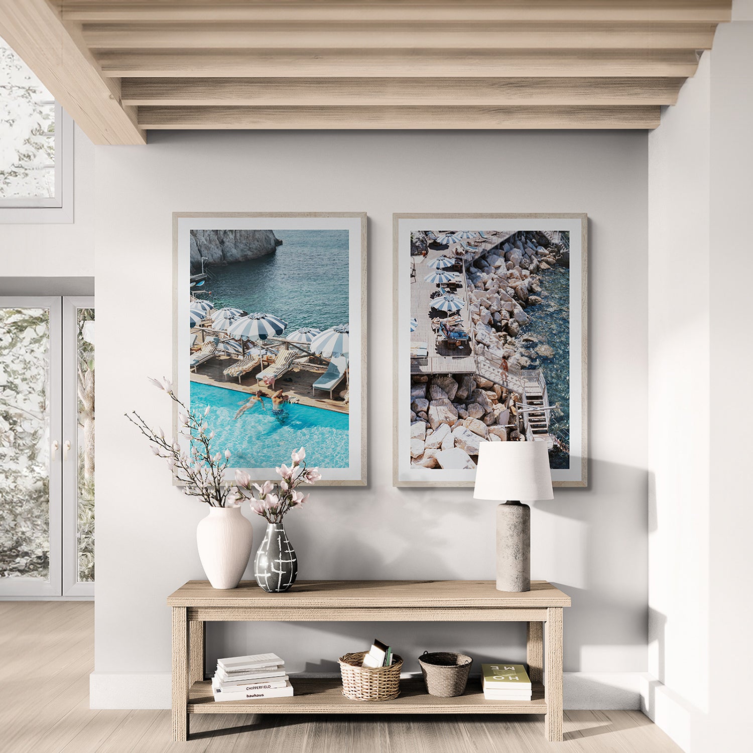
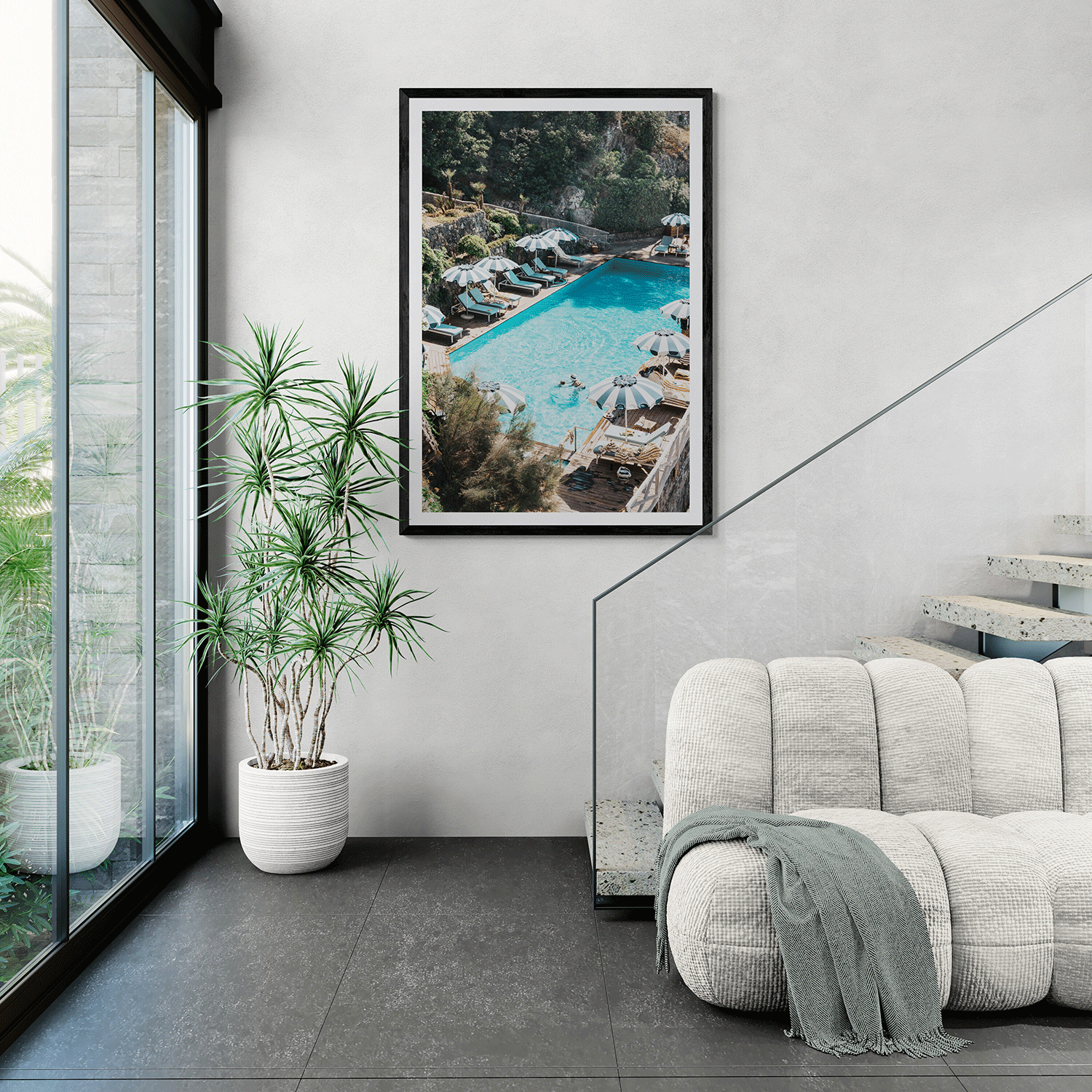
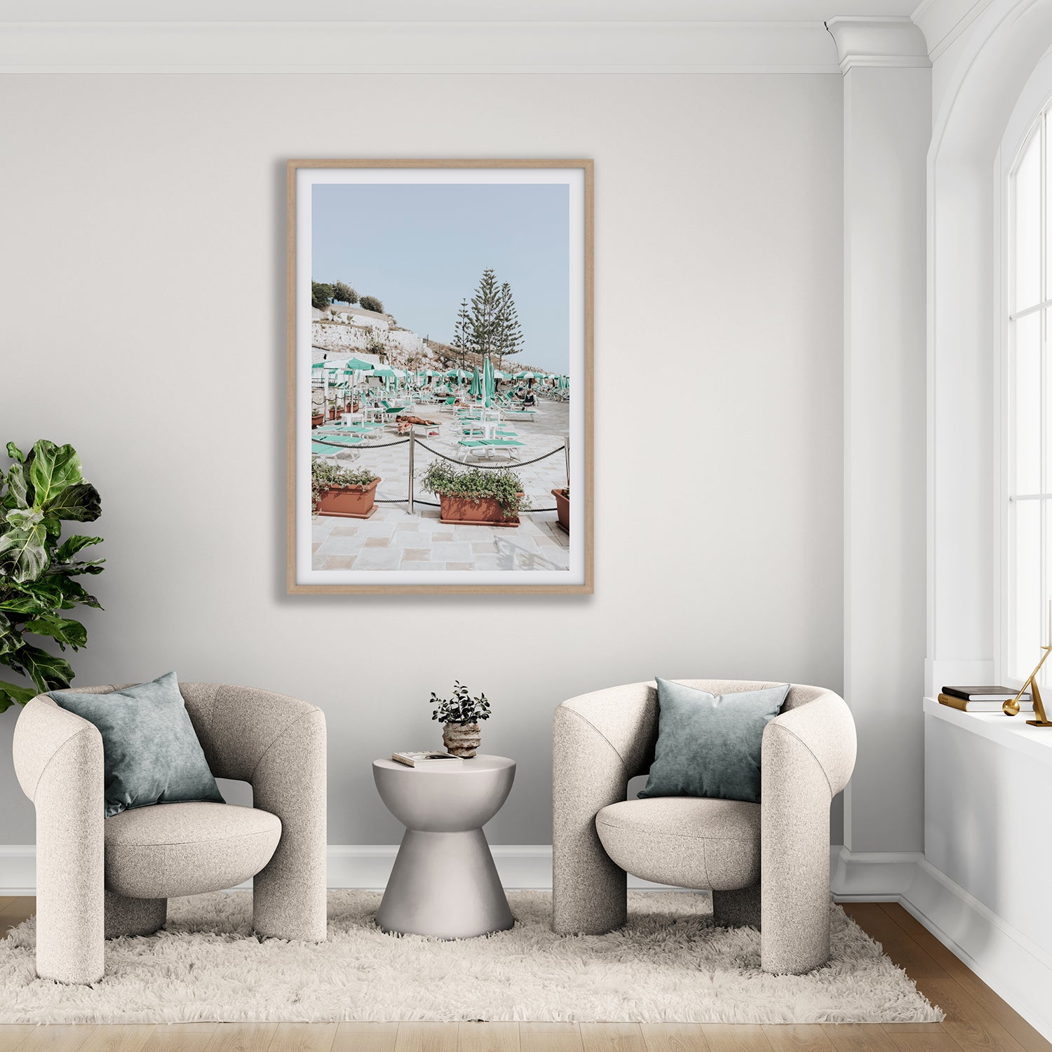
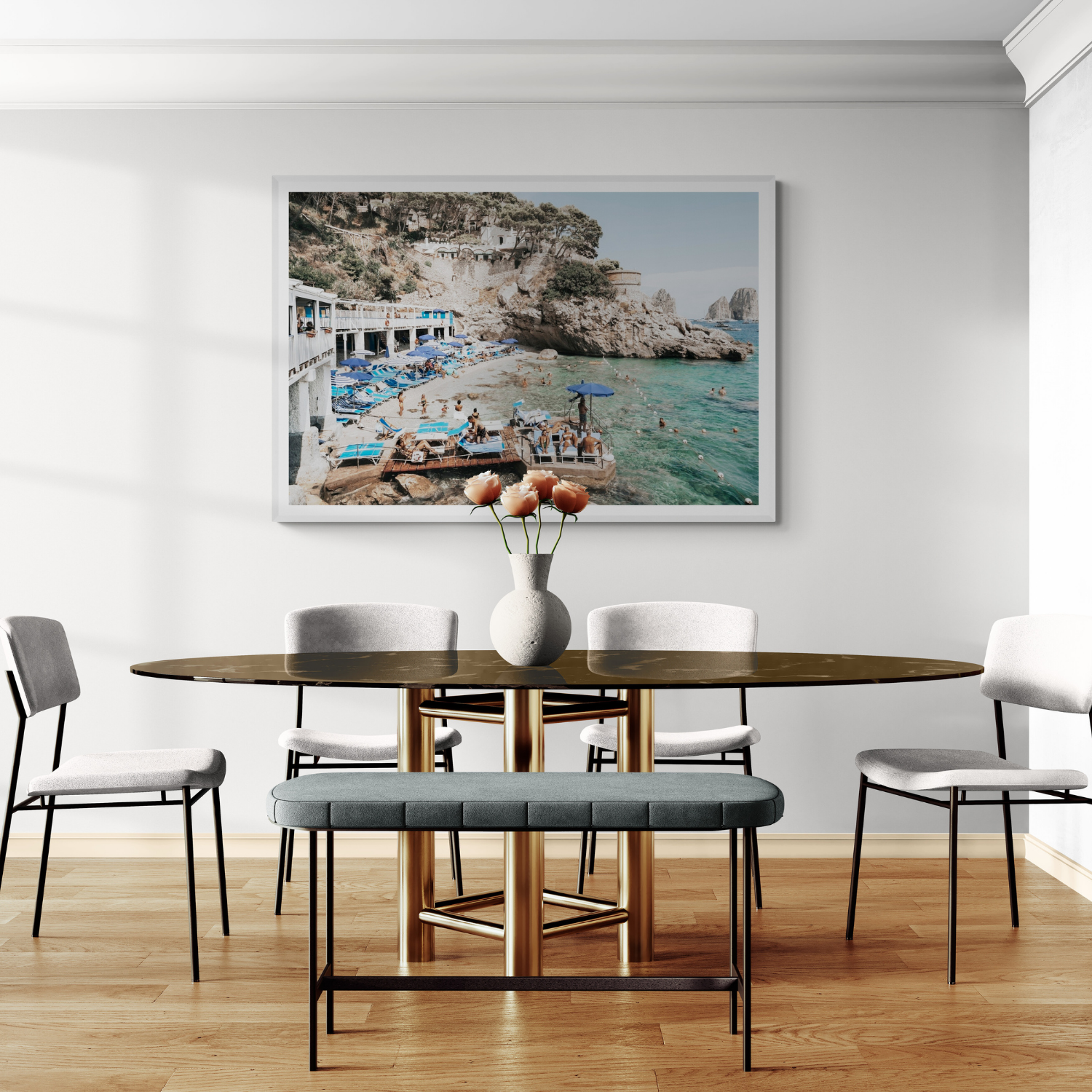
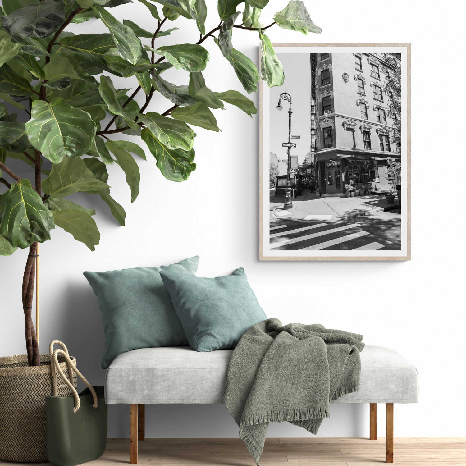
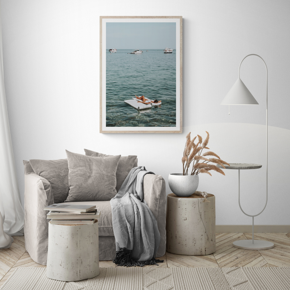
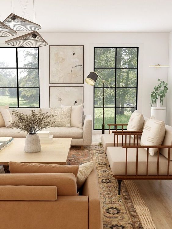


How to Choose Colours for Interior Design and Wall Art is really about one thing: making a home feel more intentional without losing the ease and emotion that make it yours. The best wall art colour palette choices are not chosen in isolation. They respond to the room, the light, the memories you want to live with, and the way one image can shift the feeling of an entire wall.
Quick answer
For wall art colour palette, start with the mood before the product. If the room needs calm, choose softer tones and more negative space; if it needs energy, look for stronger colour, movement or architecture. Then use scale, framing and a small set of related links, such as wall art by colour and aesthetic and coastal blue wall art, to make the choice feel considered rather than accidental.
Start with the feeling you want the room to hold
Before choosing a print, name the feeling you want to walk into. Some rooms need warmth. Others need contrast, freshness, nostalgia or a quiet sense of escape. This matters because artwork is often the emotional anchor of a space. A coastal photograph can make a living room feel breezy and open; an architectural travel print can make a hallway feel more collected; a warm Mediterranean scene can soften a room that has become too plain or practical.
For Amichi Co, the strongest pieces usually work because they carry both place and atmosphere. They do not simply fill a blank wall. They introduce a point of view. That is why the best starting point is not "what matches the sofa?" but "what does this room need to feel like?" Once that answer is clear, the practical choices become much easier.
Use scale before you choose the final style
Scale is where many rooms lose their polish. A print that is too small can make a sofa, console or bed feel disconnected from the wall behind it. A piece that is too large can overwhelm the furniture and flatten the room. As a general rule, artwork above a major piece of furniture should feel visually connected to it, usually sitting wide enough to look intentional while leaving breathing room around the edges.
If you are deciding between one large statement piece and a pair, think about rhythm. One large print creates a clear focal point. A pair or set creates movement and can be easier to use across a wide wall. For practical sizing, keep bright wall art prints nearby and compare portrait and landscape formats through portrait print size guide and landscape print size guide before committing.
Build a colour story, not a perfect match
The most sophisticated rooms rarely match every shade perfectly. They repeat enough colour to feel calm, then introduce one new tone to make the room feel alive. If your palette is neutral, a soft blue, sun-washed ochre or warm terracotta can add interest without taking over. If the room already has strong colour, look for artwork with quieter negative space, natural stone, water, sky or architectural detail.
This is where earth tone wall art can be especially useful. Print pairings let you repeat a colour, location, texture or mood across more than one image, which makes the room feel styled rather than decorated in pieces. If you are unsure of your natural direction, the white and neutral wall art can help narrow the aesthetic before you browse.
Let colour guide the artwork shortlist
Colour is the easiest way to make art feel connected to a room. Pull one shade from an existing rug, cushion, timber tone or stone surface, then choose artwork that repeats it lightly. A second accent colour can create energy, but the overall palette should still feel edited.
The Amichi Co edit
To bring this idea into your own home, start with wall art by colour and aesthetic, then compare it with coastal blue wall art. For a ready-made pairing, browse earth tone wall art; for a more personal direction, use white and neutral wall art before narrowing your shortlist.
- For a calm focal point, choose one large print with generous negative space.
- For a layered wall, pair Zesty Shade with Water Wonderland or use a curated print set.
- For a gift or new home, lean toward timeless locations, soft palettes and flexible framing.
What to avoid
Avoid choosing art only because the colours technically match. A room can match and still feel flat. Also avoid filling every wall. Negative space gives the artwork room to matter. Finally, try not to buy a piece because it is temporarily trending. The prints that last are the ones that connect to a memory, a destination, a palette or a feeling you genuinely want to live with.
Frequently asked questions
How do I choose wall art colour palette for my home?
Start with the room's mood, then narrow by size, colour palette and subject. If a print supports the feeling of the room and has enough scale for the wall, it is much more likely to feel right long term.
Should wall art match my furniture?
It should relate to the furniture, but it does not need to match exactly. Repeating one or two colours from the room is usually enough. The artwork can introduce a new accent, texture or sense of place.
Is one large print better than a set?
One large print is best when the room needs a single focal point. A set works beautifully across wide walls, above long furniture, or anywhere you want a more collected gallery feel.
Where should I start browsing?
Start with wall art by colour and aesthetic for the broadest view, or go straight to earth tone wall art if you want a ready-made pairing. If you are still defining your style, use the white and neutral wall art first.
Explore wall art by colour and aesthetic to find fine art photography that brings more story, calm and intention into your home.
Colour recipe
Three decisions that make colour feel intentional

Pull one existing tone
Repeat a colour from timber, stone, textiles or cushions so the print feels connected.

Add one new accent
A second artwork can introduce energy, but it should still share a visual thread.

Balance colour with space
Negative space, sky, water or architecture keeps brighter palettes from feeling crowded.