
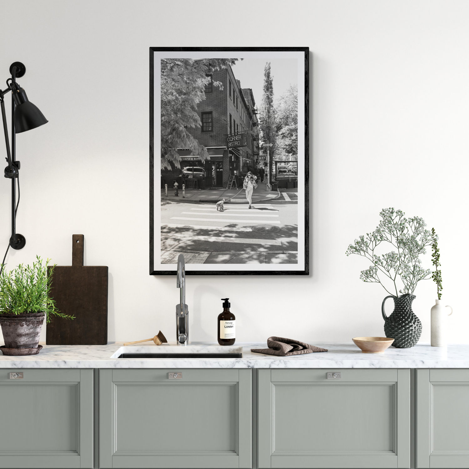
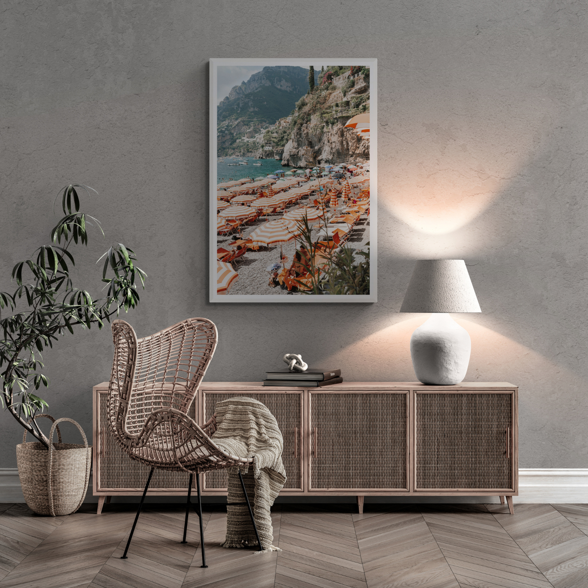
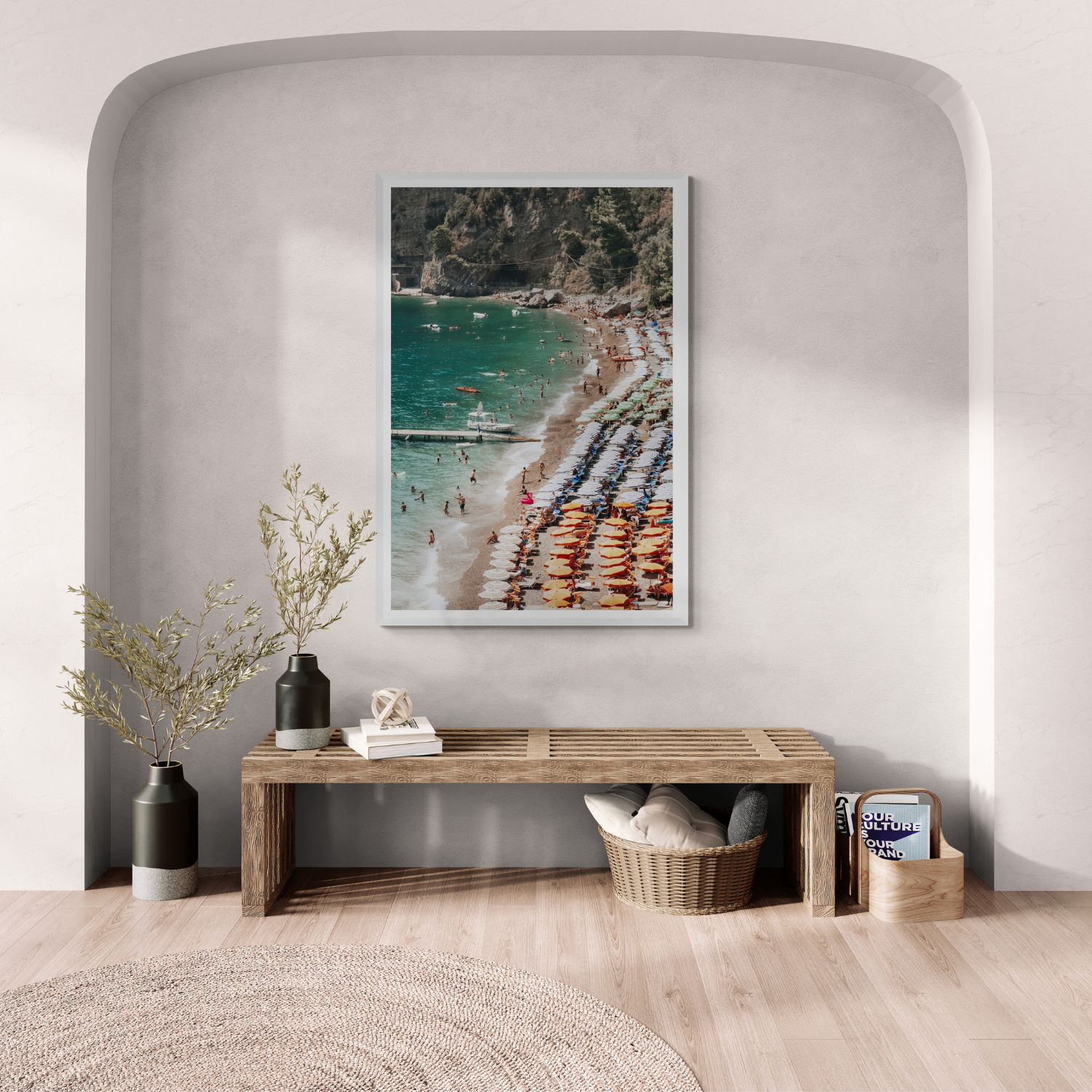
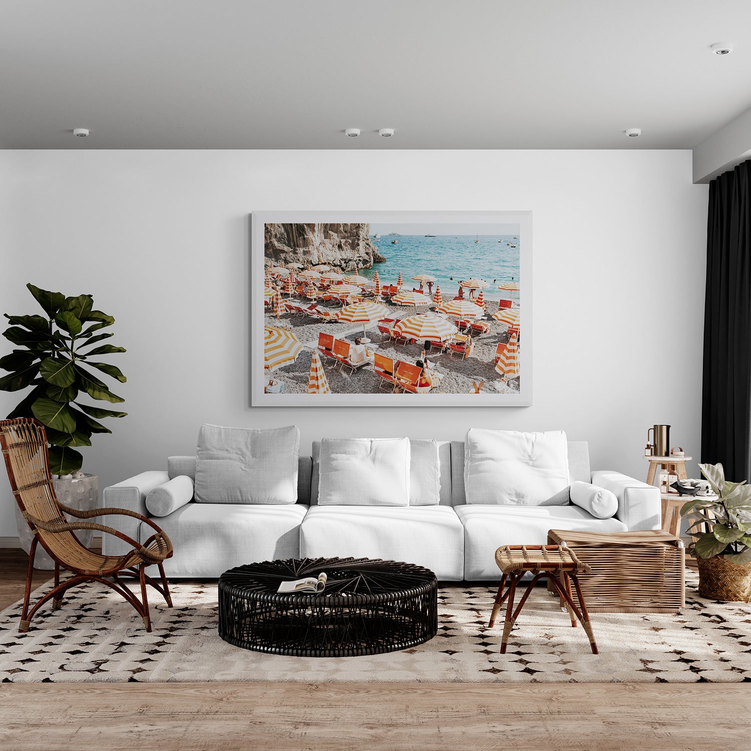
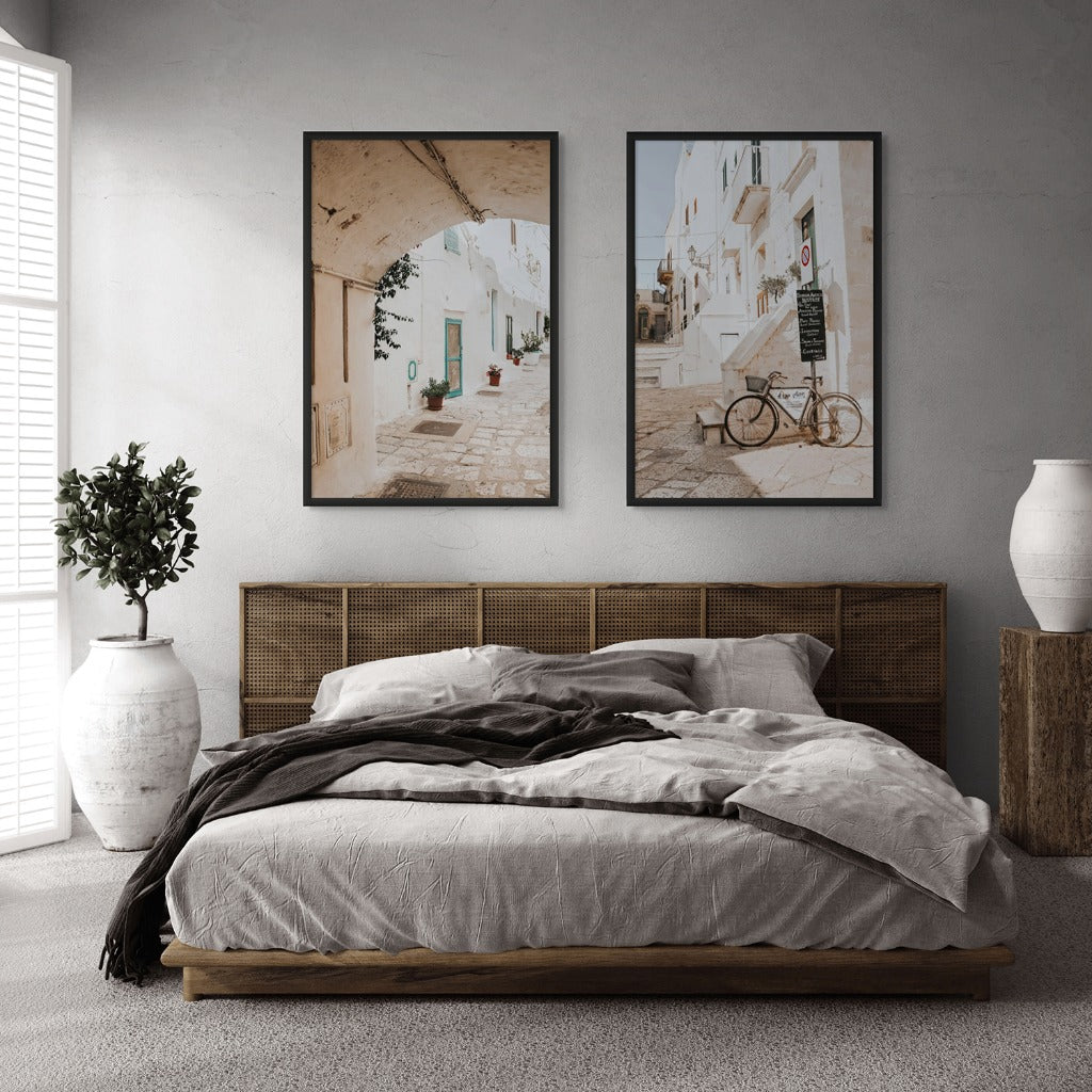
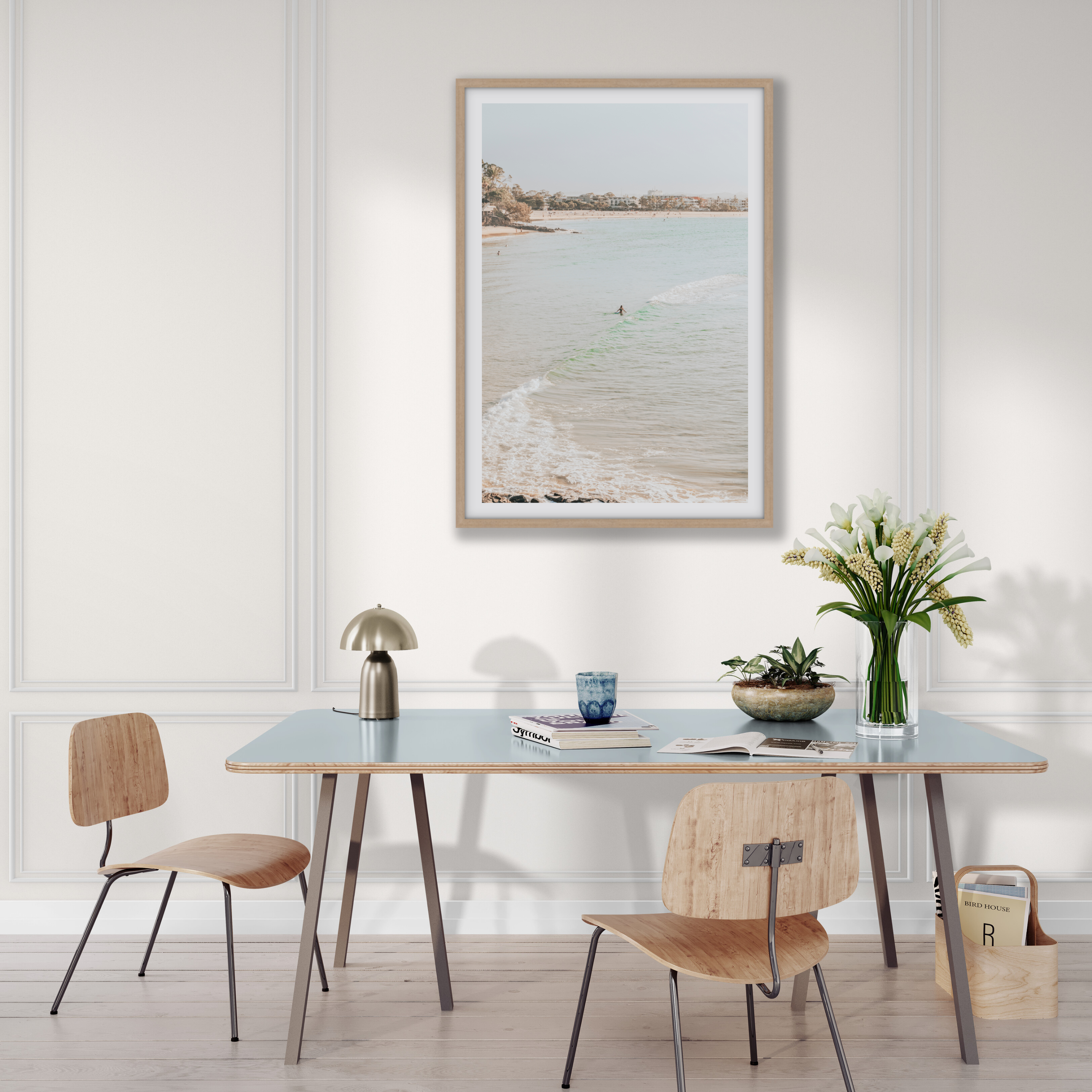
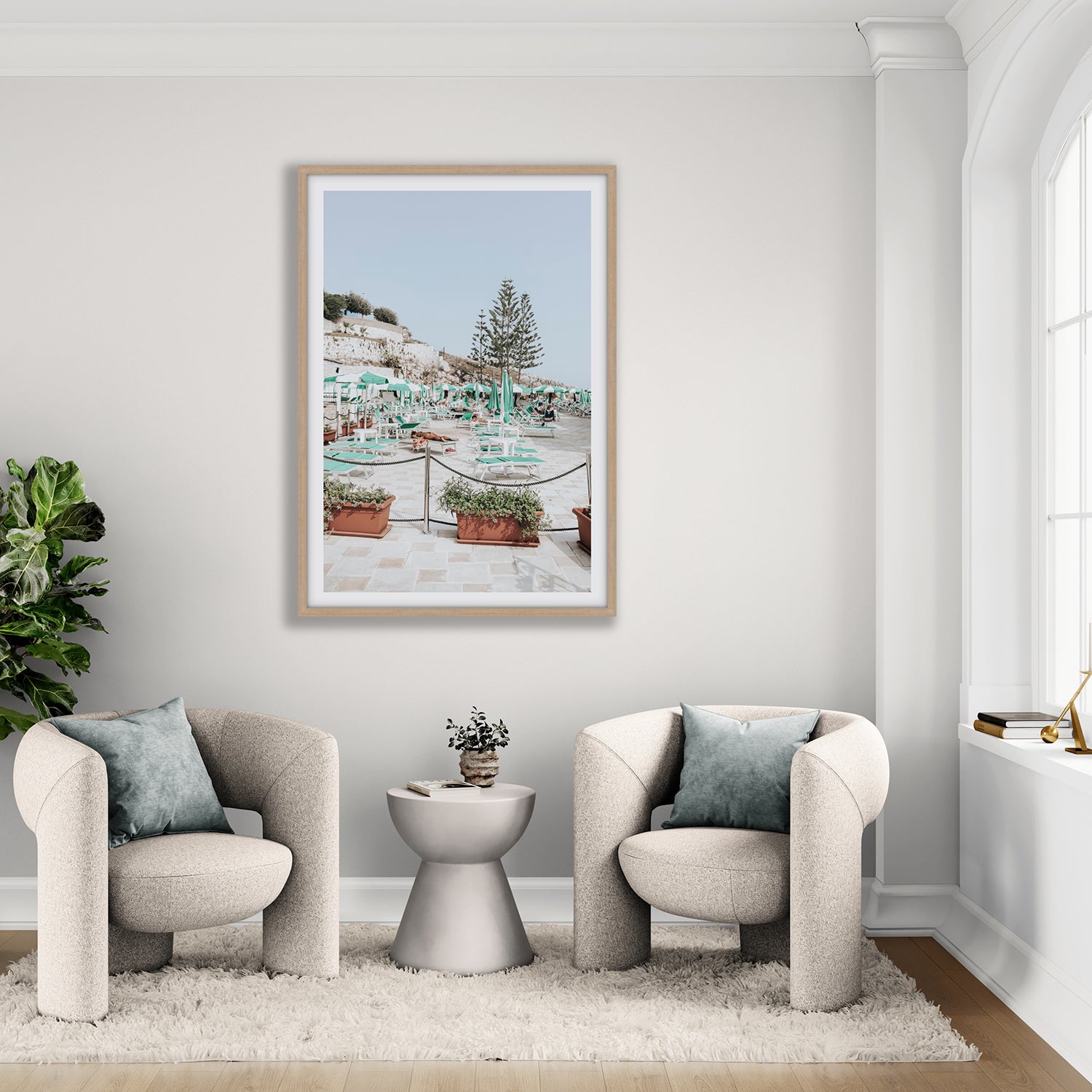
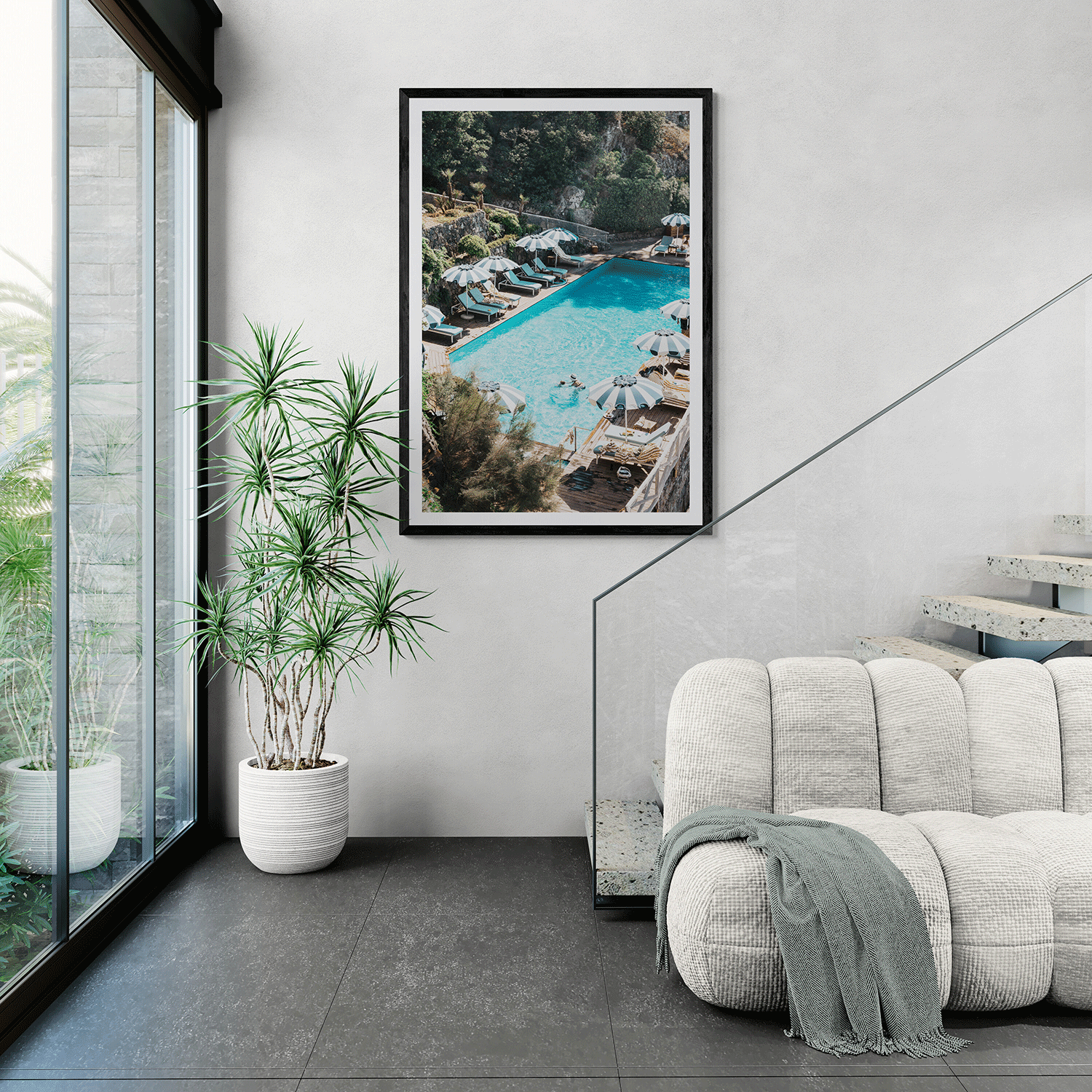

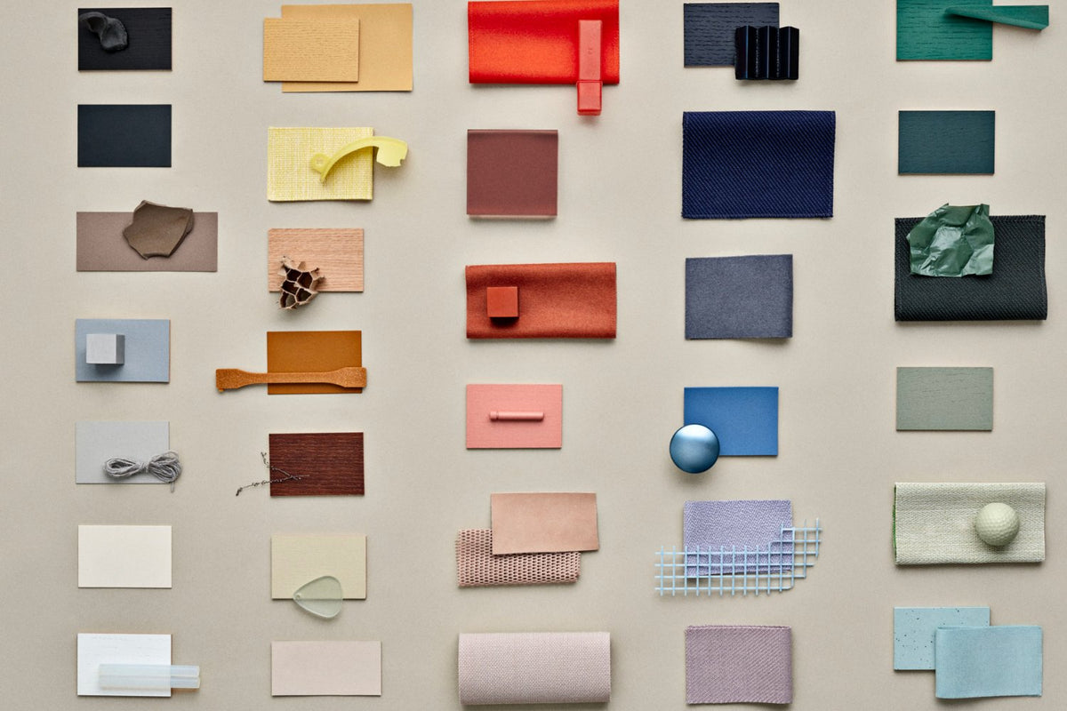

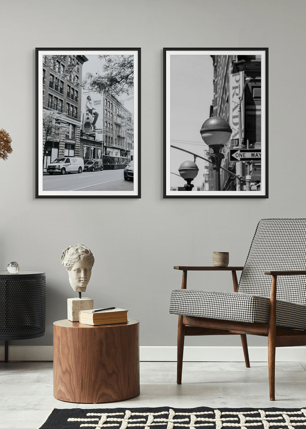

Colour choices feel subjective because they are experienced in context. A blue sample can look different beside warm timber than beside cool grey, and the same surface can change appearance under daylight and a lamp. Understanding a few terms helps you test a palette without pretending that a colour has one universal emotional effect.
Hue, lightness and saturation are different decisions
Hue describes the colour family, such as blue or orange. Lightness describes how light or dark a colour appears; saturation describes how vivid or muted it feels. A pale, muted blue and a deep, vivid blue share a broad hue but do very different jobs in a room. Compare all three qualities when choosing a wall shade or artwork.
Light changes what you see
Objects reflect different parts of the light that reaches them. Change the light source or its position and the colours you perceive may change. Researchers at the US National Institute of Standards and Technology demonstrate this with adjustable lighting and explain why colour rendering matters. A phone screen adds another layer of uncertainty: it cannot replace a physical sample viewed in your own room.
Surrounding colours alter the impression
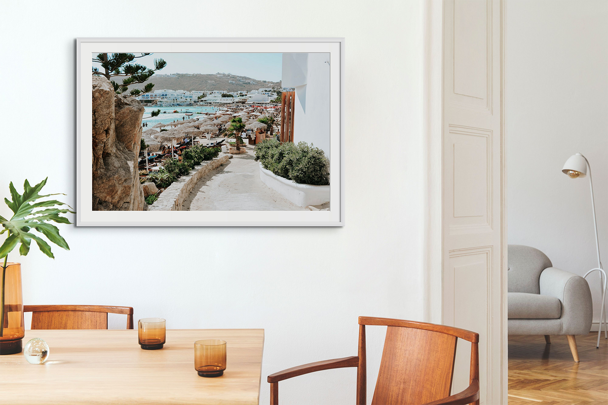
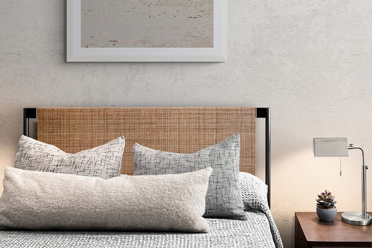
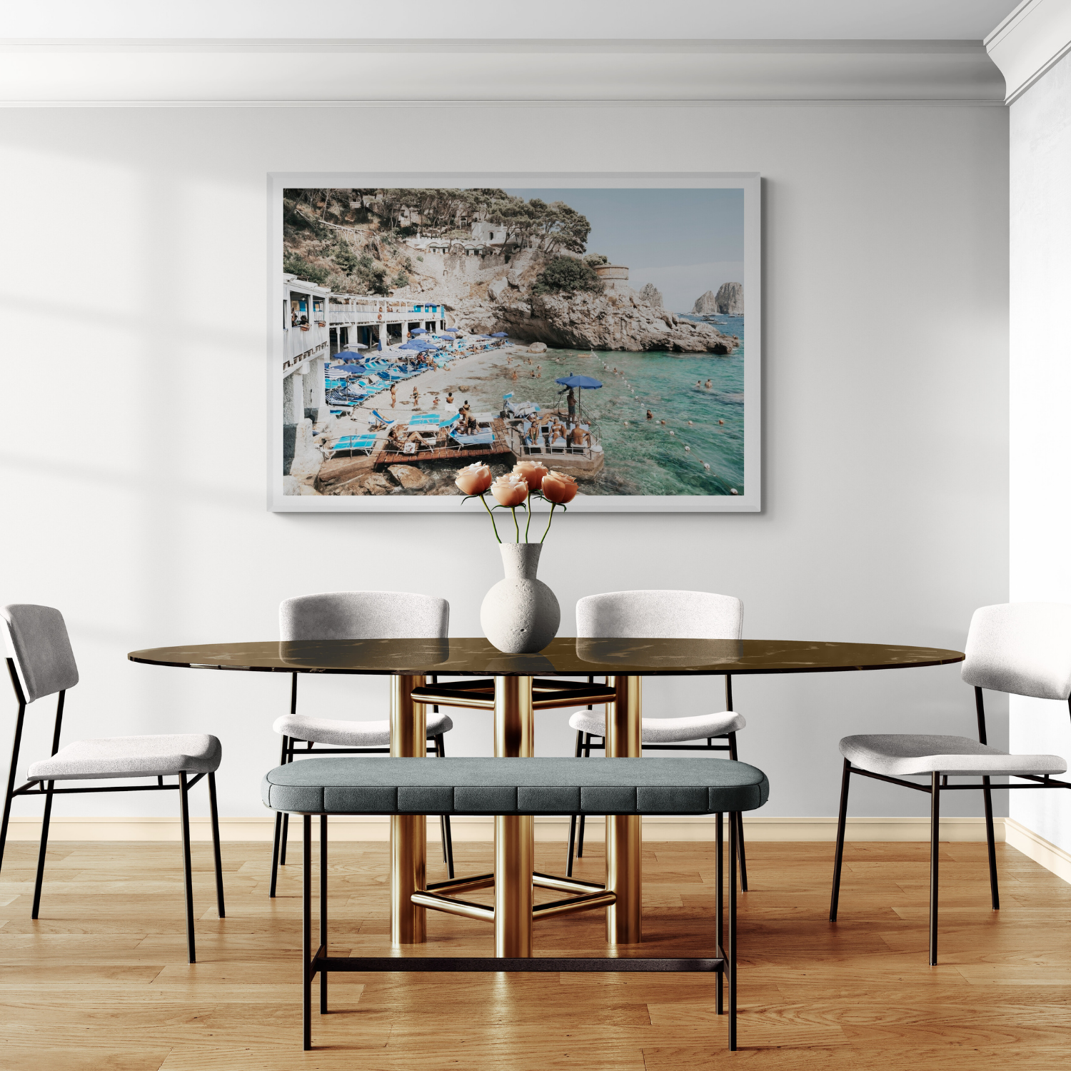
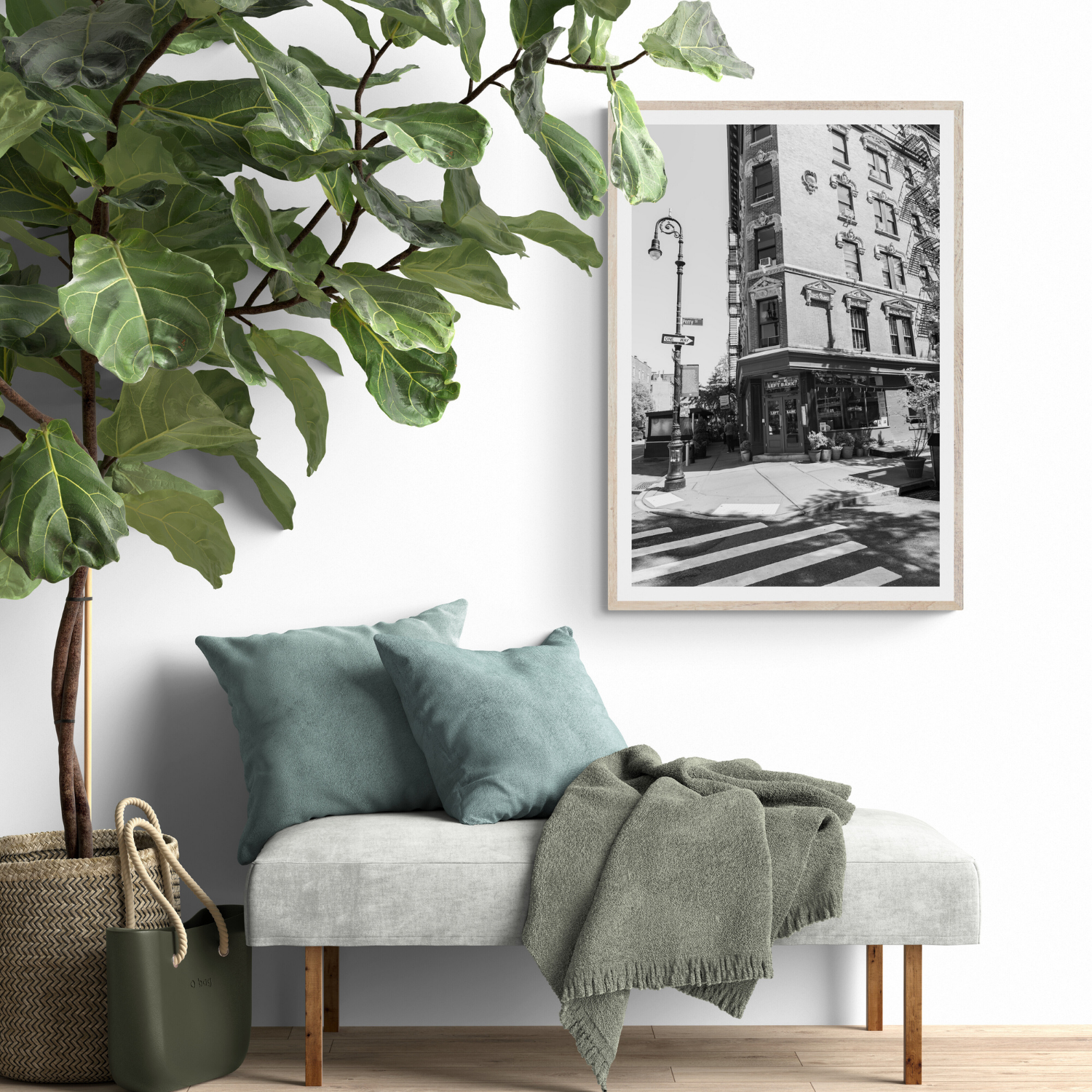
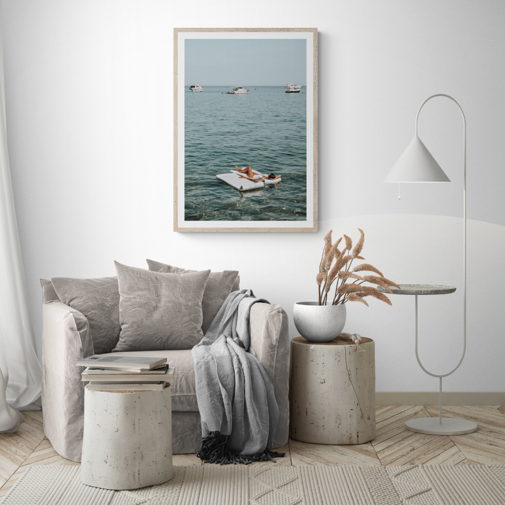
A warm white wall can make a cool grey sofa appear bluer; a vivid rug may make a nearby print feel quieter. Place samples beside the permanent finishes in the room, not on a blank board at a shop. Look at them from the place you normally sit. This is a practical comparison, not a claim that one colour will affect everyone the same way.
Build a palette in a simple sequence
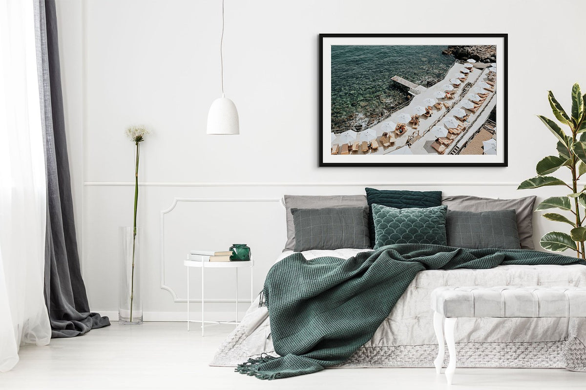
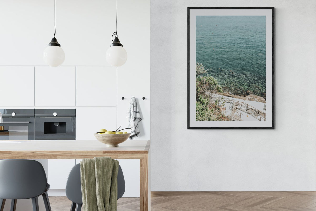
First identify the colours you cannot easily change: floor, cabinetry and large furniture. Second choose the room's broad lightness balance—airy, mid-toned or dark. Third add one controlled accent. Finally, decide whether artwork should repeat that accent or introduce a deliberate counterpoint. Leave a little visual space so several strong colours do not compete.
Test before committing
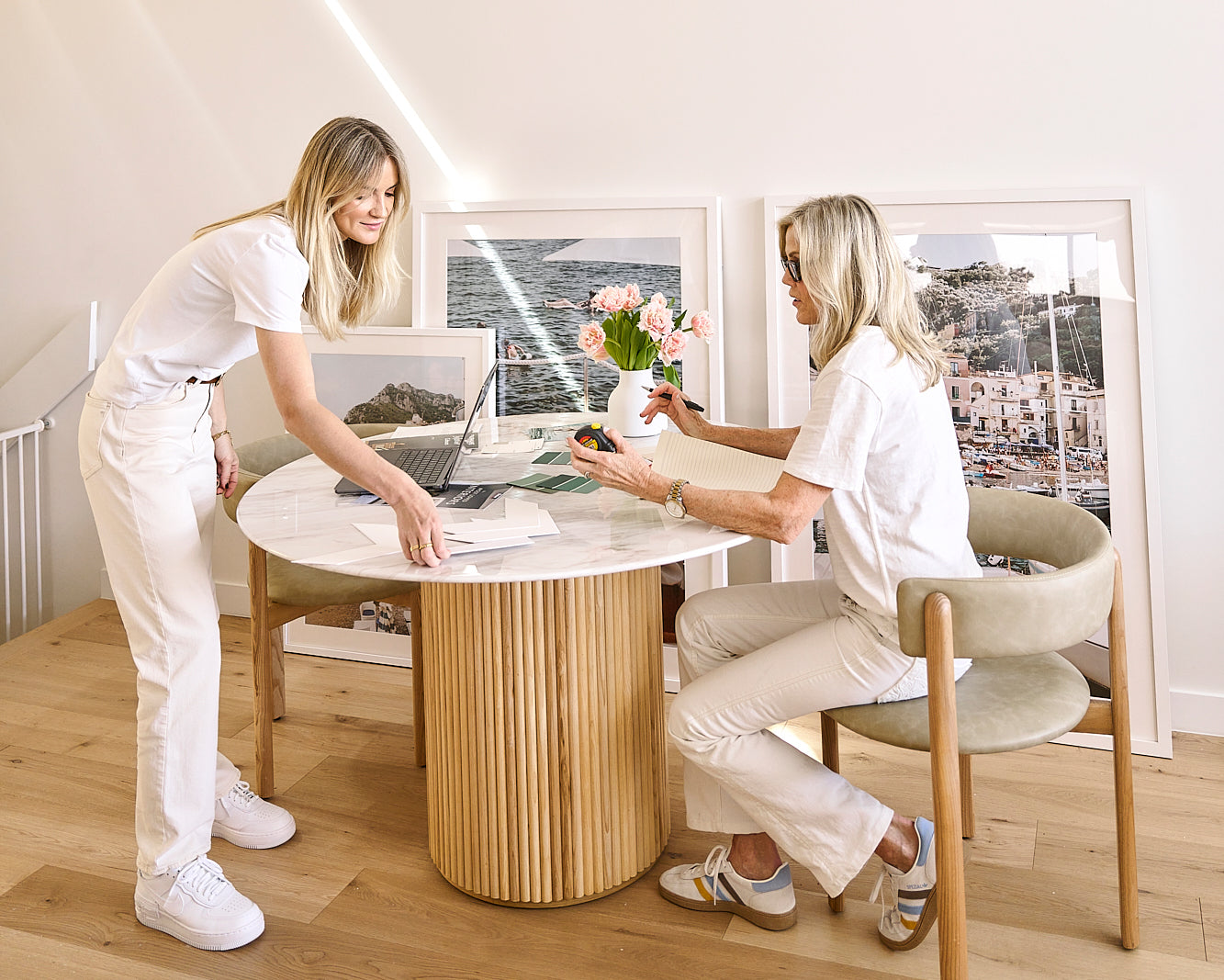
View paint samples and fabric in daylight and evening light. If possible, compare the artwork's physical proof or reliable material sample with the room's lighting; otherwise use the product imagery as a guide and check return terms before ordering. A photograph may hold several colours, so look at its overall tonal weight rather than matching one tiny detail. Our practical colour selection guide takes these ideas into a room-by-room decision.
The science explains why colour appearance can shift. Your preference and the room's purpose still decide which result you want to live with.
Colour recipe
Three decisions that make colour feel intentional

Pull one existing tone
Repeat a colour from timber, stone, textiles or cushions so the print feels connected.
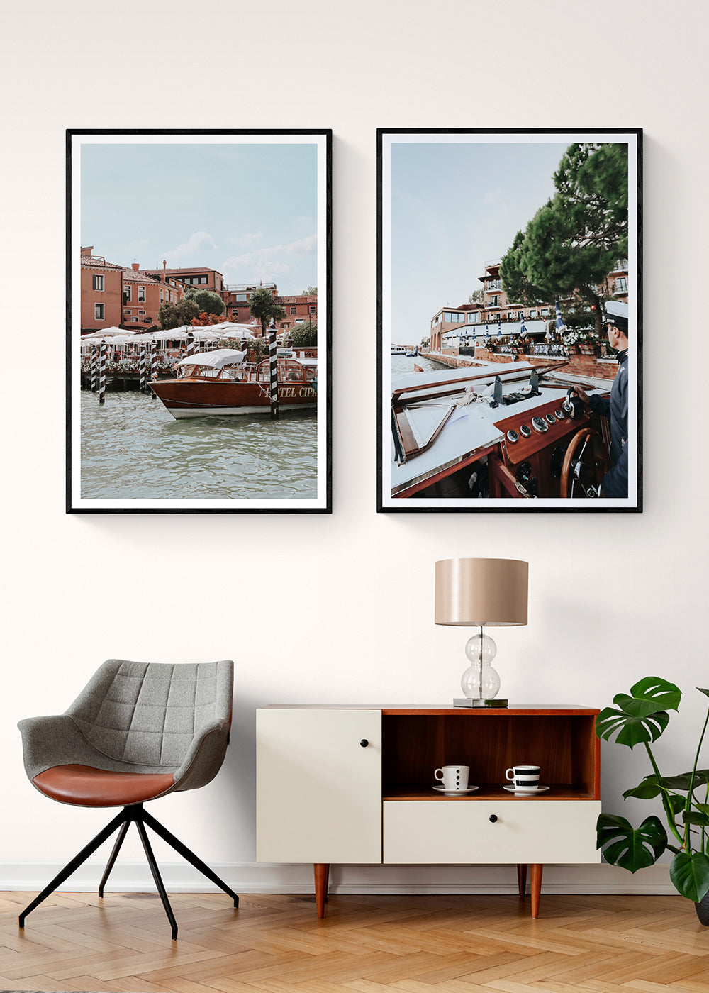
Add one new accent
A second artwork can introduce energy, but it should still share a visual thread.

Balance colour with space
Negative space, sky, water or architecture keeps brighter palettes from feeling crowded.