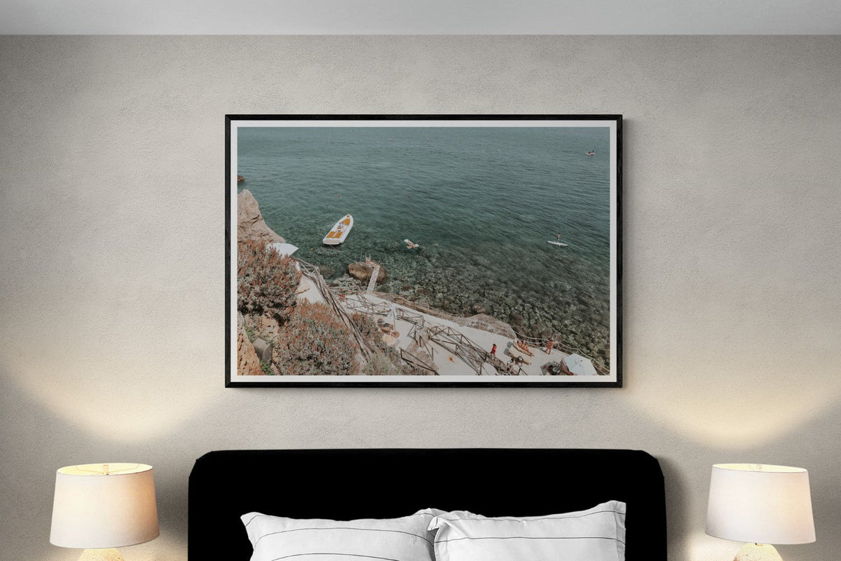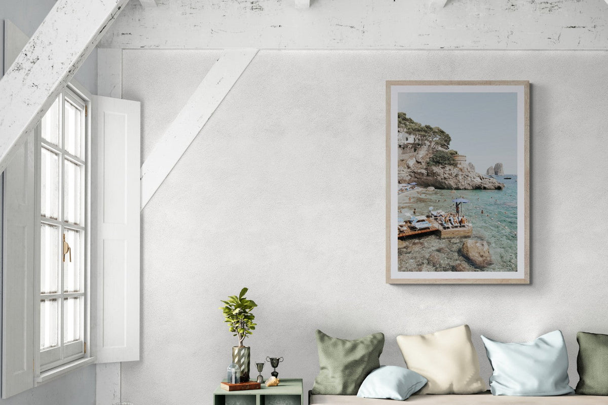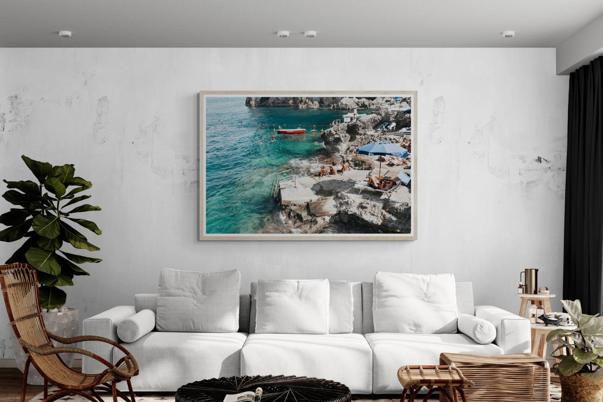

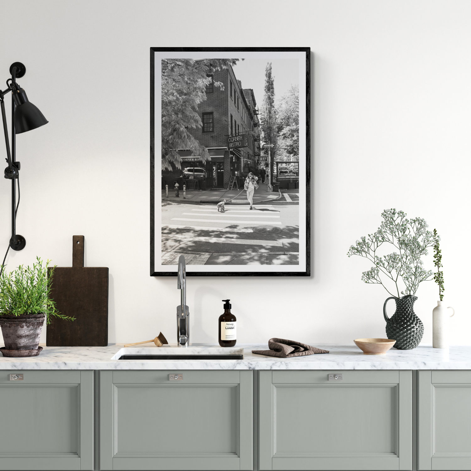
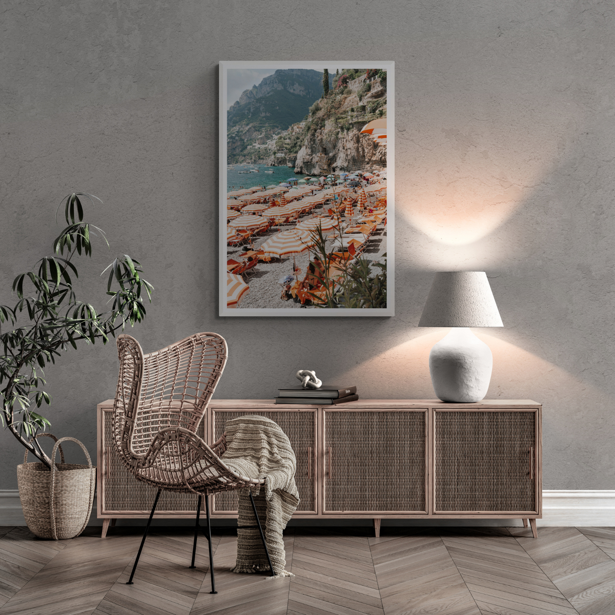
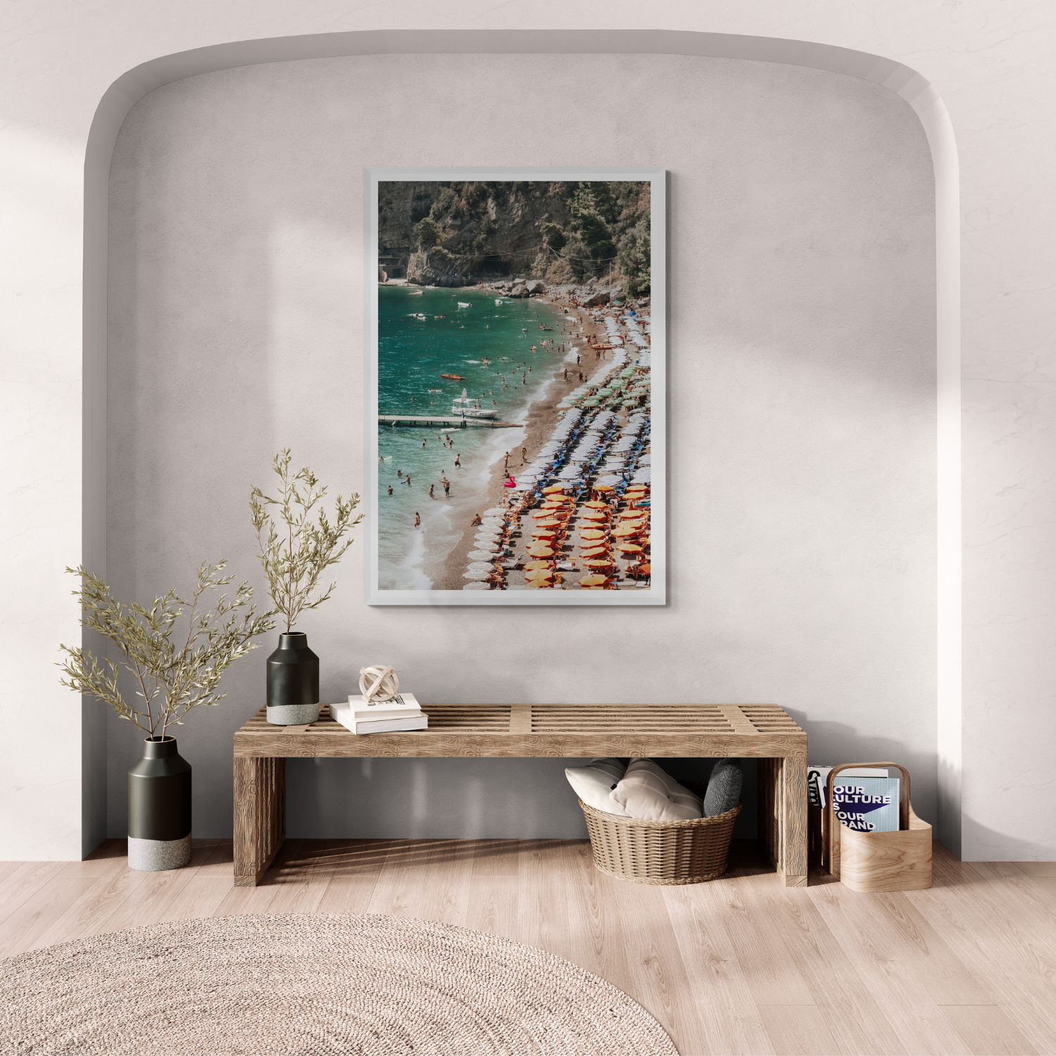
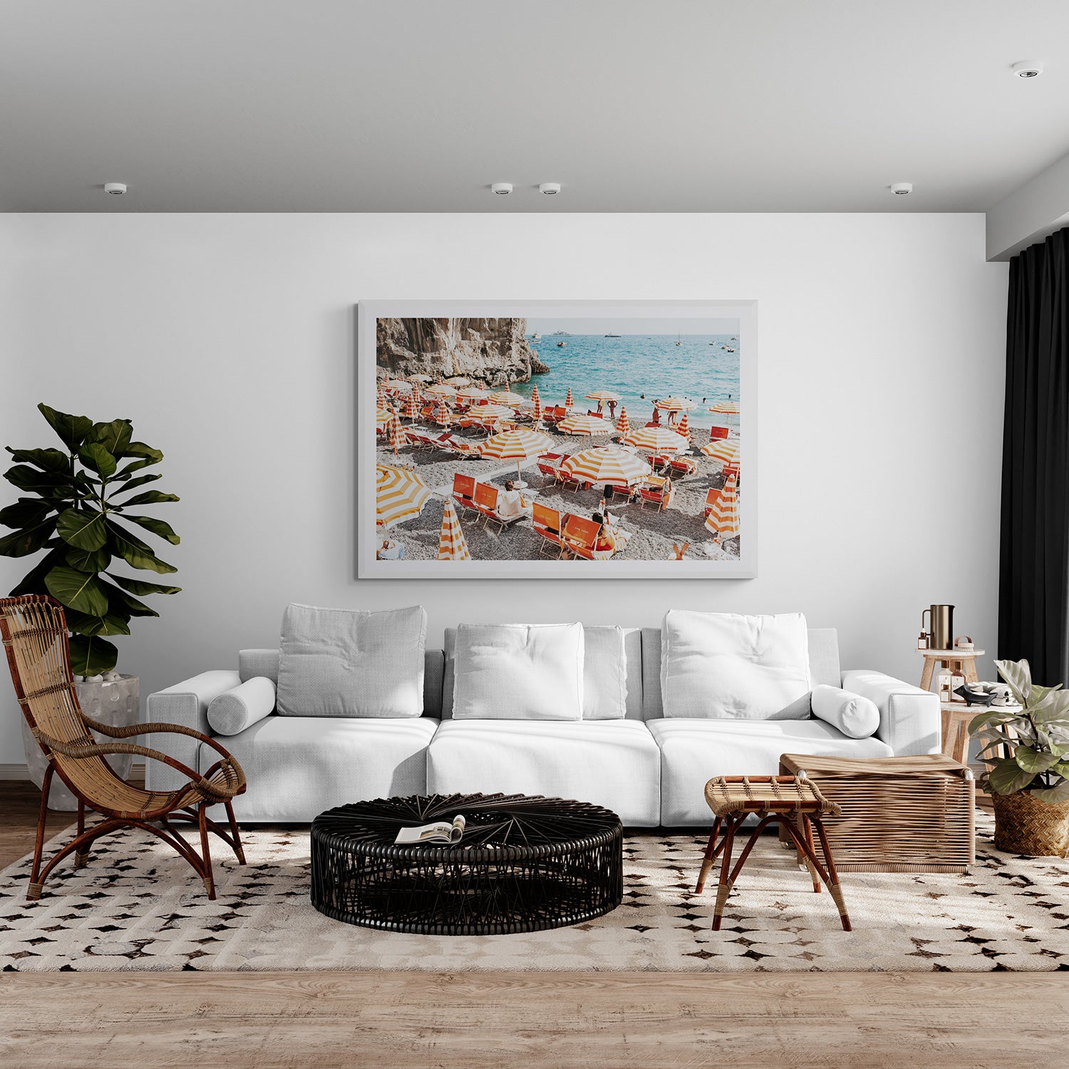
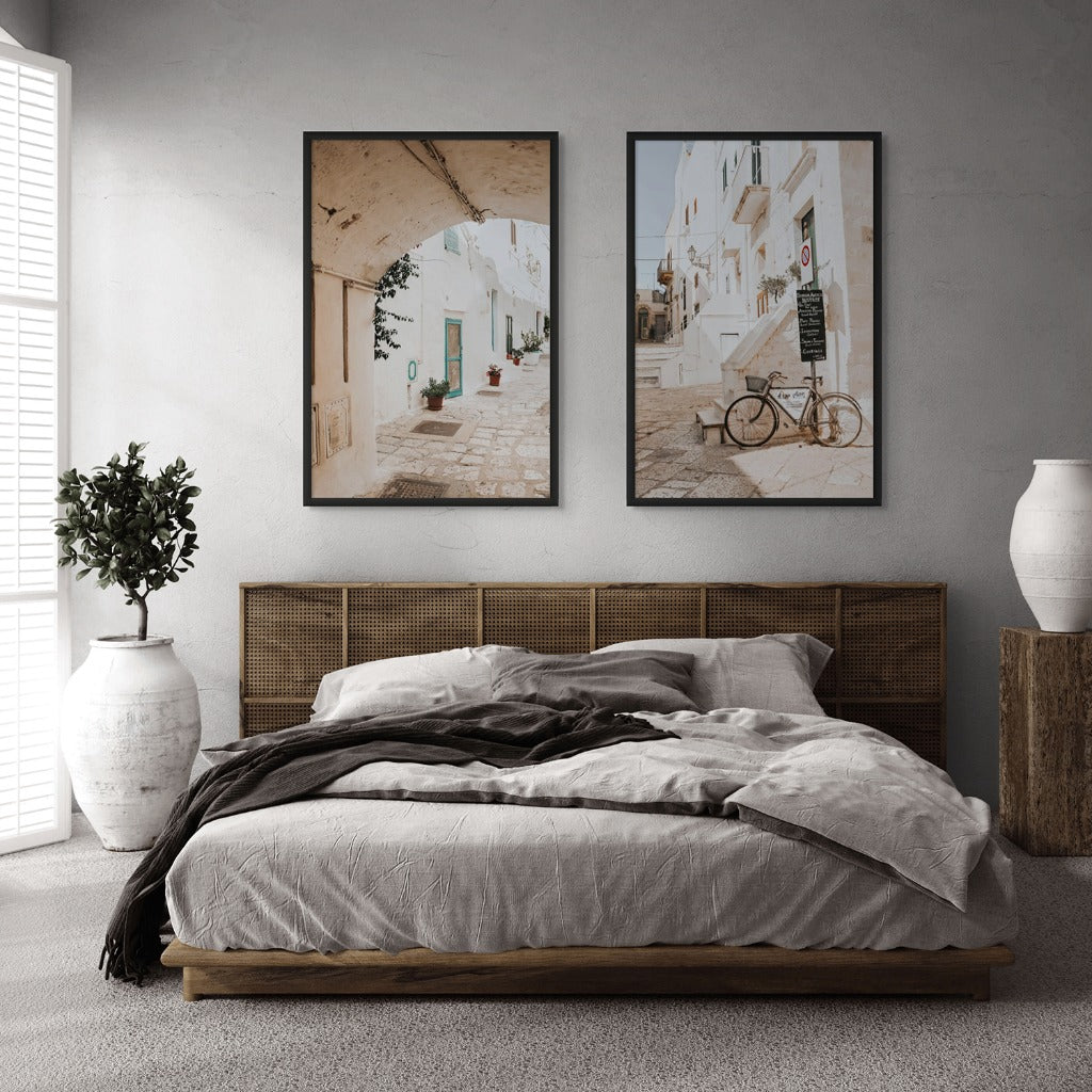
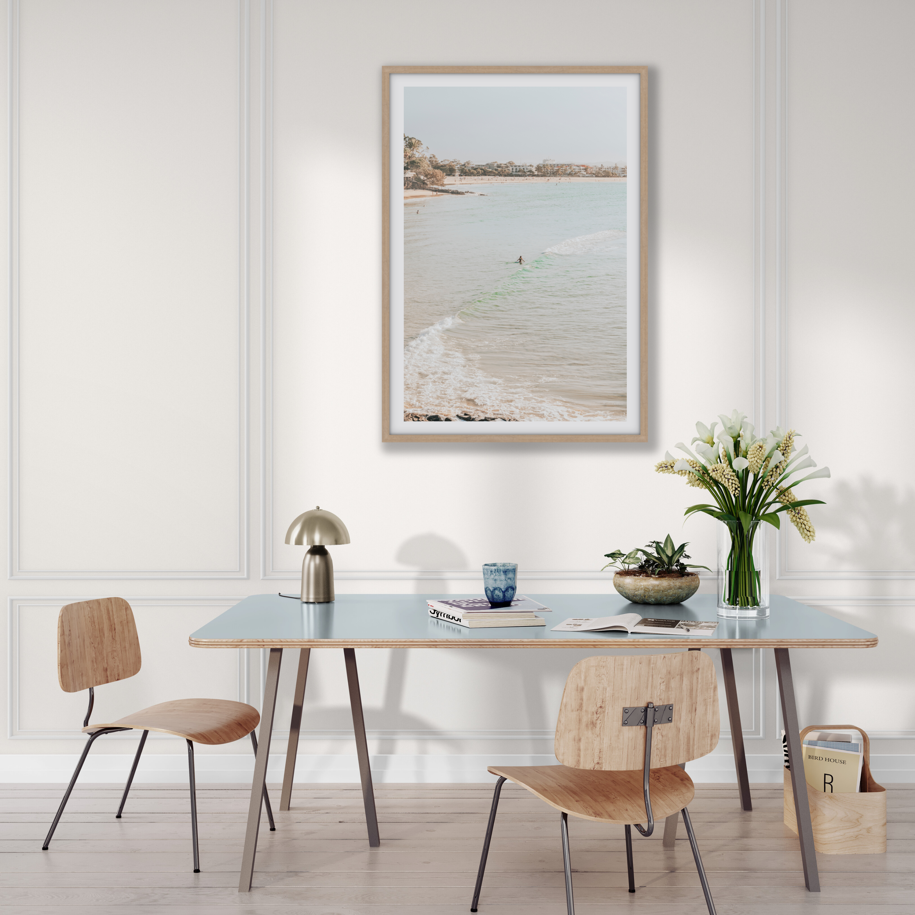
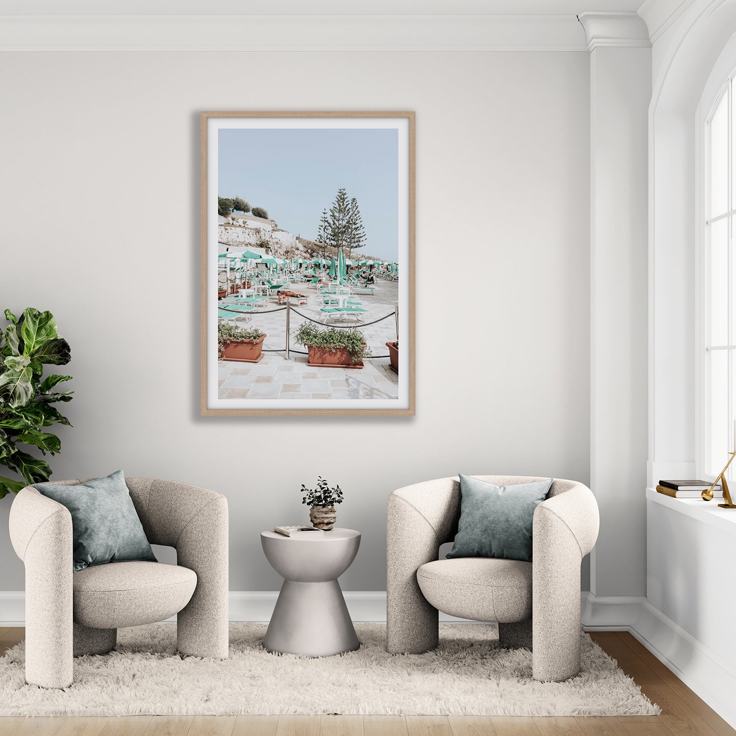
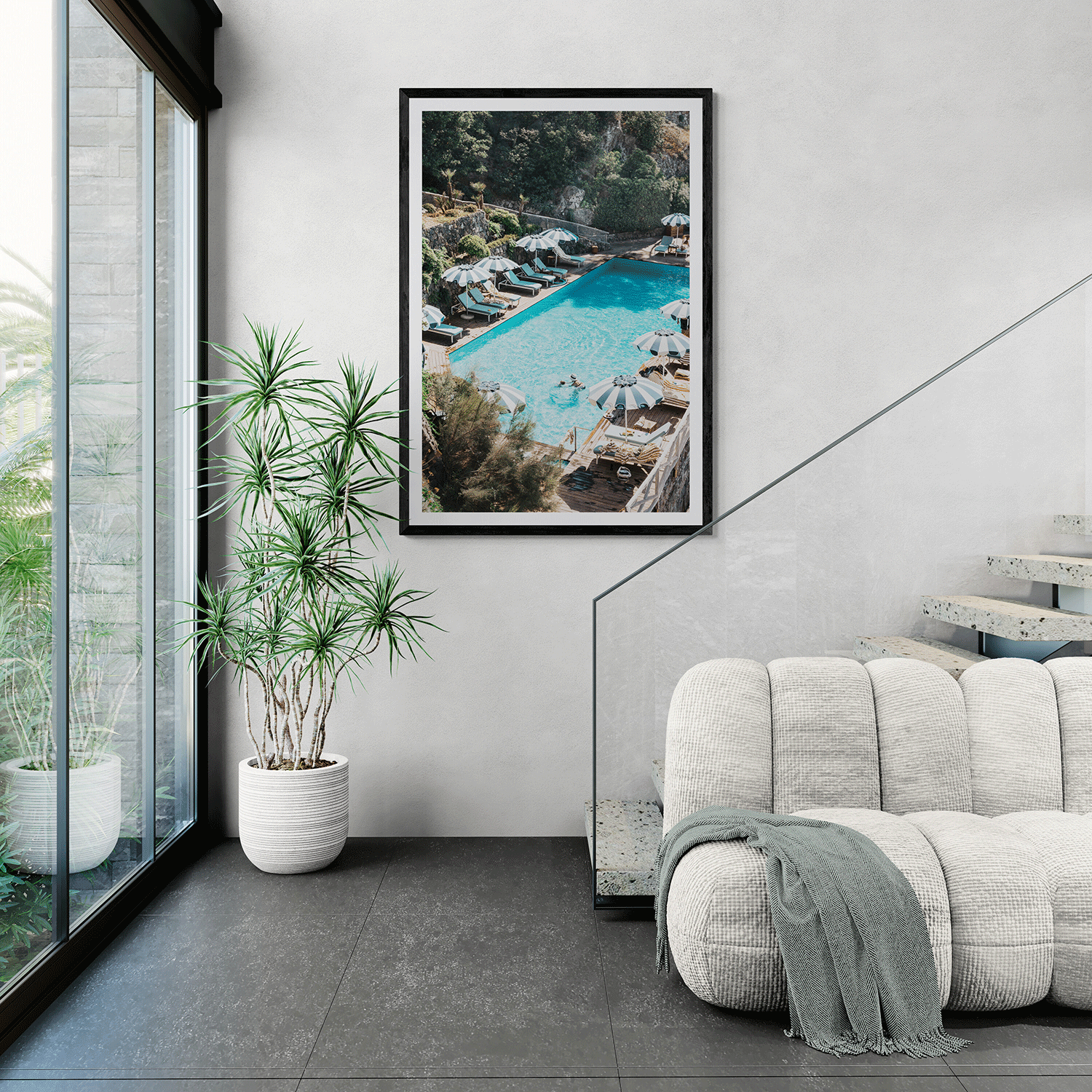
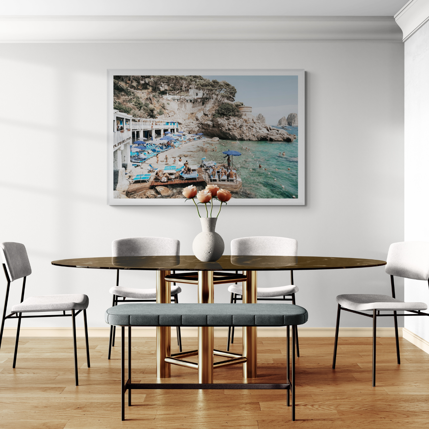


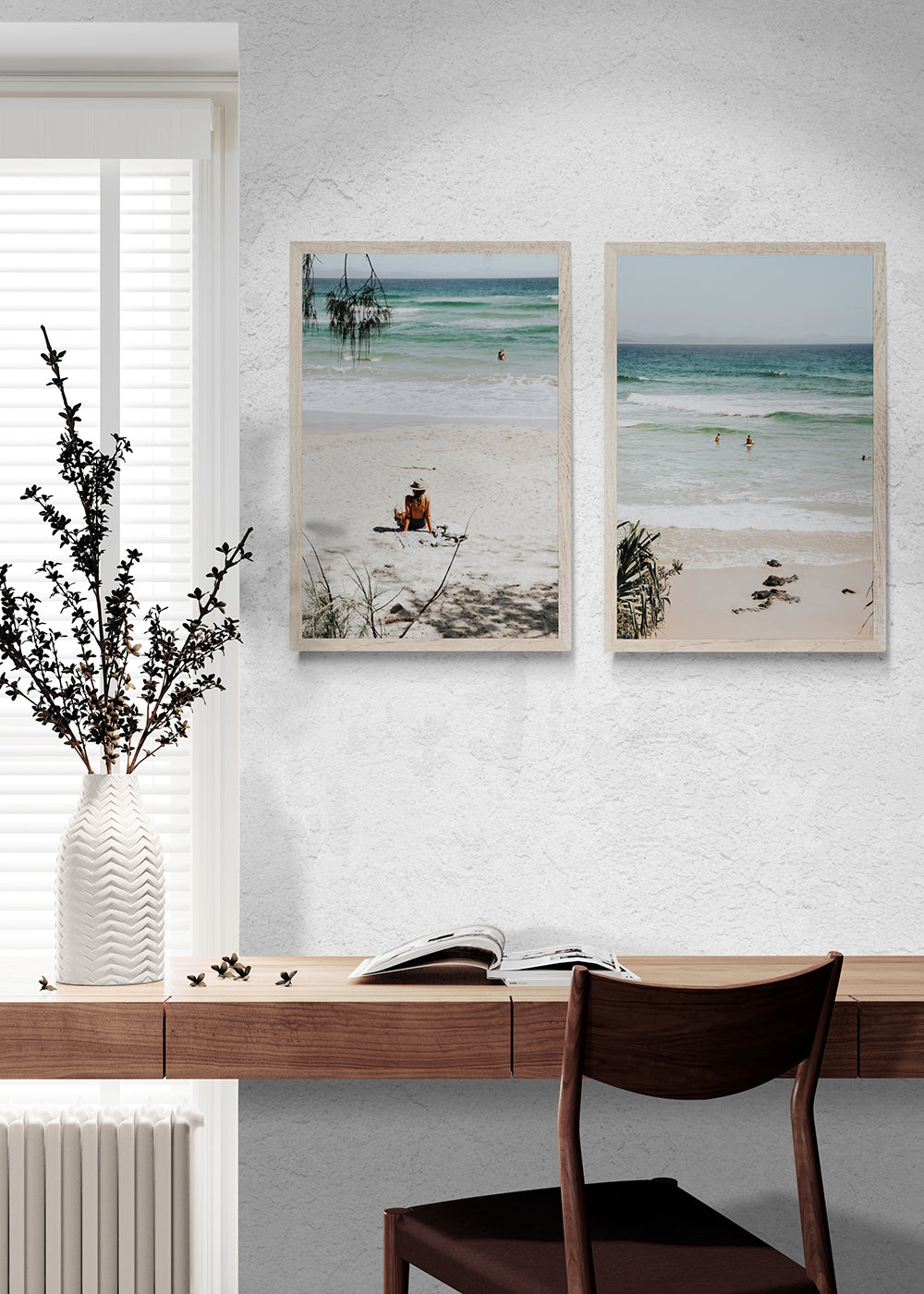

Choose a white frame when you want the artwork to feel light and quietly integrated. Choose black when the room or image needs definition and contrast. Choose natural oak when you want to introduce warmth and connect the artwork with timber, linen and other natural materials.
That is the short answer. The best frame color, however, should respond to three things together:
- the artwork;
- the wall and surrounding room; and
- how much visual emphasis you want the frame to have.
The frame does not need to match every finish in the room. Its purpose is to give the artwork the right boundary—quiet, strong or warm—without overpowering the image.
Black, white and natural oak at a glance
| Frame color | Overall effect | Often works well with |
|---|---|---|
| White | Light, clean and understated | Pale walls, coastal imagery, soft colors and airy interiors |
| Black | Defined, graphic and high-contrast | Black-and-white art, architectural imagery and rooms with dark accents |
| Natural oak | Warm, textural and relaxed | Coastal, Mediterranean and earth-toned artwork; timber and natural materials |
These are useful starting points, not rigid rules. The same artwork can feel entirely different in each finish.

Begin with the artwork
Before looking at the sofa, flooring or cabinet handles, study the image itself.
Ask:
- Is the artwork predominantly light or dark?
- Does it contain warm or cool tones?
- Are its lines soft and atmospheric or strong and architectural?
- Do you want the frame to blend with the image or sharpen its edges?
- Is the artwork already visually bold?
A frame can either echo something within the image or create a deliberate contrast around it.
For example, natural oak can pick up warm stone, sand and sun-faded architecture. Black can repeat deep shadows, dark windows or graphic lines. White can extend the feeling of an open sky, pale façade or light Matboard.
You do not need to match an exact color within the artwork. Look for a shared temperature, level of contrast or overall feeling.
When to choose a white frame
A white frame creates the quietest boundary around an artwork, particularly when it sits against a white or pale wall. It can make the complete piece feel fresh, spacious and easy to integrate.
White is often a natural fit for:
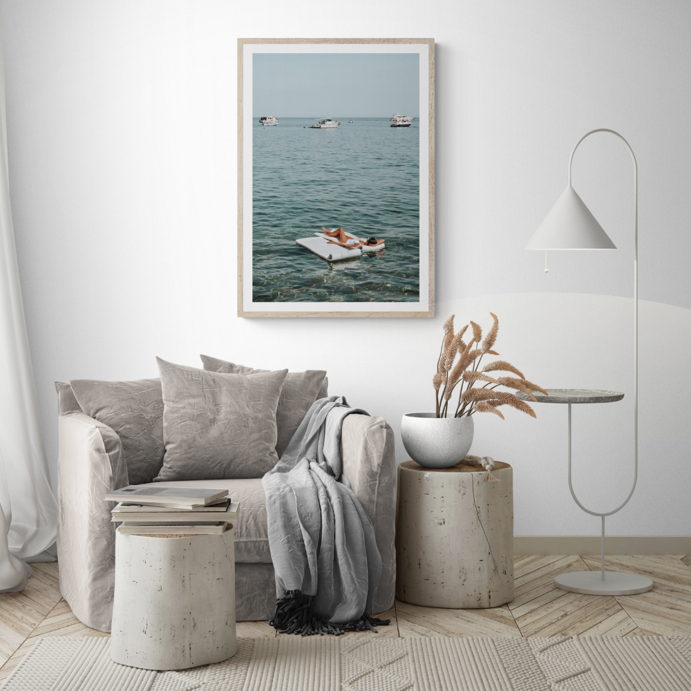
- pale coastal and Mediterranean imagery;
- light blue, neutral and sun-washed artwork;
- white, soft gray or lightly colored walls;
- relaxed coastal interiors;
- rooms where the artwork supplies most of the color; and
- multi-piece arrangements where you want consistency without heavy outlines.
A white frame does not necessarily disappear. On a white wall, the frame’s edges and natural shadows still create separation. With Matboard presentation, the layered whites can give the artwork a light gallery-style finish.
When white may feel too quiet
If the image itself contains extensive pale space, a white frame and Matboard can make the complete artwork feel softer than intended. That may be perfect for a calm bedroom, but less effective if the living room needs a clear focal point.
In that situation, you could:
- retain the white frame but choose Full Bleed;
- introduce natural oak for gentle warmth; or
- use black to create a stronger outer edge.
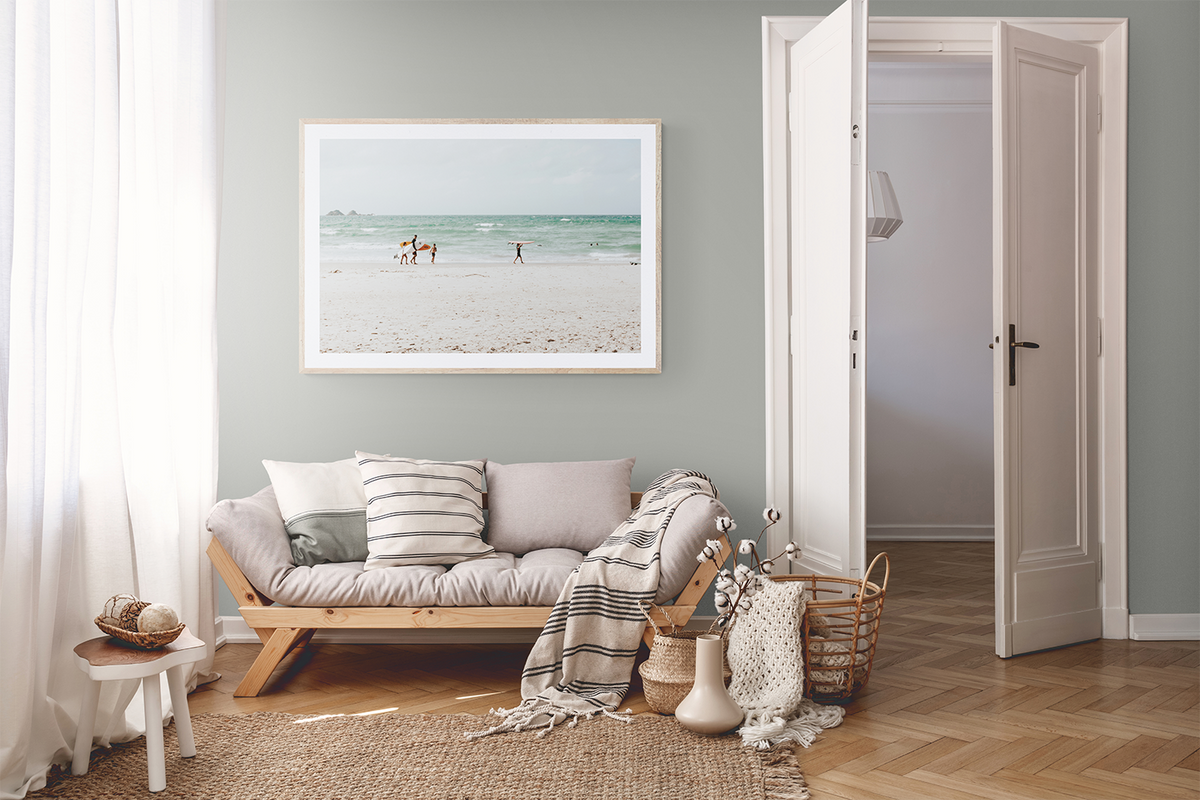
The Beachside Byron collection is useful for visualising how a light coastal palette can work with white or natural timber framing.

When to choose a black frame
A black frame gives the artwork the clearest boundary. It can repeat darker elements within the image or introduce contrast around a pale composition.
Black often suits:
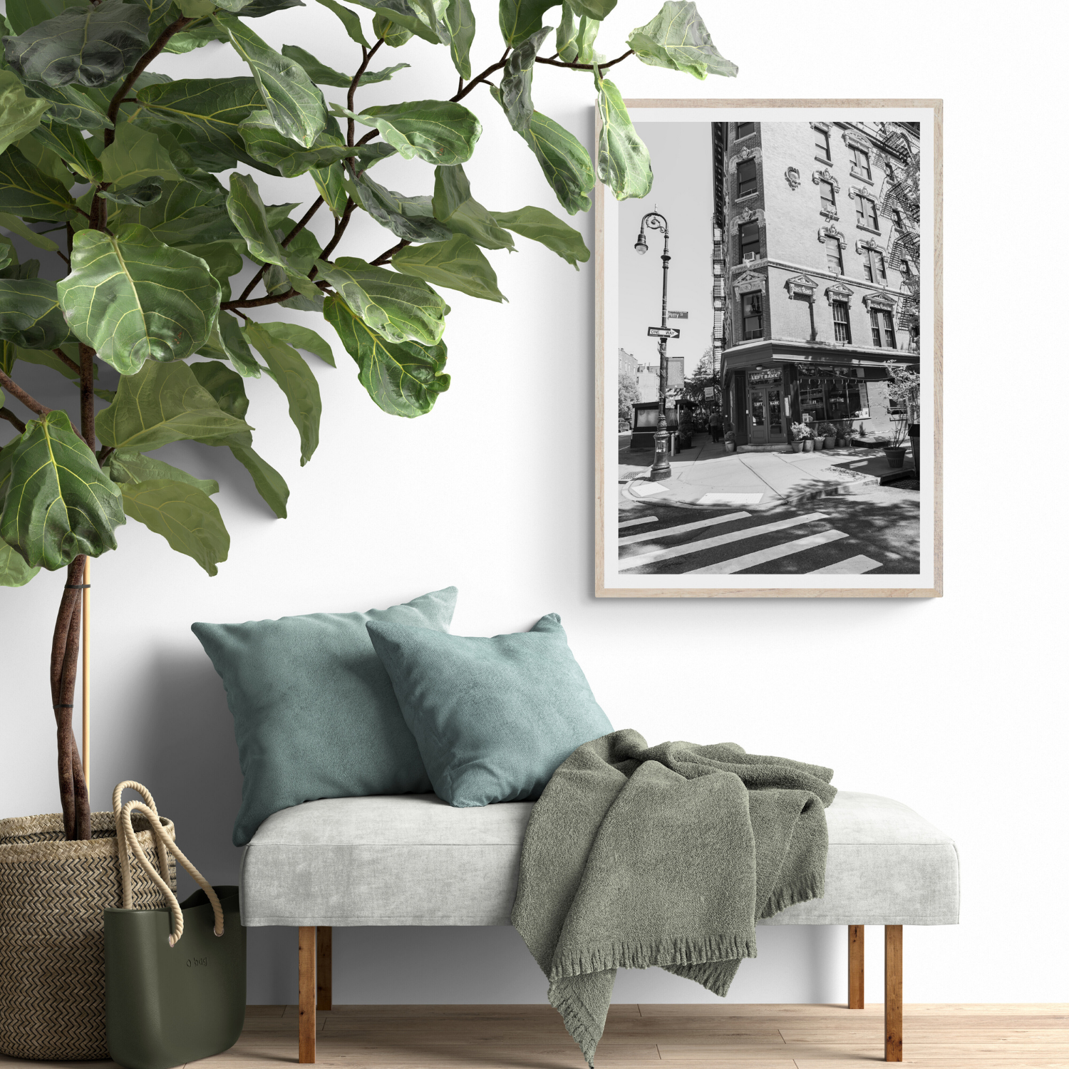
- black-and-white photography;
- city, architectural and street imagery;
- artwork containing deep shadows or rich contrast;
- rooms with black lighting, window frames or furniture details;
- contemporary interiors;
- Full Bleed presentation; and
- statement artwork that needs a stronger visual edge.
A thin black frame can feel precise without becoming dominant. It does not automatically make an artwork formal or severe; the effect depends on the image, presentation and surrounding room.
For example, black can sharpen a bright coastal scene by containing its color. It can also give pale or minimal artwork enough definition to stand away from a light wall.
Does a black frame make the image look darker?
Not necessarily. A black frame increases the contrast at the artwork’s outer edge, which can make lighter colors appear brighter.
The result becomes heavier only when several dark elements accumulate: a dark image, black frame, dark wall and little surrounding space. If you love a black frame but want a lighter overall effect, Matboard presentation creates separation between the image and frame.
Explore the Monochrome Manhattan collection to see artwork whose graphic lines and black-and-white tones naturally suit a more defined framing treatment.

When to choose a natural oak frame
Natural oak introduces warmth without adding a strong color. It sits between the visual lightness of white and the sharper definition of black.
Oak is especially effective with:
- Mediterranean and coastal scenes;
- warm whites, cream, beige and earth tones;
- blues that benefit from a warmer counterpoint;
- timber flooring or furniture;
- linen, rattan, stone and other natural materials;
- relaxed contemporary interiors; and
- rooms combining warm and cool finishes.
Natural oak does not have to match the room’s timber exactly. In most interiors, a close tonal relationship is enough. Trying to match every timber perfectly can make the room feel more controlled than connected.
Instead, look at the undertone. If the room contains pale, warm timber, natural oak will usually sit comfortably beside it. If the furniture is very dark or red-toned, use oak as a lighter contrast or repeat it through another small element elsewhere.
The Ristorante fine art print has styled images in white, black and natural oak frames, making it a particularly useful piece for comparing how each finish changes the same Italian artwork.
Should the frame match the wall color?
The frame can either blend with the wall or contrast against it. Both approaches work.
For a quiet, integrated result
Choose a frame close to the wall color:
- white frame on a white wall;
- black frame on a dark wall; or
- natural oak against a warm neutral wall.
This reduces the contrast around the outside of the artwork and allows the image to lead.
For stronger definition
Choose a frame that separates clearly from the wall:
- black on white;
- white on deep blue or charcoal; or
- natural oak against a cool gray or white wall.
Contrast is most helpful when the image would otherwise disappear into its surroundings.
Remember that “white” walls vary. A crisp white frame may look sharper beside a creamy wall, while it can feel almost seamless against a clean neutral white. This is not necessarily a problem—it simply changes how prominent the frame becomes.
Should frames match the furniture?
They do not need to match, but a repeated finish can make the frame feel connected to the room.
Look for one or two details you can echo:
- black frame with black lamp bases or window trim;
- natural oak with a timber coffee table or dining chairs;
- white frame with pale joinery or light walls.
Avoid using every furniture finish as an instruction. A room with oak furniture can still suit a black frame, particularly when the artwork needs stronger contrast. Likewise, a white frame can soften a room containing substantial dark furniture.
The goal is visual balance rather than perfect matching.
If you are unsure about your wider interior direction, the Amichi Co Design Style Quiz can help clarify the style and mood you naturally prefer.
How Matboard or Full Bleed changes the frame color
Frame color is only half of the presentation decision.
Frame with Matboard
Matboard places a light border between the image and frame. This softens the effect of black and natural oak because neither finish touches the image directly.
Choose Matboard when you want:
- more visual breathing room;
- a classic gallery-style presentation;
- a lighter overall composition;
- separation between a dark frame and dark image; or
- several framed prints to feel consistent.
Full Bleed frame
Full Bleed brings the image directly to the frame, creating a stronger relationship between the two.
Choose Full Bleed when you want:
- greater image impact;
- color to occupy more of the finished piece;
- a contemporary finish;
- a black frame to sharpen the composition; or
- a white or oak frame to define the image without a Matboard border.
You can view every current presentation and frame choice on product pages such as Bagni d’Arienzo, which is available with white, black and natural oak frames across Matboard, Full Bleed and Float Frame Canvas options.
What frame color suits black-and-white art?
Black-and-white artwork can work with all three Amichi Co frame finishes:
- Black reinforces contrast and creates a graphic result.
- White keeps the complete piece light and places attention on the image.
- Natural oak introduces warmth and prevents a monochrome arrangement from feeling overly sharp.
Choose according to the room rather than assuming black-and-white artwork must have a black frame. In a warm, relaxed living room, natural oak may create the easiest transition. In a minimal white interior, white framing can feel beautifully restrained. In a contemporary room with black architectural details, black may be the strongest option.
Can you mix frame colors in one room?
Yes. Frame colors do not need to match across the entire home—or even within the same room.
Mixing works best when there is a clear pattern. You might:
- use one finish for each artwork collection;
- repeat black and oak but keep every Matboard consistent;
- use a large oak-framed focal piece with smaller black-framed works;
- keep the frame profile consistent while varying the color; or
- connect mixed frames through a shared artwork palette.
For a symmetrical pair, matching frame finishes will usually create the calmest result. For an informal gallery wall, two complementary finishes can add depth.
If the arrangement already combines different sizes, orientations, colors and subjects, using one frame color can provide the unifying element.
A simple frame-color decision process
When comparing the three finishes, work through these questions:
- Does the artwork need softness or definition? Choose white for the softest boundary, black for the strongest and natural oak for warmth between the two.
- Which tones dominate the artwork? Pale and cool images often feel open in white. High-contrast images respond well to black. Warm or natural scenes pair easily with oak—but intentional contrast can be equally effective.
- What finish already repeats in the room? Use an existing black, white or timber detail as a reference, without trying to match everything.
- Will the print use Matboard or Full Bleed? Matboard softens the frame color. Full Bleed makes its relationship with the artwork more immediate.
- Is the artwork standing alone or joining a group? A standalone piece can handle more contrast. A pair or gallery wall often benefits from a consistent finish.
- Have you compared the options on the actual wall? Product renders are useful, but room lighting and wall color can change the result.
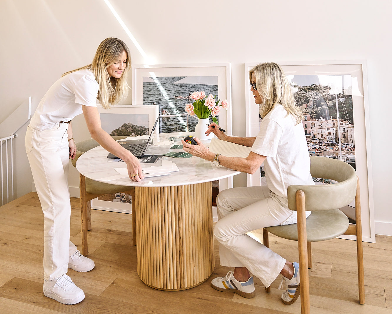
Photograph the wall straight on in natural daylight. Amichi Co’s Complimentary Styling Service can help you compare artwork, size, presentation and frame color before ordering.

See your preferred frame on the wall
Browse the Amichi Co wall art collections, then compare each artwork in white, black and natural oak on its product page.
If you would like to see the options against your own walls, use the Complimentary Styling Service before making your final choice.
Frequently asked questions
How do I choose a frame color for artwork?
Begin with the artwork’s tones and level of contrast, then consider the wall and finishes already present in the room. Choose white for lightness, black for definition or natural oak for warmth.
What frame color looks best on white walls?
All three can work. White gives a subtle layered effect, black creates the most contrast and natural oak adds warmth. Choose according to how prominent you want the frame to be.
Should the frame match the artwork or the room?
It should respond to both, but it does not need to match either exactly. Let the artwork guide the frame’s visual strength, then use the room to choose between a warmer, lighter or more contrasting finish.
What frame color is best for black-and-white photography?
Black creates a graphic edge, white produces a lighter presentation and natural oak adds warmth. There is no universal best choice; the surrounding interior should help decide.
Can I mix black and oak frames?
Yes. Repeat both finishes elsewhere or keep another element consistent, such as the frame profile, Matboard or artwork palette. For a formal pair, matching frames will usually look more unified.
Is natural oak only suitable for coastal interiors?
No. Natural oak also complements contemporary, Scandinavian-inspired, Mediterranean, neutral and earth-toned rooms. Its warmth can soften monochrome artwork and cool-colored walls.
Styling recipe
Three decisions that make the room feel finished

Start with mood
Choose the feeling first: calm, sun-washed, graphic or nostalgic. The right artwork should clarify the room before it asks for a decision.
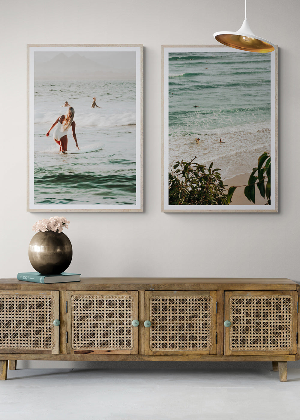
Build a pair
An artwork set can carry colour, subject or mood across the room and make the whole space feel more collected.

Choose the finish
The final edit should support the room: crisp and gallery-like for structure, softer and quieter for relaxed coastal spaces.