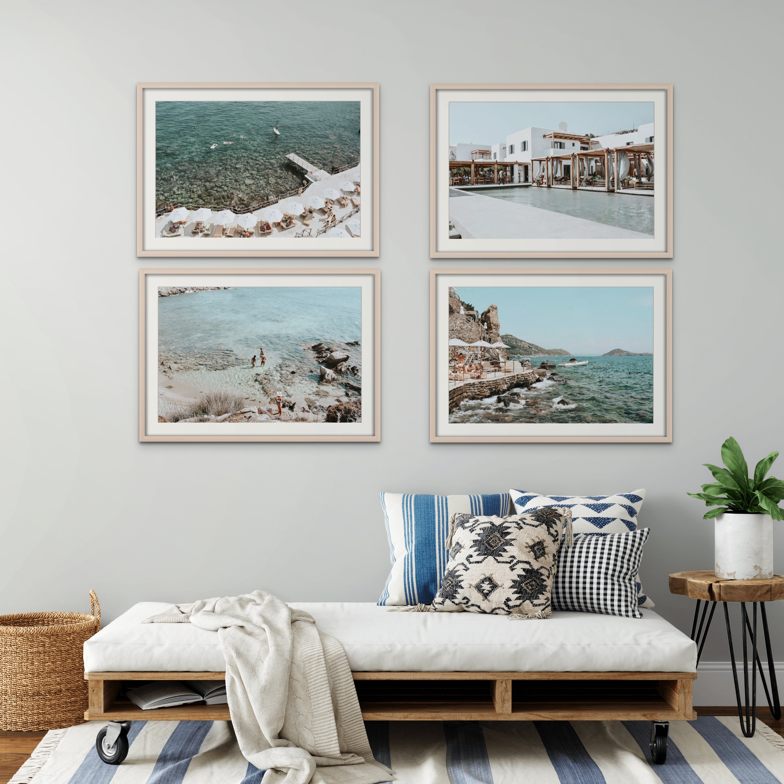

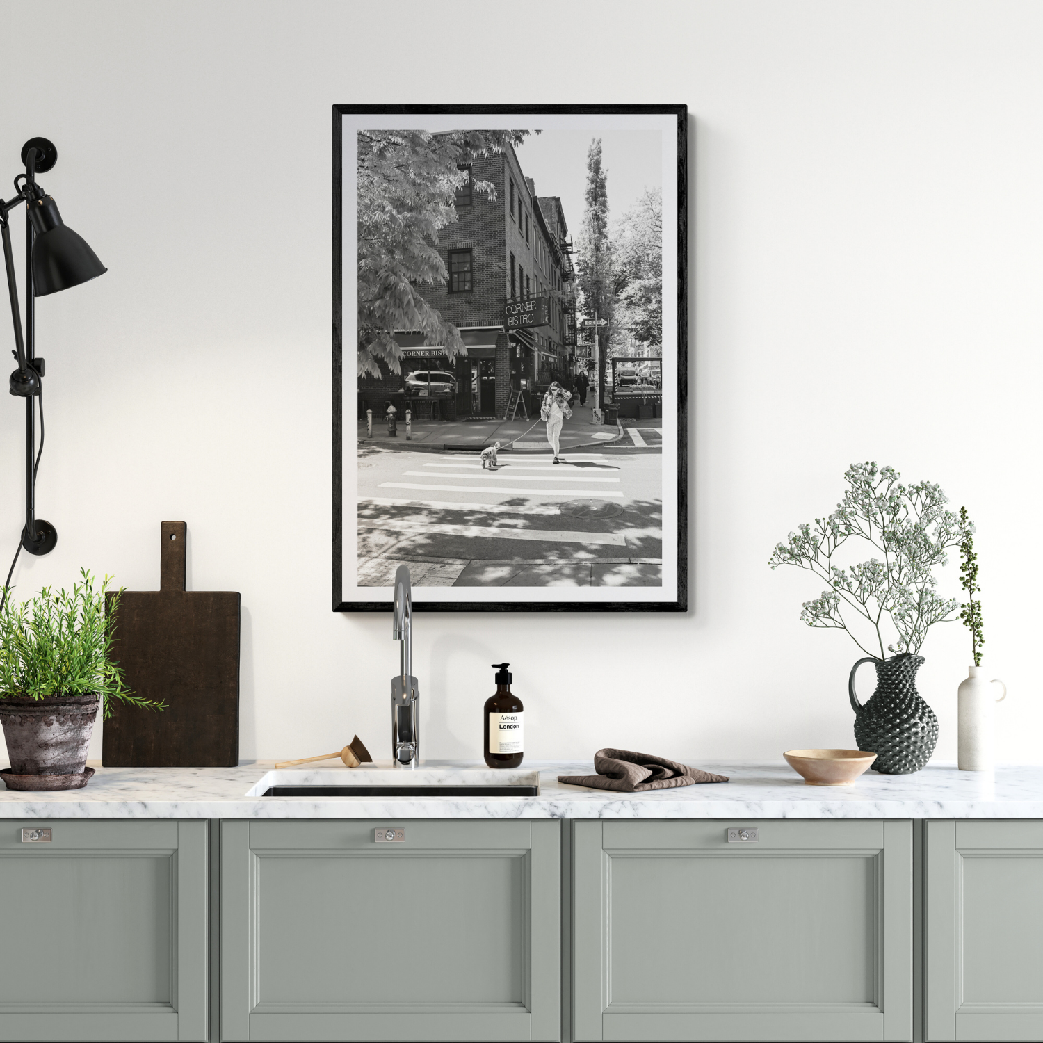
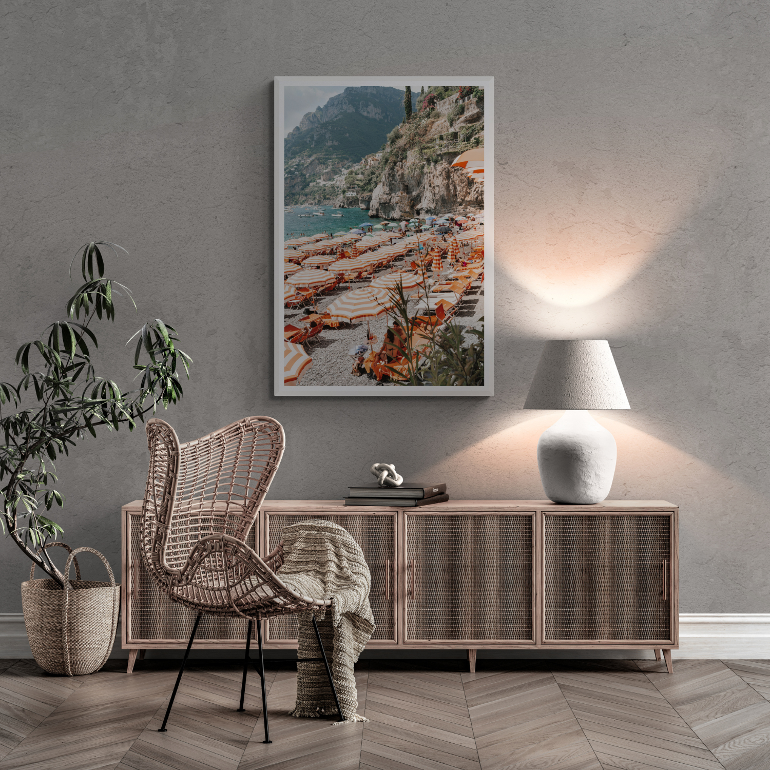
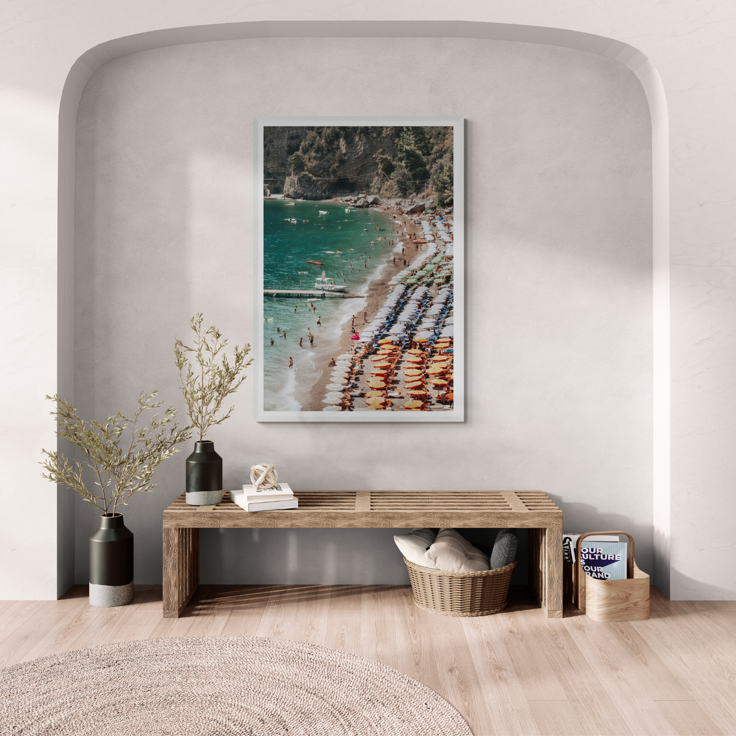
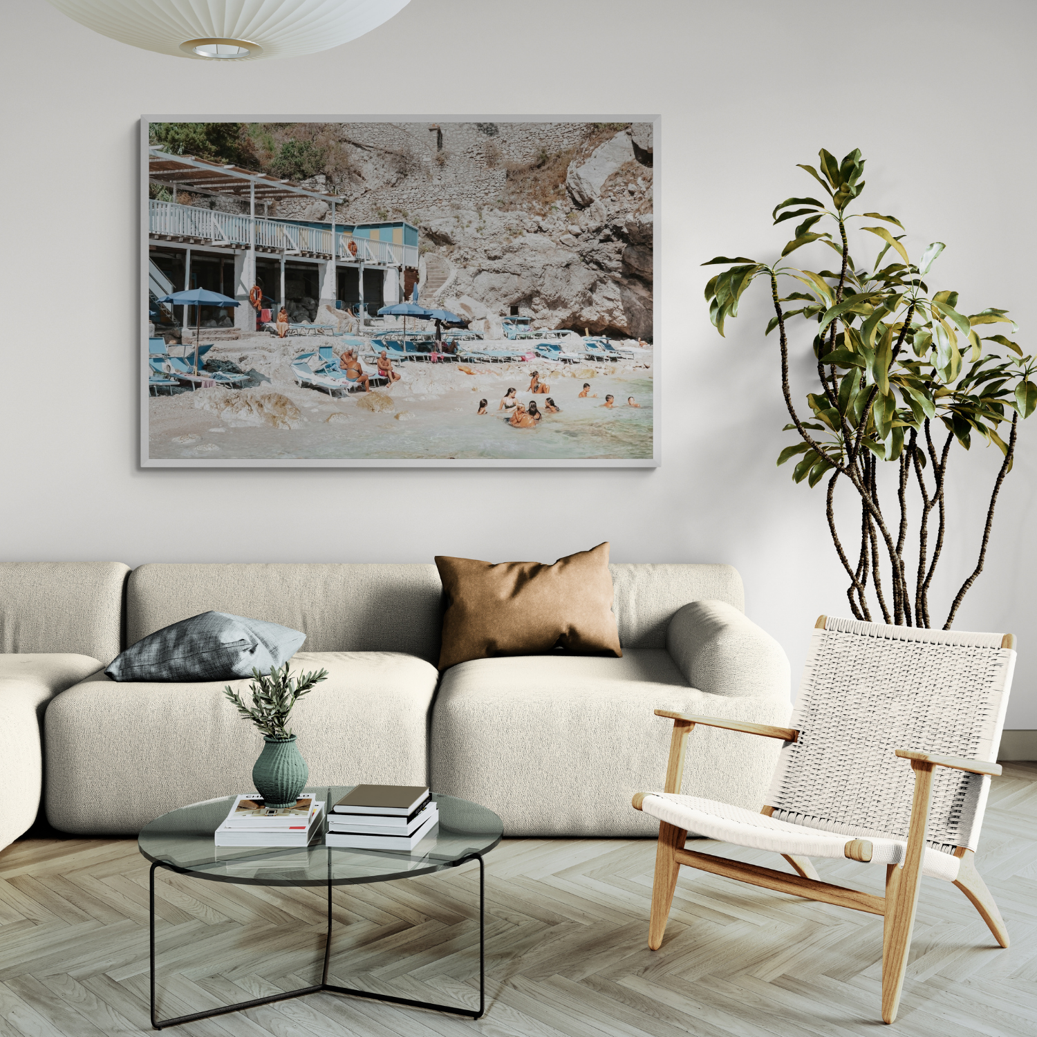
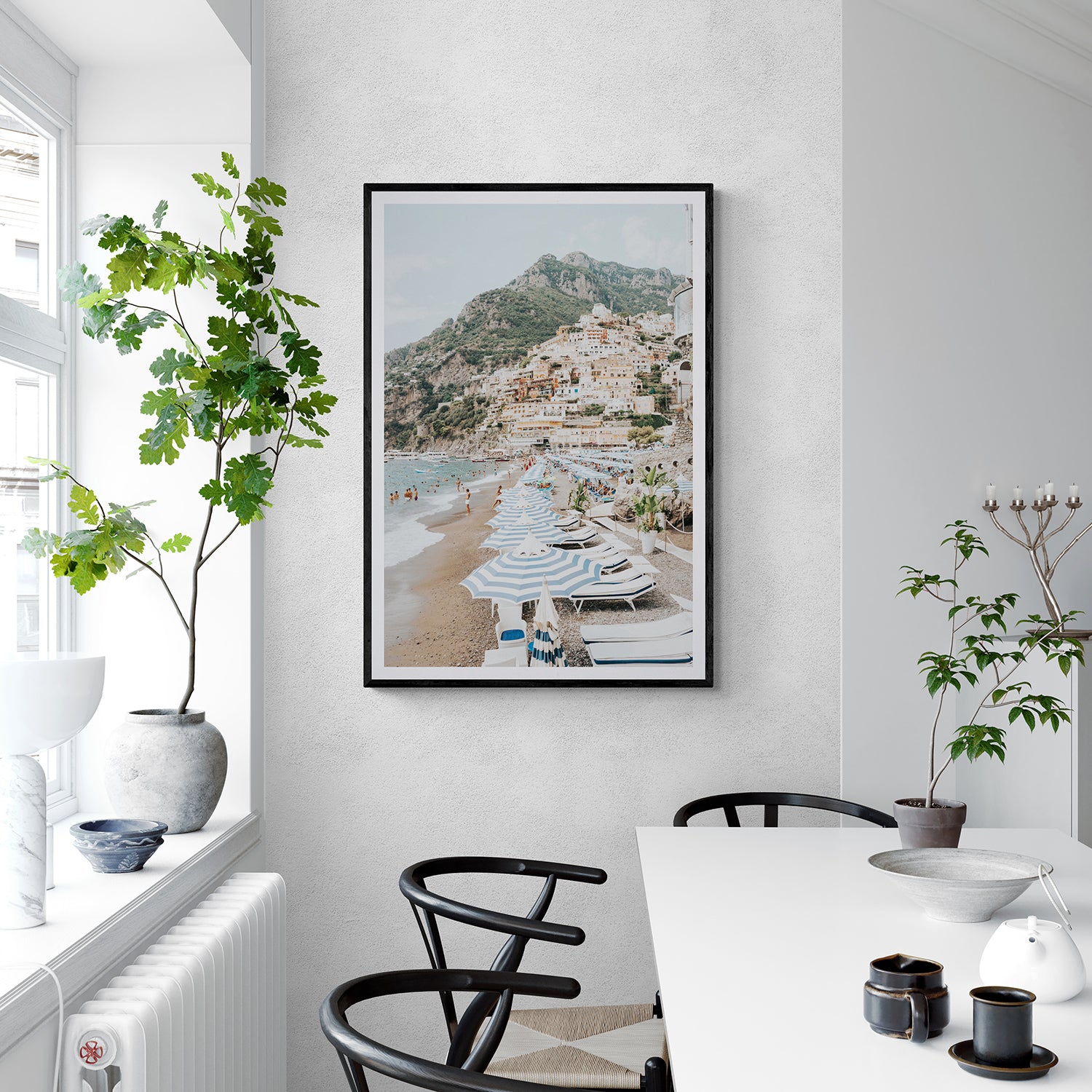
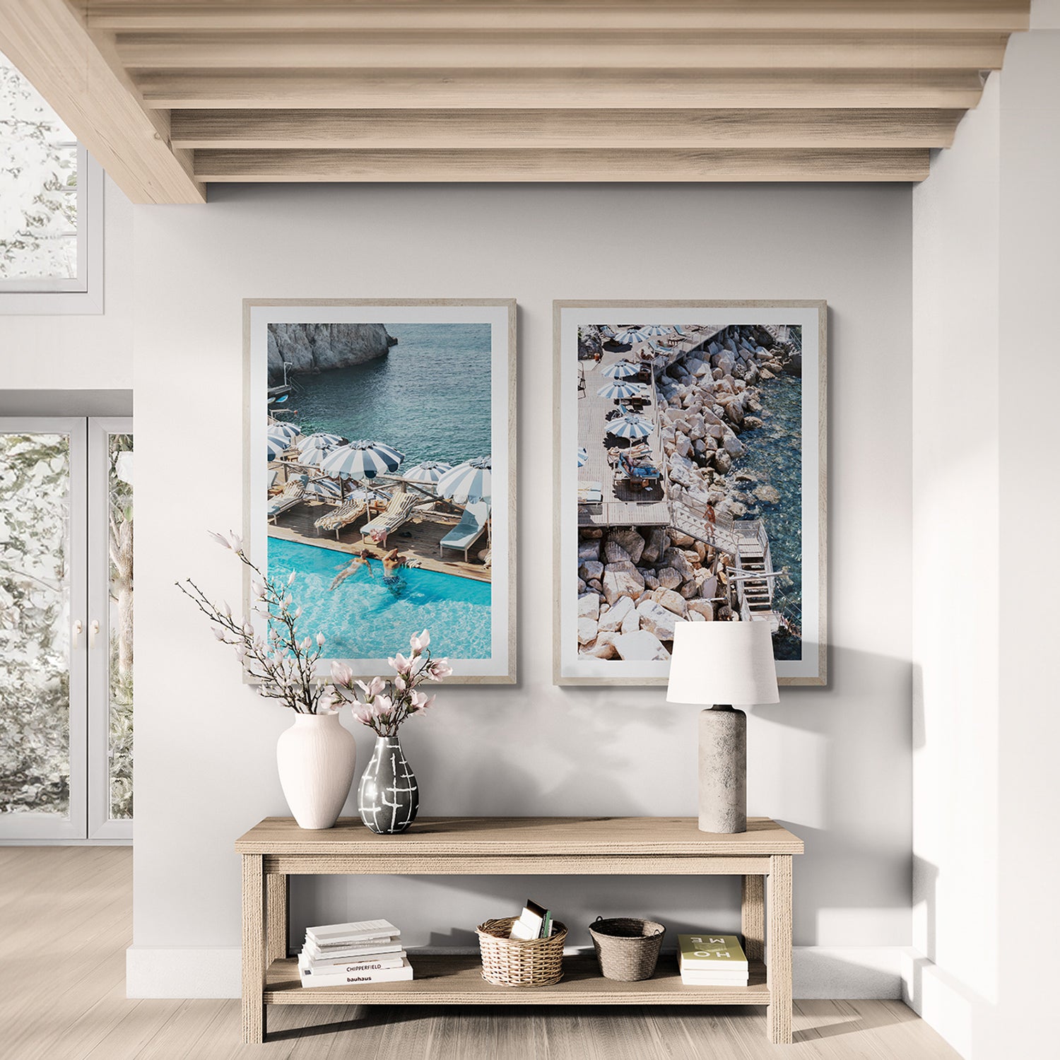
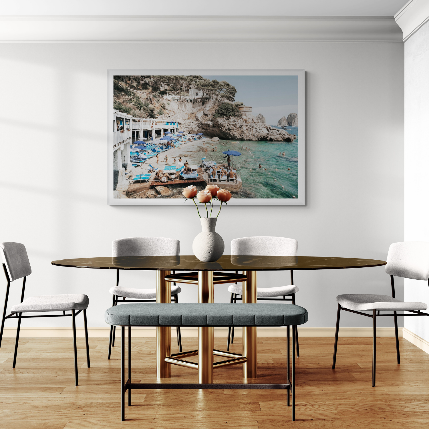


For most homes, the best lighting for artwork is a dimmable, high-colour-rendering LED aimed evenly at the piece without reflecting into the viewer's eyes.
As a practical starting point:
- choose CRI 90 or higher so colours appear natural;
- use a warm-to-neutral colour temperature, usually 2700–3000K in living spaces;
- aim ceiling lights towards the artwork at roughly a 30-degree angle;
- keep the beam even rather than creating a bright hotspot; and
- avoid prolonged direct sunlight, even when a framed print has UV-resistant acrylic.
A picture light works beautifully for one framed focal piece. Adjustable ceiling spots or track lighting give greater flexibility for large artwork, canvas and print sets. If neither is possible, thoughtful room lighting can still make the artwork feel present.
These numbers are starting points, not rules. The artwork's colours, surface, frame, room lighting and main viewing position should decide the final result.
The three main ways to light artwork
1. A picture light
A picture light is mounted above the artwork and directs light down its surface. It visually connects the light and frame, making it especially suited to one permanent focal piece above a console, bed, fireplace or sideboard. It is also useful when ceiling access is limited or a plug-in or rechargeable retrofit is required.
Picture lights can be hardwired, plug-in or rechargeable. Hardwired designs give the cleanest finish, while rechargeable options can be useful in rentals or rooms where electrical work is impractical. Battery life, colour accuracy and dimming quality vary, so compare specifications rather than choosing by appearance alone.
2. An adjustable ceiling spotlight
A ceiling-mounted spotlight keeps the wall itself visually quiet. It works well for a large statement piece, a canvas or a room where several artworks may change over time.
The fitting should allow the beam direction and spread to be adjusted. A narrow beam may create a bright circle in the middle of the image, while an overly broad beam can make the artwork lose emphasis.
3. Track lighting
Track lighting is the most flexible option for several artworks, changing displays, high ceilings or a long gallery wall. Individual heads can be repositioned and aimed separately while retaining one clean ceiling system.
For electrical installation or detailed beam calculations, use a licensed electrician or lighting professional.
Choose high-CRI light so colour looks natural
CRI stands for Colour Rendering Index. It describes how faithfully a light source reveals colours compared with a reference source.
For artwork at home, CRI 90+ is a useful minimum. Higher-quality fittings may specify CRI 95 or above, which can better reveal subtle skin tones, warm stone, sea greens and variations within neutral photography.
Low-CRI light can dull blues and greens, muddy warm whites and flatten delicate tonal transitions.
CRI is not the only measure of quality. Beam control, dimming, colour temperature and fixture placement still matter. A high-CRI source aimed badly can produce more glare than a simpler light placed thoughtfully.
What colour temperature is best for artwork?
For most living rooms, bedrooms and dining spaces, begin around 2700–3000K.
- 2700K feels warmer and softer. It suits evening rooms, timber, warm neutrals and sunlit Mediterranean colour.
- 3000K remains warm but slightly clearer. It is a versatile choice for colourful fine art photography and contemporary interiors.
- 3500–4000K creates a cleaner, more neutral appearance. It may suit a home office, modern gallery-like room or crisp black-and-white photography, but it can feel cooler beside warm lamps.
Match the artwork light with the broader room. A cool spotlight above a print in an otherwise warm room can make both the light and artwork feel isolated.
Do not choose colour temperature only by the artwork's palette. View the complete composition: wall colour, frame, furniture, nearby lamps and the way the room is used after dark.
How to position a picture light
A traditional starting point is to choose a picture light approximately one-half to two-thirds of the artwork's width. The fixture's beam and projection are more important than the ratio alone, so follow the manufacturer's coverage guide.
Centre the light over the complete framed artwork, not only the printed image.
Many picture lights sit around 15–18 cm or 6–7 inches above the frame, but the correct distance depends on:
- the fitting's arm length;
- beam angle;
- artwork height;
- frame depth;
- glazing; and
- how far the artwork projects from the wall.
Before drilling, temporarily hold or mock up the fixture and check whether the light reaches the bottom corners without creating an intense band across the top.
For a very wide landscape piece, one narrow picture light may leave the edges dark. Choose a wider fitting with suitable optical coverage or use two discreet ceiling sources.
Use the 30-degree angle as a starting point
When light comes from the ceiling, aiming it towards the artwork at roughly 30 degrees from vertical is a practical starting point.
If the light is too close to the wall, steep illumination can create strong shadows beneath the frame. If it is too far away, the light may reflect from acrylic directly into the main viewing position.
Adjust the angle according to:
- the artwork's height;
- the frame and Matboard depth;
- the reflectivity of the surface;
- the ceiling height; and
- where people usually stand or sit.
Mark the main viewing point before finalising the light. A framed print that looks glare-free while standing directly beneath it may reflect badly from the sofa or dining table.

How to avoid glare on framed fine art prints
Framed fine art prints sit behind protective acrylic, so reflections require more attention than they do on an unglazed canvas.
To reduce glare:
- Move the light source or alter its angle rather than simply increasing brightness.
- Check the artwork from the room's main seated and standing positions.
- Use a wider, softer beam instead of a concentrated hotspot.
- Add a dimmer so the artwork light can balance with the room at night.
- Avoid placing a bright lamp or bare bulb directly opposite the frame.
- Use curtains or blinds when a window reflects across the artwork.
Amichi Co framed prints use UV-resistant acrylic glazing, while canvas is displayed without glazing. Canvas generally produces less mirror-like reflection, although its satin surface is not completely matte.
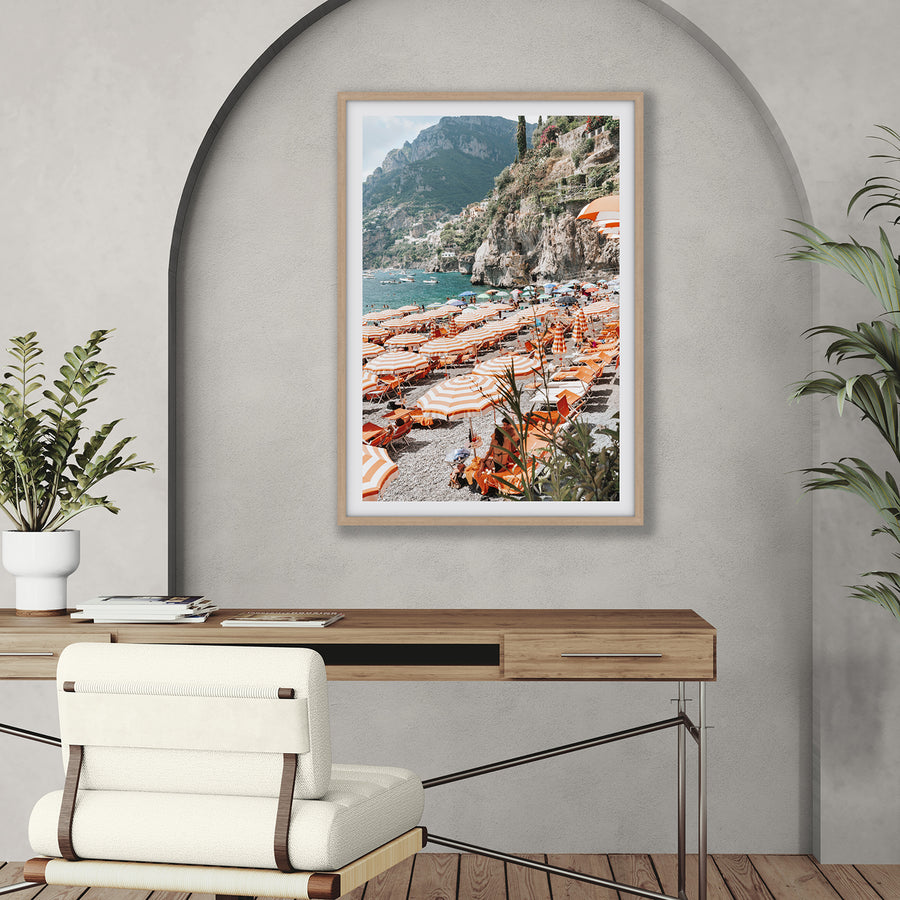
You can compare the framed and canvas presentations on Bagni d'Arienzo before deciding which surface best suits a bright room.
How to light canvas artwork
Canvas has texture and physical depth, so directional light can make its surface more visible.
Use a broad, controlled beam rather than a very narrow spot. Light arriving from a slight angle can reveal texture, but an extreme side angle may create uneven brightness across a large piece.
For Float Frame Canvas, check the shadow gap. The light should enhance the depth without casting a distracting hard shadow along one side.
For Stretched Canvas, ensure the beam reaches the complete image and does not over-emphasise the wrapped edge.
The Sea of Tranquility product page shows the same coastal artwork across framed fine art print, Float Frame Canvas and Stretched Canvas presentations.
Lighting a pair or gallery wall
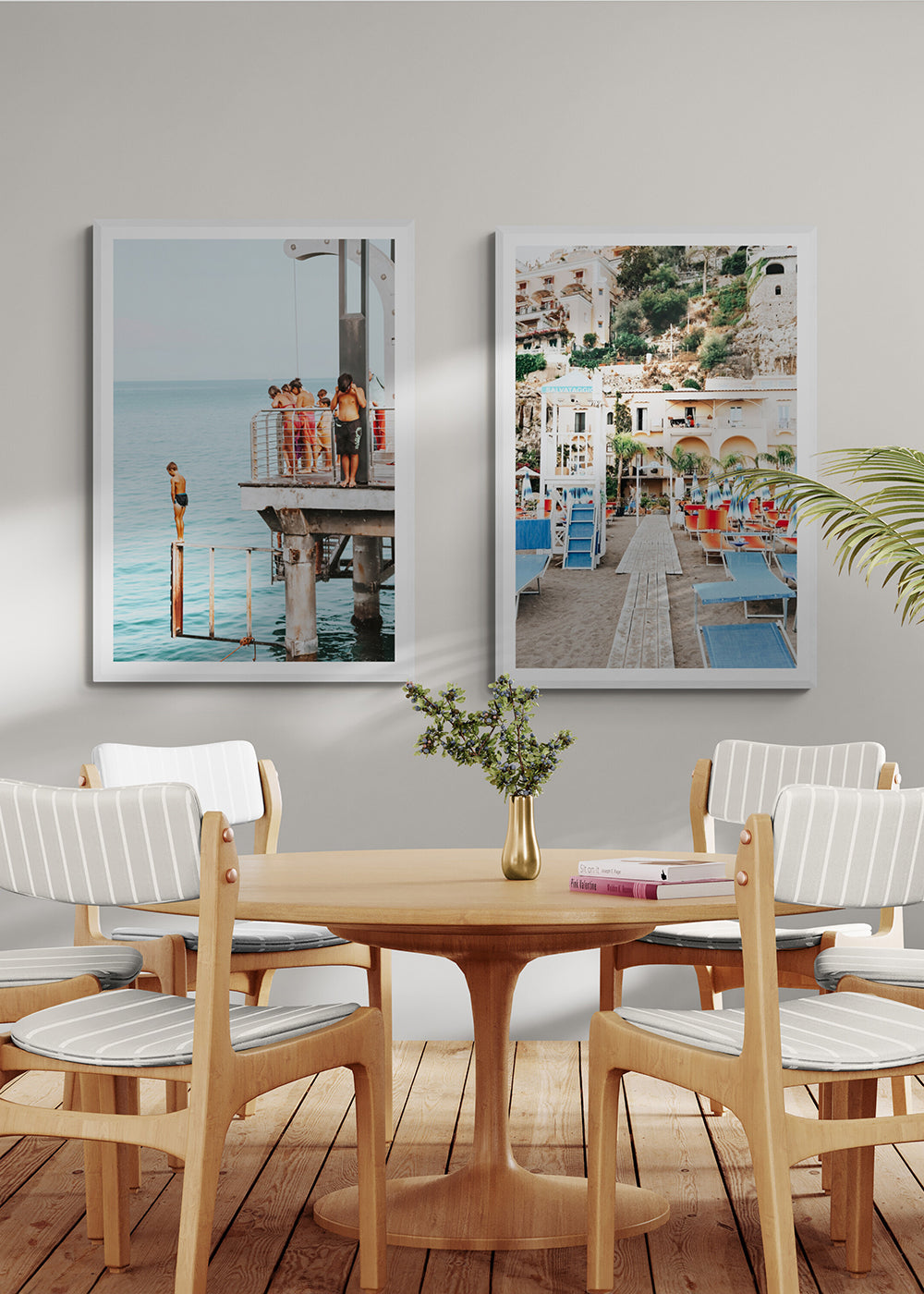
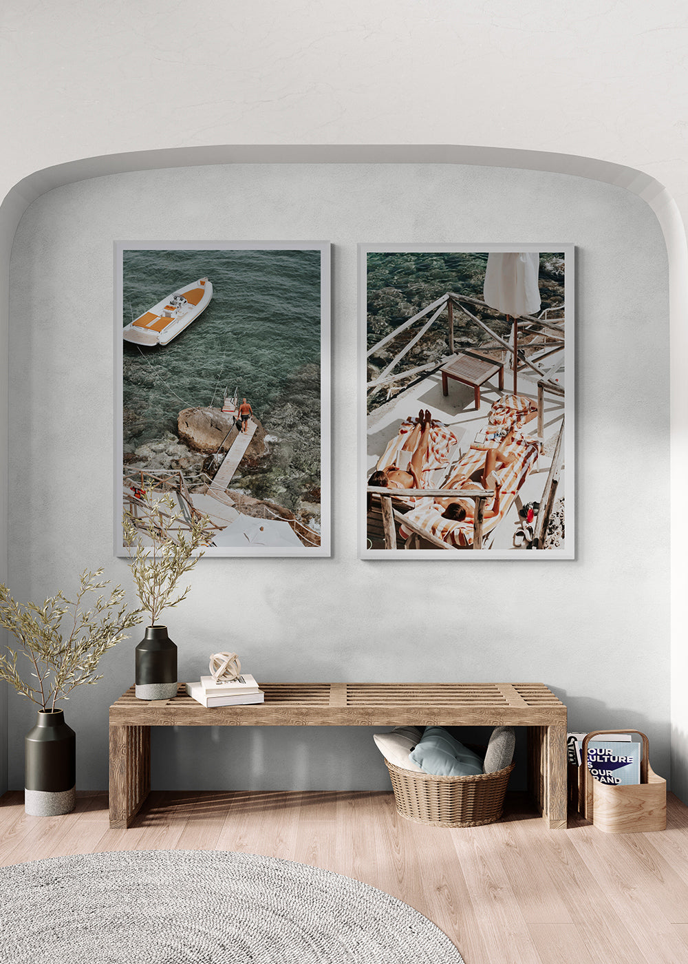
A pair should read as one composition. Use the same colour temperature and similar brightness across both pieces.
For a wider set:
- use two ceiling lights with overlapping beams;
- position them symmetrically;
- avoid one bright centre and dark outer edges;
- check that neither frame casts a shadow across the other; and
- dim both sources together where possible.
For a gallery wall, one even wall wash is often calmer than attaching a separate picture light to every frame. Individual lights can work when the display is intentionally formal, but several fittings may compete with the artworks.
If you are still deciding between one piece and a set, browse the Amichi Co print sets and assess the complete arrangement width before planning the lighting.
Natural light is beautiful—but direct sunlight is not art lighting
Soft daylight can reveal colour beautifully, but direct sun should not be used as a feature light for fine art.
Light exposure is cumulative. The Canadian Conservation Institute explains that visible light, not only ultraviolet radiation, contributes to fading. UV filtering therefore reduces one risk but does not make prolonged bright exposure harmless.
At home:
- avoid walls receiving direct sun for extended periods;
- use blinds or curtains during the brightest part of the day;
- do not assume UV-resistant glazing removes every light-related risk;
- turn dedicated artwork lights off when the room is unused; and
- use dimmers rather than illuminating the piece more intensely than necessary.
The goal is not to keep artwork in darkness. It is to enjoy it under controlled, comfortable light while avoiding needless exposure.
A room-by-room starting point
Living room
Use a warm, dimmable source and test glare from the sofa. A picture light creates a focused feature; ceiling spots are more flexible for large pieces and pairs.
Dining room
Coordinate the artwork light with the pendant and check it after dark. Avoid a beam that becomes uncomfortable from seated eye level.
Bedroom
Choose warm, lower-intensity light. Keep fittings above a bed securely installed and avoid harsh brightness in the direct line of sight.
Hallway or entry
A picture light can make a single piece feel welcoming, while adjustable ceiling lights work better for multiple artworks along a passage. Keep projections clear of traffic.
Home office
A slightly clearer 3000–4000K source can work if it matches the task lighting. Position the artwork so it does not reflect in computer screens.
Test the light before committing
Before installing a permanent fitting:
- Photograph the wall in daylight and at night.
- Identify the main viewing positions.
- Test the colour temperature with a portable lamp or sample fitting.
- Check the full artwork for even coverage and reflections.
- Compare several dimming levels before finalising it.
If the artwork itself is still being selected, Amichi Co's free Styling & Print Mockup Service can help compare artwork, size, frame and placement on your actual wall. It does not replace electrical or lighting-design advice, but it can help you establish the composition the lighting needs to support.
Common artwork-lighting mistakes
Choosing brightness instead of colour quality
More lumens do not automatically make colour look better. Begin with high CRI and controlled placement.
Creating one bright hotspot
Use the correct beam spread and distance so the full artwork is illuminated evenly.
Ignoring the main viewing position
Always test reflections from the sofa, dining table, bed or room entrance.
Treating UV-resistant acrylic as permission for direct sun
UV protection is useful, but visible light exposure still matters.
Frequently asked questions
What is the best lighting for artwork at home?
A dimmable, high-CRI LED is the strongest all-purpose starting point. Use CRI 90 or higher, choose a colour temperature that suits the room and aim the light evenly without reflecting it into the viewer's eyes.
What colour temperature should an artwork light be?
For most living spaces, begin around 2700–3000K. Use 2700K for a warmer effect and 3000K for slightly clearer colour. A home office or crisp contemporary room may suit 3500–4000K if it matches the surrounding lighting.
How wide should a picture light be?
One-half to two-thirds of the complete artwork width is a traditional starting point. The fixture's beam coverage and projection matter more than the ratio, so check the manufacturer's guide.
How far above artwork should a picture light hang?
Many fittings begin around 15–18 cm or 6–7 inches above the frame. Adjust the distance for the fixture arm, artwork height, beam angle and glazing, and test the complete surface before installing.
How do you stop glare on framed artwork?
Alter the light angle, use a broader beam, dim the source and check reflections from the main viewing position. Also control bright windows or lamps directly opposite the acrylic.
Can LED lights damage artwork?
Any visible light contributes to cumulative exposure. A well-selected LED can provide high-quality illumination with little heat and no need for UV output, but it should still be dimmed appropriately and switched off when the room is unused.
Lighting checklist
Three decisions that make artwork lighting feel considered

Start with colour quality
Choose a dimmable LED with CRI 90 or higher so subtle colour and tonal detail remain natural.
Aim for even coverage
Use the beam angle and distance to light the whole piece without a bright centre or dark corners.

Check the viewing position
Test reflections from the sofa, bed or dining table before fixing the light in its final position.