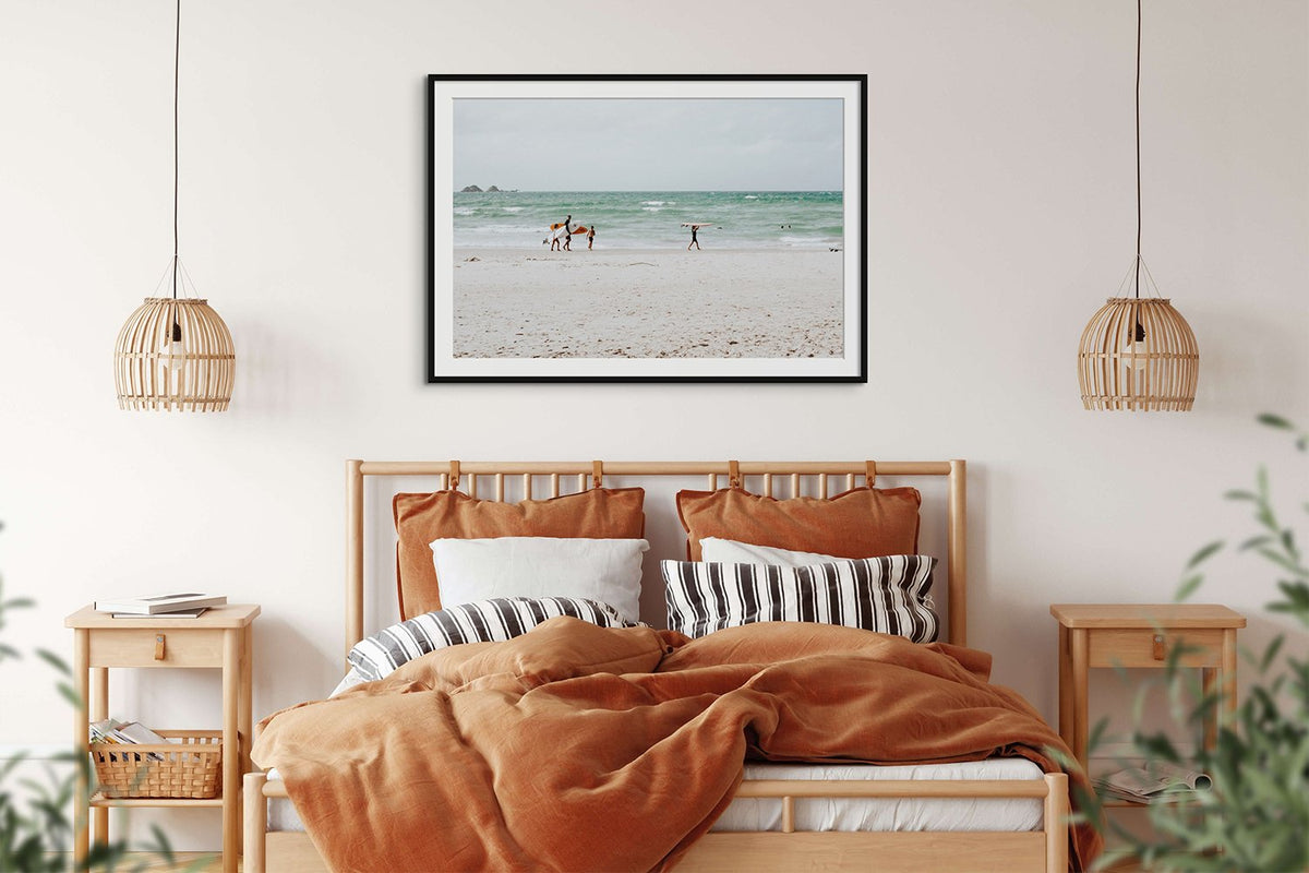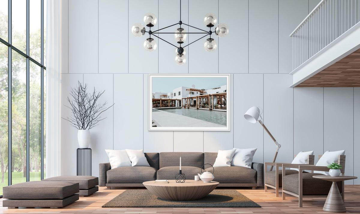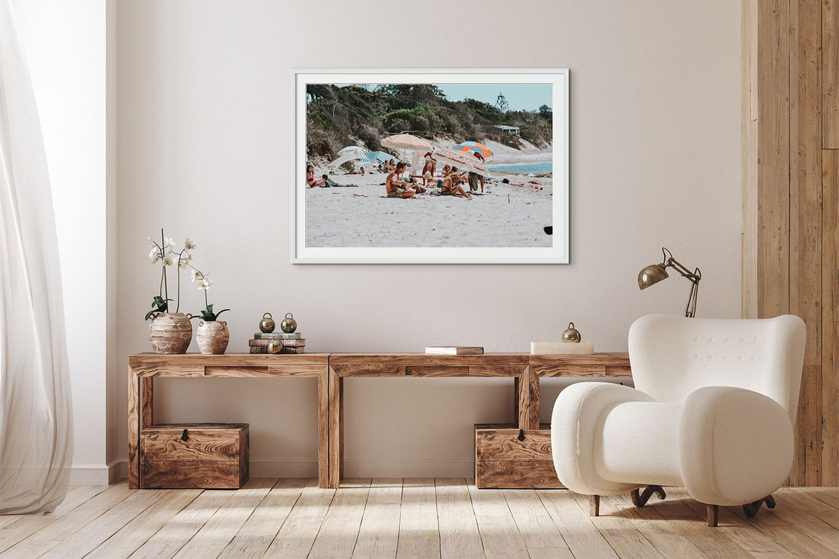

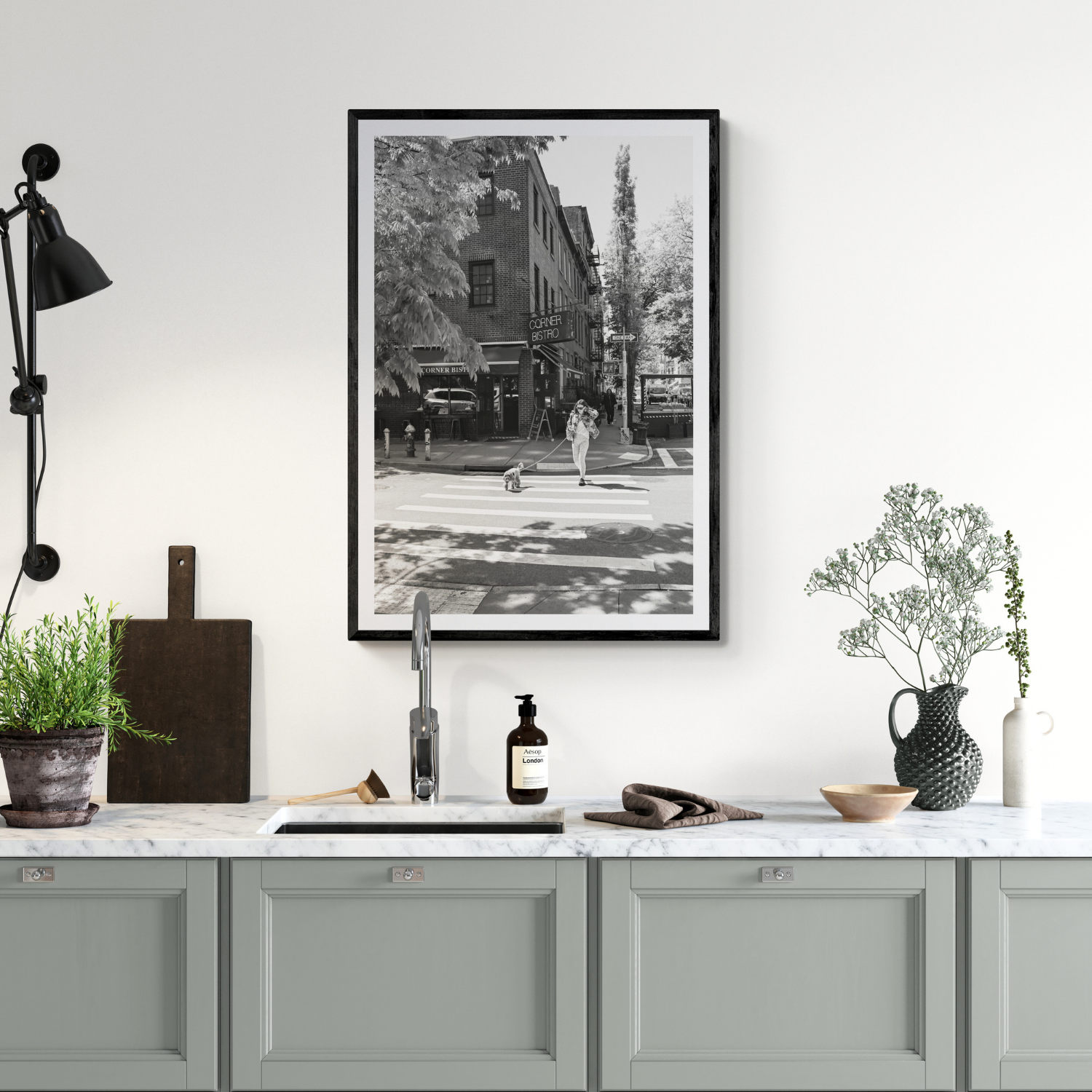
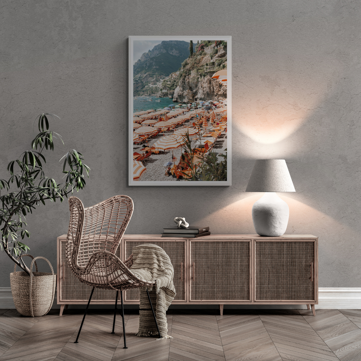
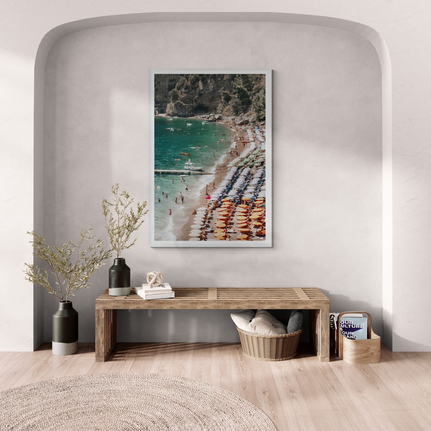
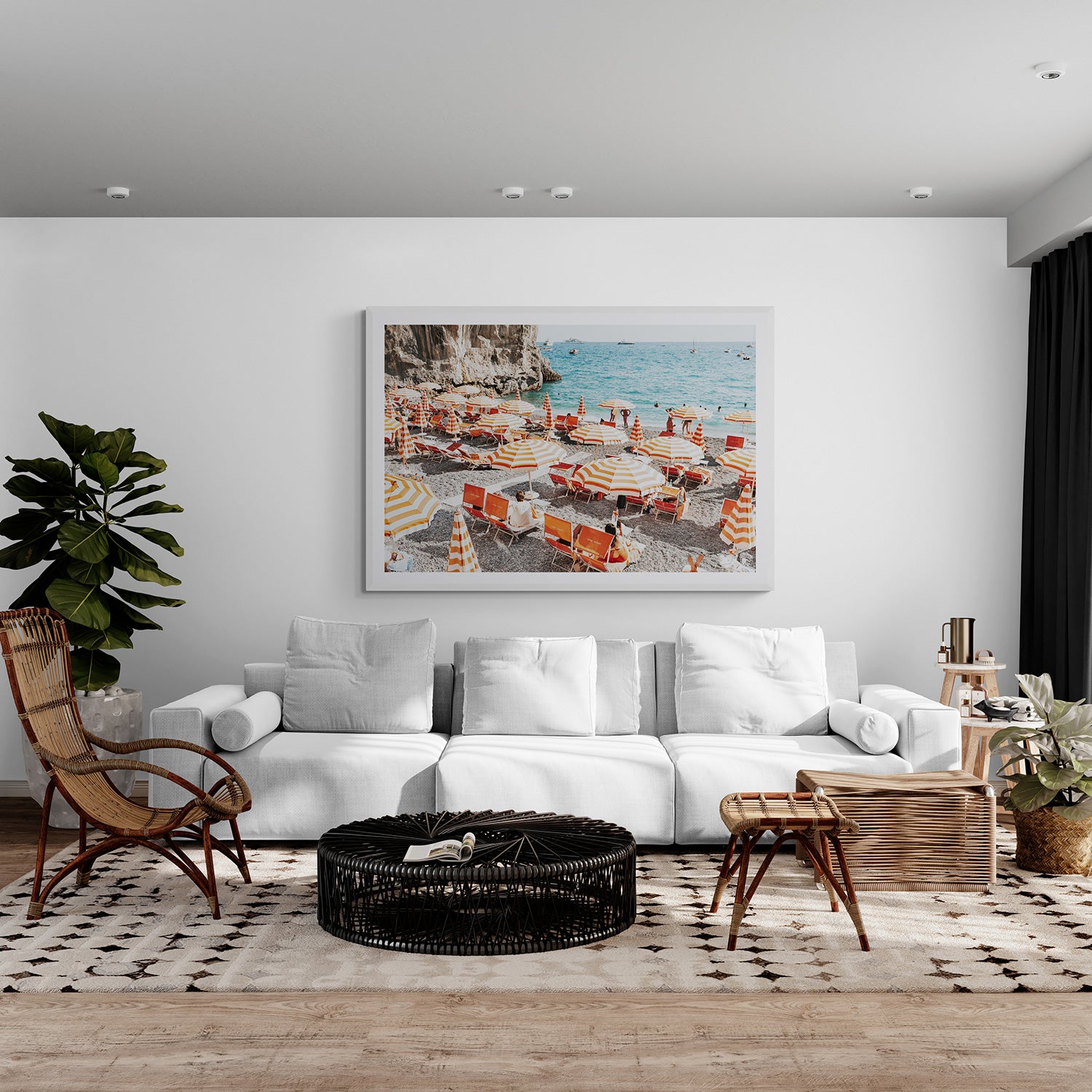
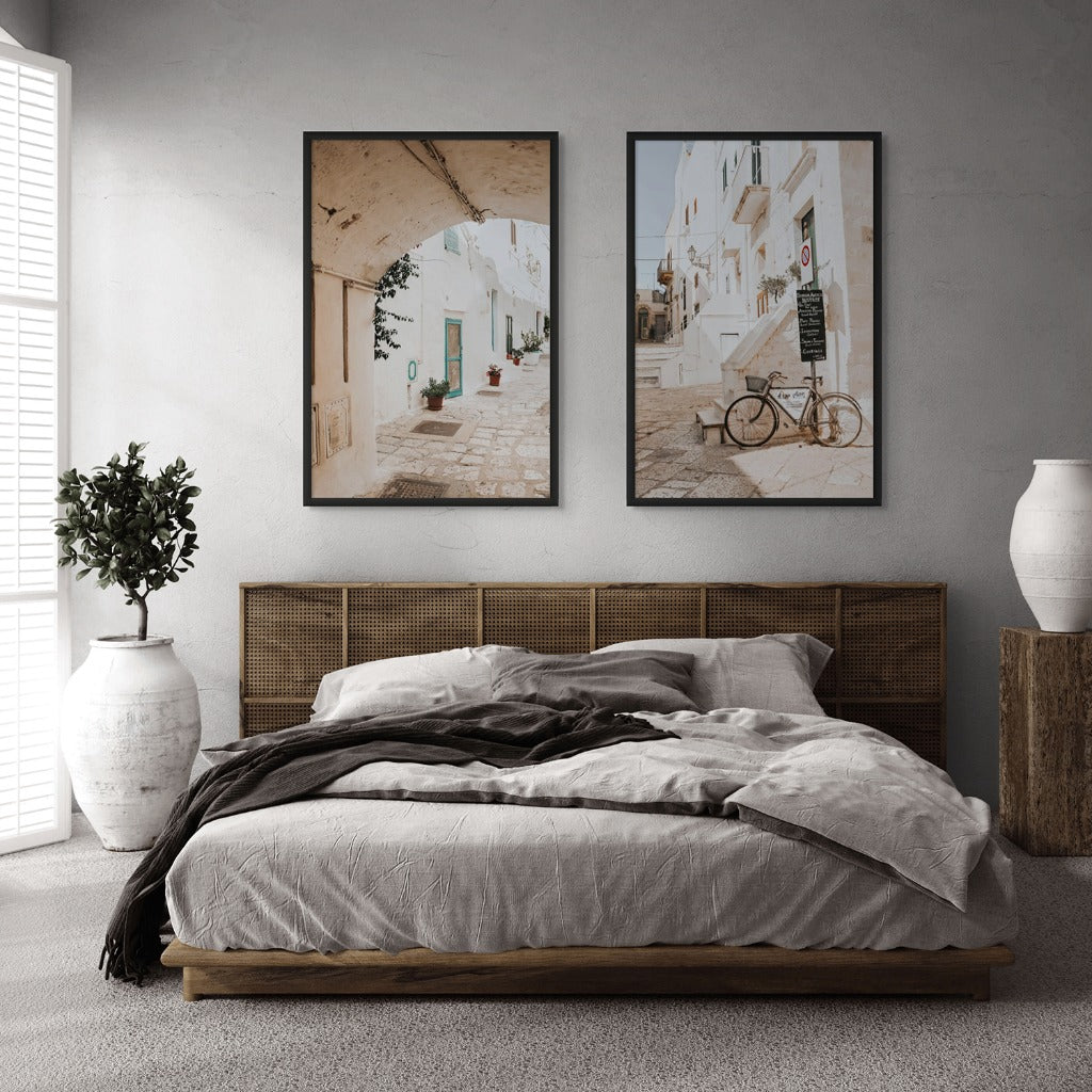




Modern and traditional are useful descriptions, but neither is a guarantee of how an artwork will feel in your home. A quiet contemporary photograph can sit beautifully above an antique cabinet; an ornate room may benefit from one clear modern image. Compare the work itself and the frame it will wear.
Look at composition before the label
Modern-feeling works often use strong cropping, open space, abstracted detail or a simple line. A traditional presentation may favour a centred subject, familiar landscape or more formal arrangement. These tendencies are not strict rules. Ask whether the image draws your eye in calmly or wants to make a strong statement.
Compare subject and emotional tone
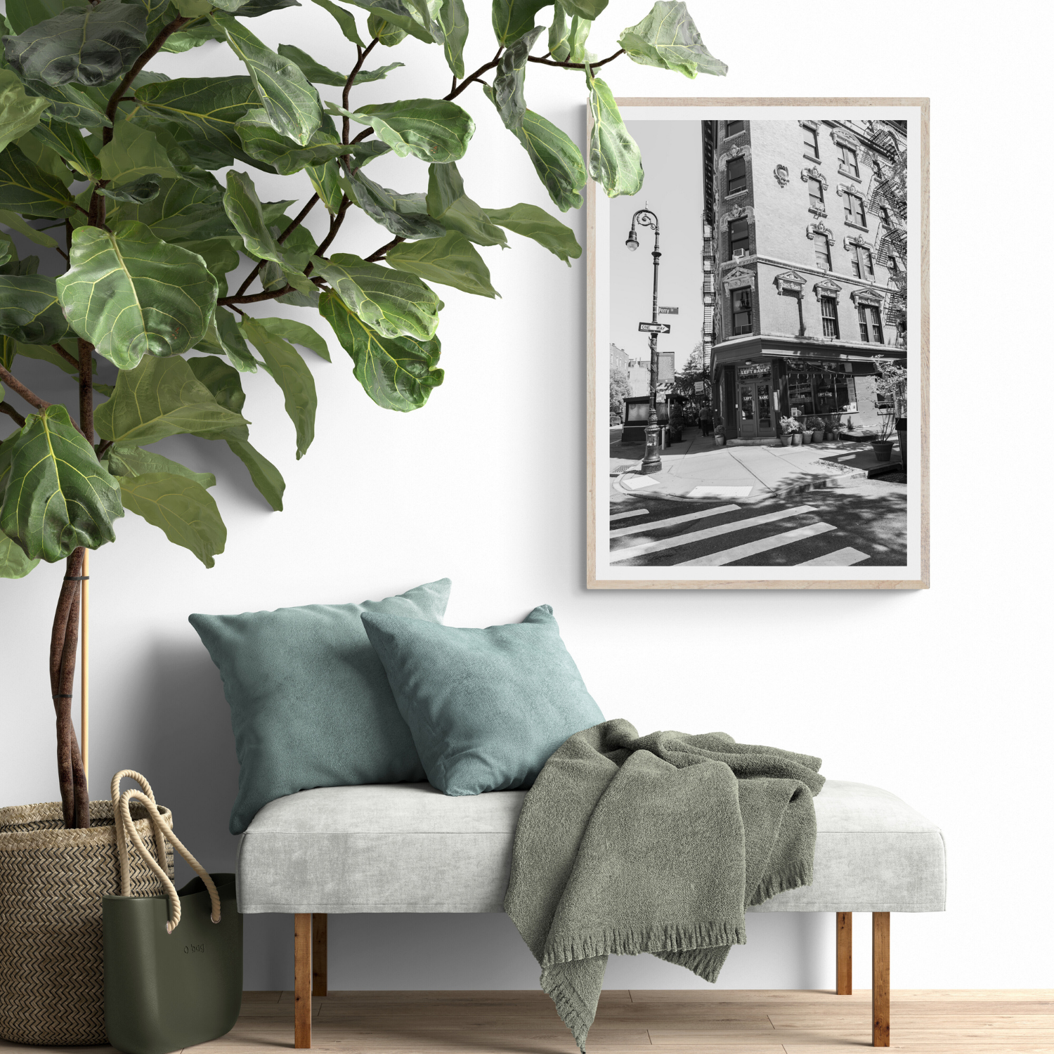
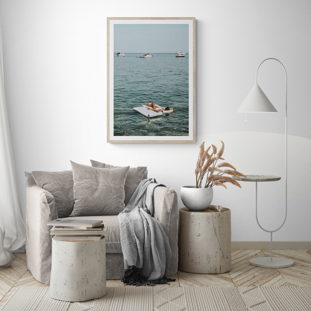
A city facade, sea horizon or portrait can be read in different ways depending on light and crop. Choose a subject you want to return to, not one chosen only because it is said to match a period of furniture. A photograph tied to your own travel or memory can give a mixed-era room coherence.
Let the frame mediate between eras
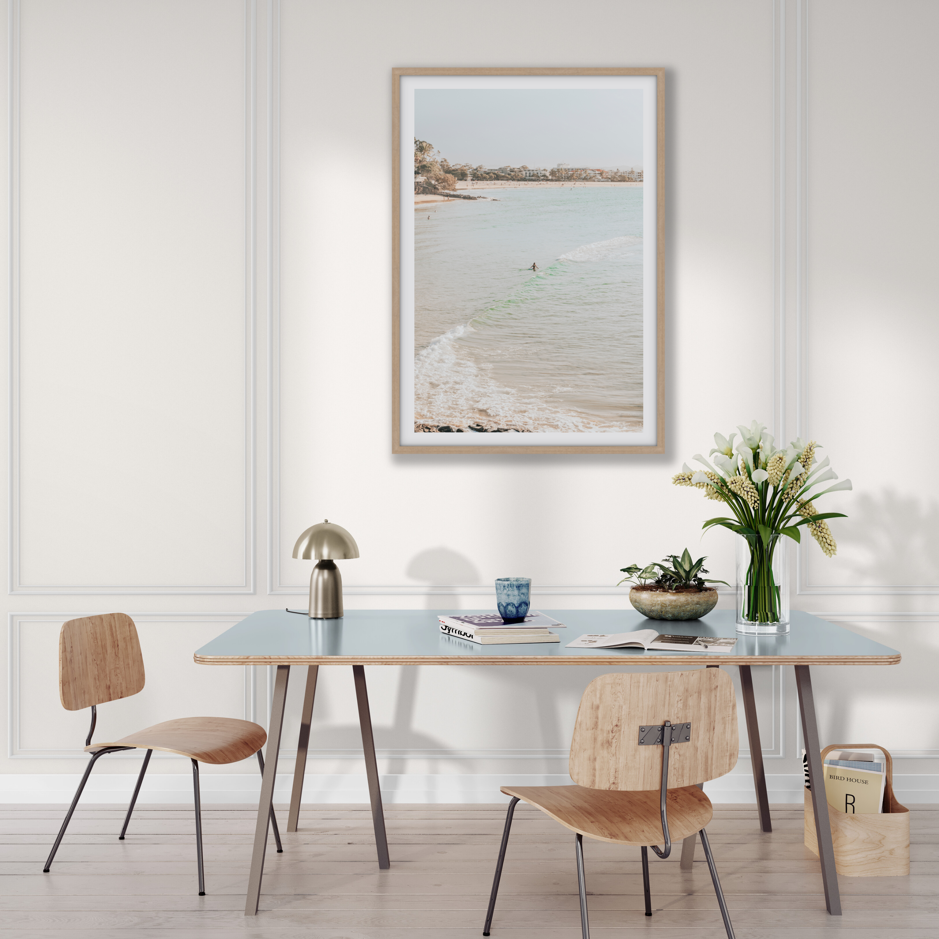
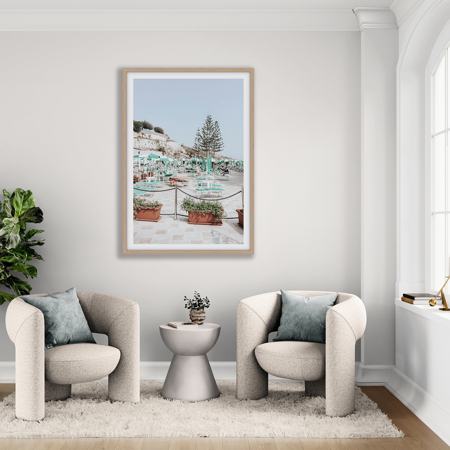
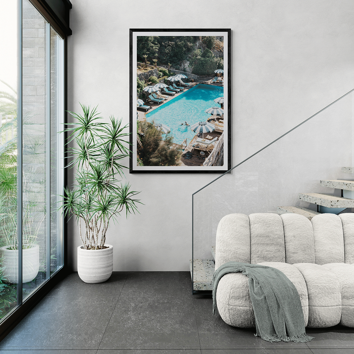
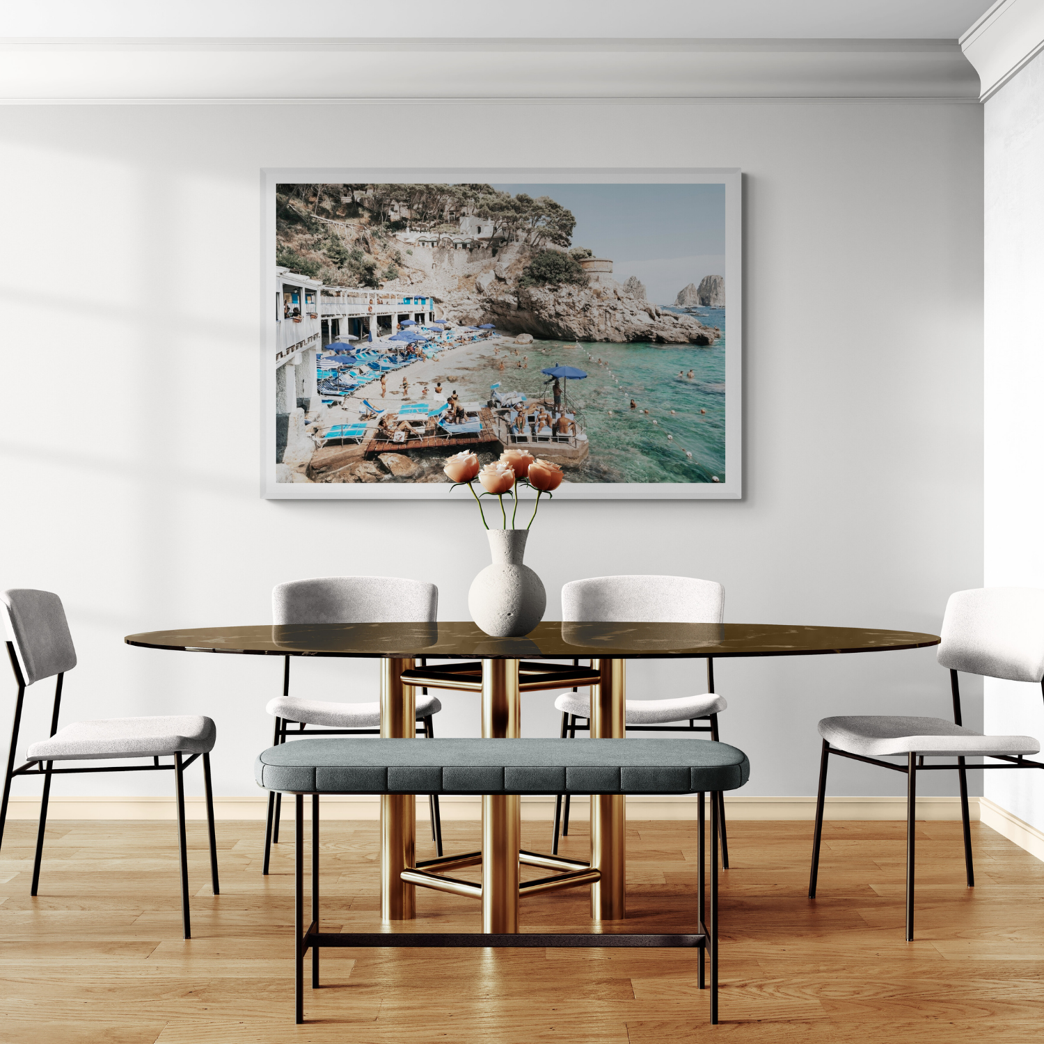
A slim black frame can make a classic scene feel crisp; natural oak can soften a modern composition; a white matboard creates a more formal pause around the image. Test frame and image together, then compare them with timber, metal and textiles already in the room. The frame colour guide shows how those finishes change a photograph's presence.
Use contrast deliberately
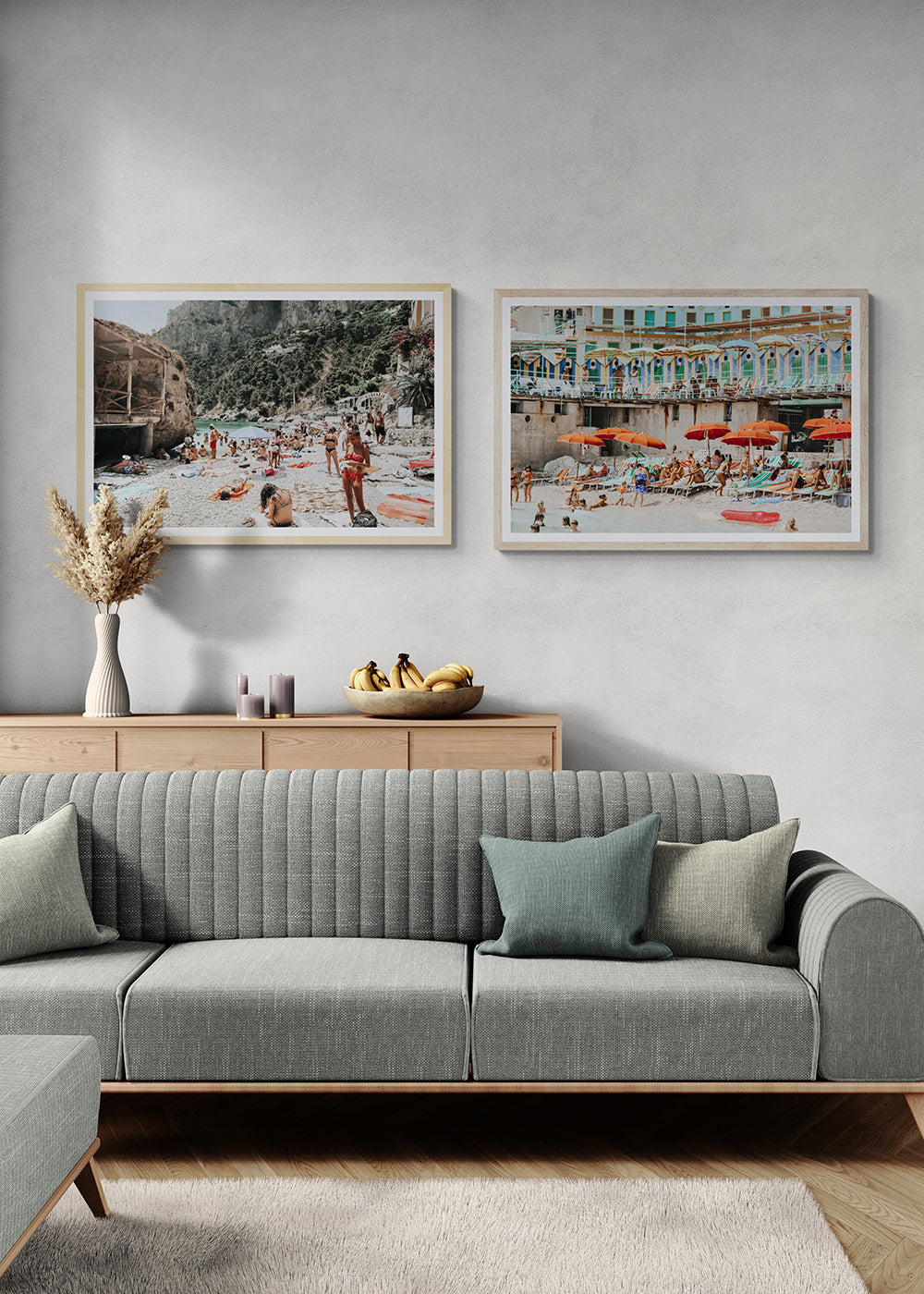
If the furniture is carved or patterned, a spacious image can offer relief. If the room is minimal, a richly detailed work may provide the point of interest it needs. Repeat one colour or material to connect the contrast. You do not need every piece to announce the same style.
Decide at the wall
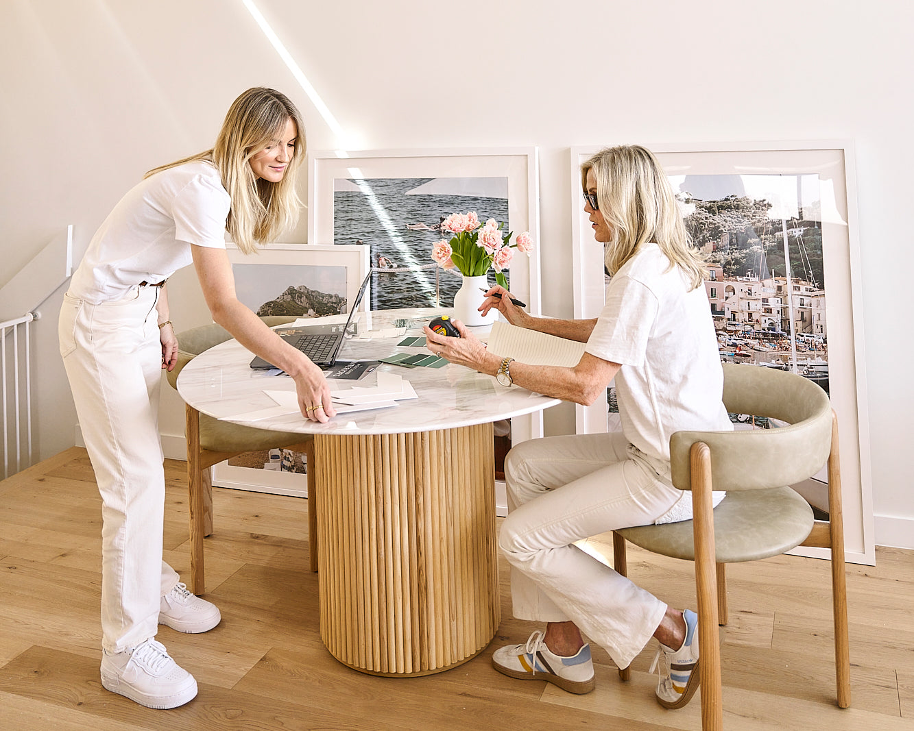
Measure the available space and mark the finished artwork dimensions. A small traditional-looking image can feel contemporary when given generous space; a large modern work can overwhelm a narrow room. View the mock-up in day and evening light. The best answer is the piece you enjoy and the room can comfortably hold—not the label on either.
Style-fit recipe
Three decisions that help the artwork suit your style

Read the furniture lines
Modern rooms often need warmth, while traditional rooms may need a lighter, fresher note.
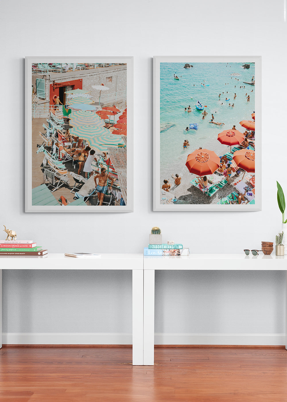
Pair contrast with restraint
A second print can add depth, but the palette should keep the room feeling cohesive.

Let the frame finish support the mood
Natural, white or black framing can shift the same image toward softer or sharper styling.