
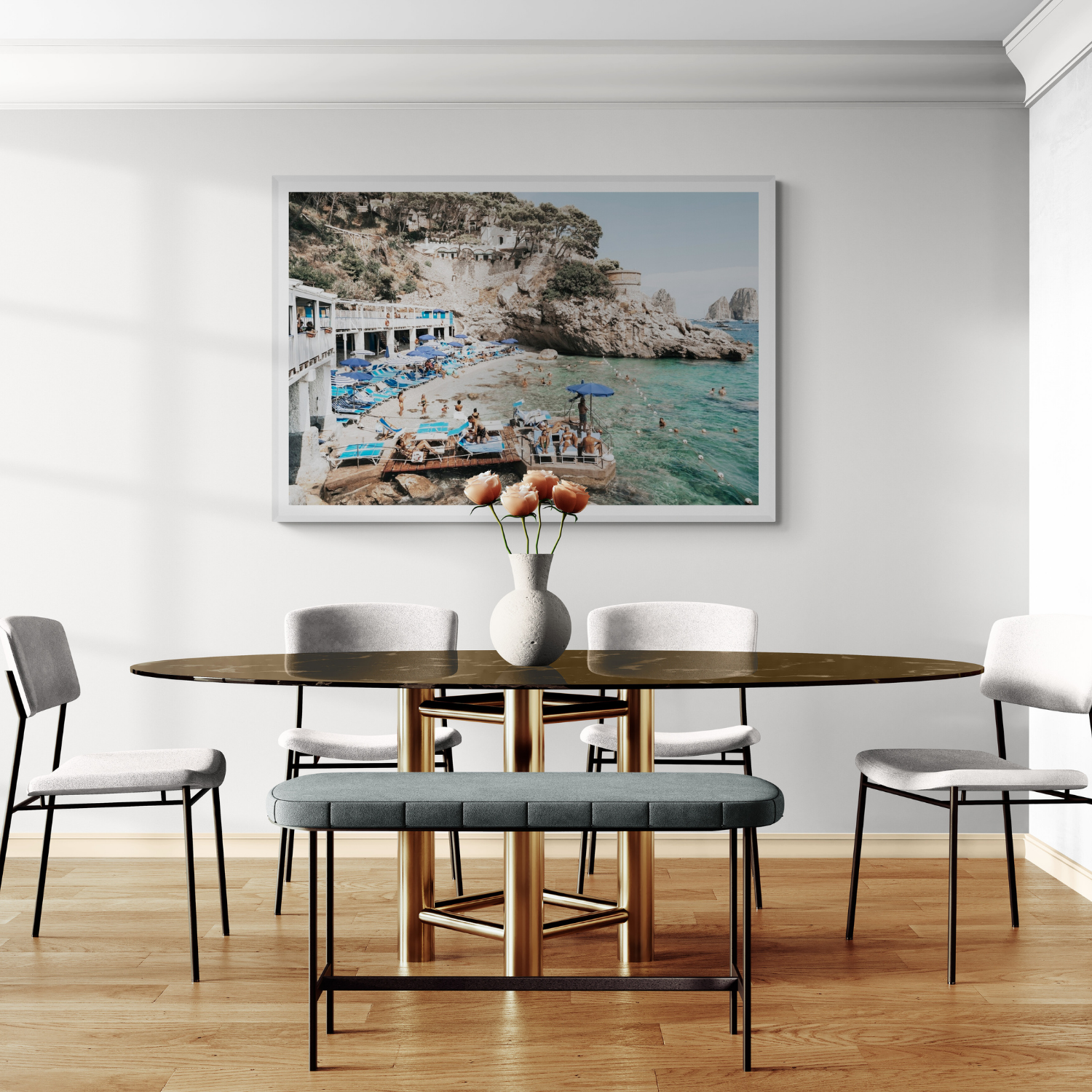

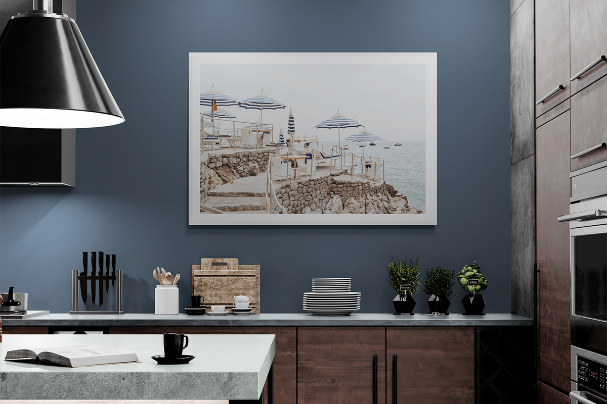

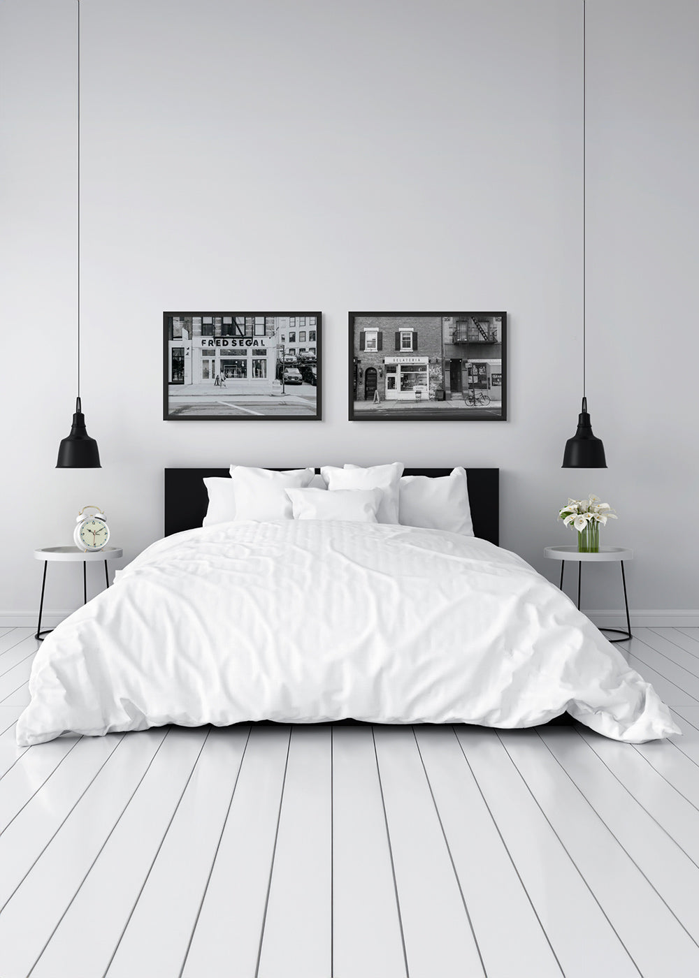

The best kitchen wall art sits on a dry, visually useful wall away from direct heat, steam and splashes. Start with the breakfast nook, an open-plan dining wall, a blank end wall or a narrow section beyond the main cooking zone.
Then choose artwork that brings the feeling you want into the room. Café and restaurant photography can make the kitchen feel social. Mediterranean streets and sunlit architecture introduce warmth. Coastal scenes create freshness, while black-and-white city photography can sharpen a contemporary kitchen.
Kitchen art does not need to show lemons, coffee or cooking utensils. A piece that connects with the cabinetry, stone, timber and the way the room is used will usually feel more enduring than literal kitchen décor.
Choose the wall before the artwork
In a living room, you might begin with a piece you love and build around it. In a kitchen, the safest wall should come first.
Avoid positioning valuable artwork:
- directly above or beside a cooktop;
- in the direct splash line of a sink;
- above a kettle, coffee machine or appliance that releases concentrated steam;
- where an opening cabinet, pantry door or chair can strike the frame;
- against a wall that regularly becomes damp; or
- in strong direct sunlight for long periods.
This is not excessive caution. The Australian Institute for the Conservation of Cultural Material notes that works on paper are sensitive to light, heat and humidity. A kitchen can contain all three, but conditions vary enormously from one wall to another.
A framed print with protective glazing is not a sealed, waterproof object. A treated canvas is not permission to place fine art in a splash zone. Choose a wall where the artwork can be enjoyed without needing to resist the kitchen itself.
The best places to hang art in a kitchen
Above a breakfast nook
A breakfast nook is often the easiest kitchen location because it behaves more like a small dining room. The artwork is connected to daily rituals but separated from the most active cooking area.
Use one landscape piece to echo the table or banquette, or a balanced pair when the wall is wide. Keep the complete arrangement visually related to the seating rather than centring it on the entire wall.
A café or Mediterranean scene can make the nook feel like a place to pause. Ristorante, featuring pastel buildings, the Ischia coastline and a white Vespa, brings a sense of Italian street life without relying on literal food imagery.
On an open-plan dining wall
In an open-plan home, kitchen artwork needs to converse with the living and dining areas. Choose one palette, destination or frame finish that repeats across the connected space rather than treating the kitchen as a separate theme.
The artwork can provide the bridge. A warm Italian photograph might repeat timber and stone in the kitchen while introducing blue or green found in the living room. A black-and-white city image can connect dark tapware, window frames or lighting with a more graphic adjoining space.
On a blank end wall
The wall at the end of a run of cabinetry can hold more visual weight than a small gap between cupboards. It is often seen from the doorway or living room, making it an excellent place for one confident piece.
Match the orientation to the wall:
- use portrait art on a tall, narrow end wall;
- use landscape art where the cabinetry creates a strong horizontal line; or
- use a pair only when the wall has enough width for two complete frames and a deliberate gap.
Between zones—not inside the splash zone
Some kitchens have a narrow wall between a pantry and dining area, beside a doorway or beyond the cabinetry. These in-between walls are ideal for a smaller portrait print because they add character without competing with appliances and open shelves.
Do not squeeze artwork into a gap simply because it is empty. Check that handles, stools, doors and people moving through the room cannot make contact with it.
What kind of art looks good in a kitchen?
The strongest kitchen artwork usually contributes one of four things: warmth, freshness, rhythm or a sense of gathering.
Café and restaurant photography
Café imagery refers to how the kitchen is used without becoming a novelty sign. It can suggest conversation, travel, morning coffee and long lunches.
Tea Room features Caffè Florian, Venice’s historic arcades and café culture. Its architecture gives the image enough structure for a refined kitchen or dining zone.
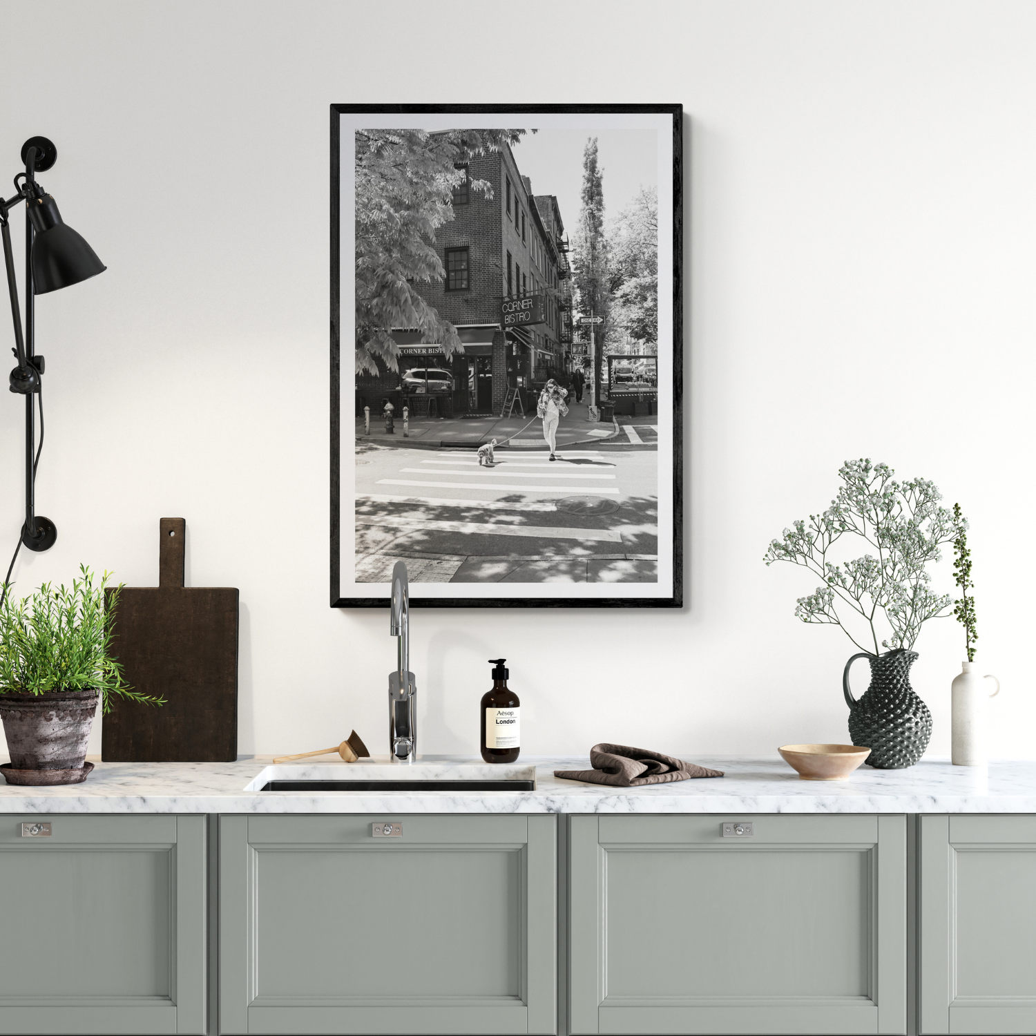
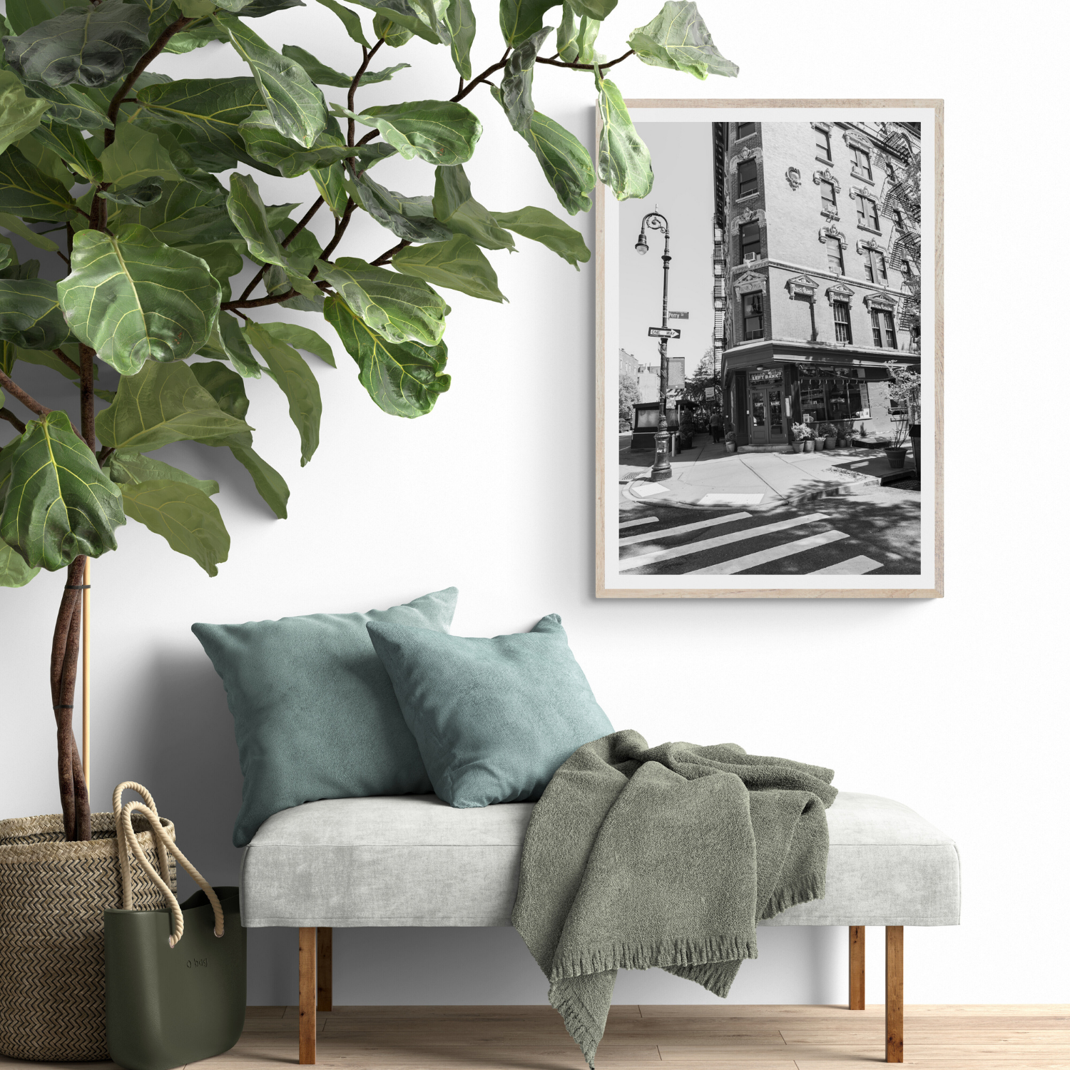
For a more urban direction, Sunny Soiree captures Dante’s Greenwich Village corner in black and white, including the restaurant frontage, people outside, greenery and crosswalk lines.
Mediterranean streets and architecture
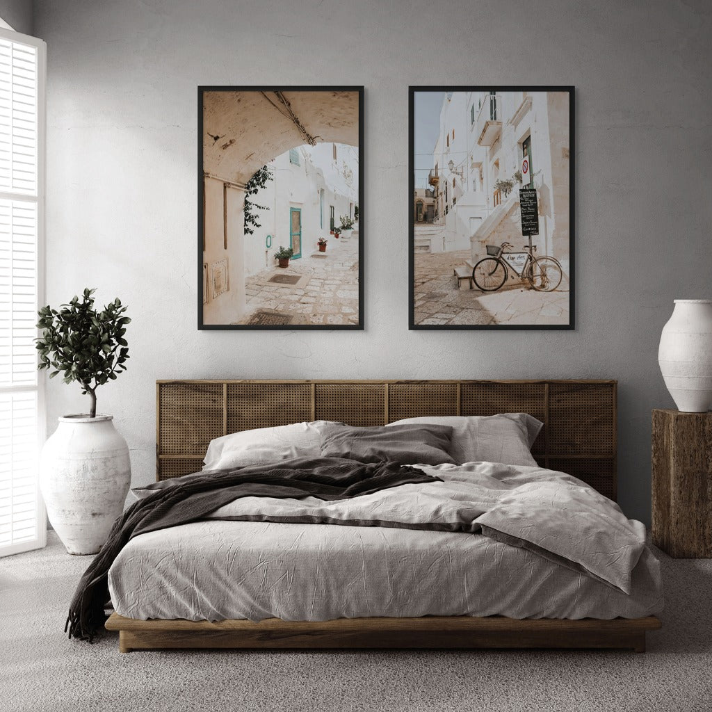
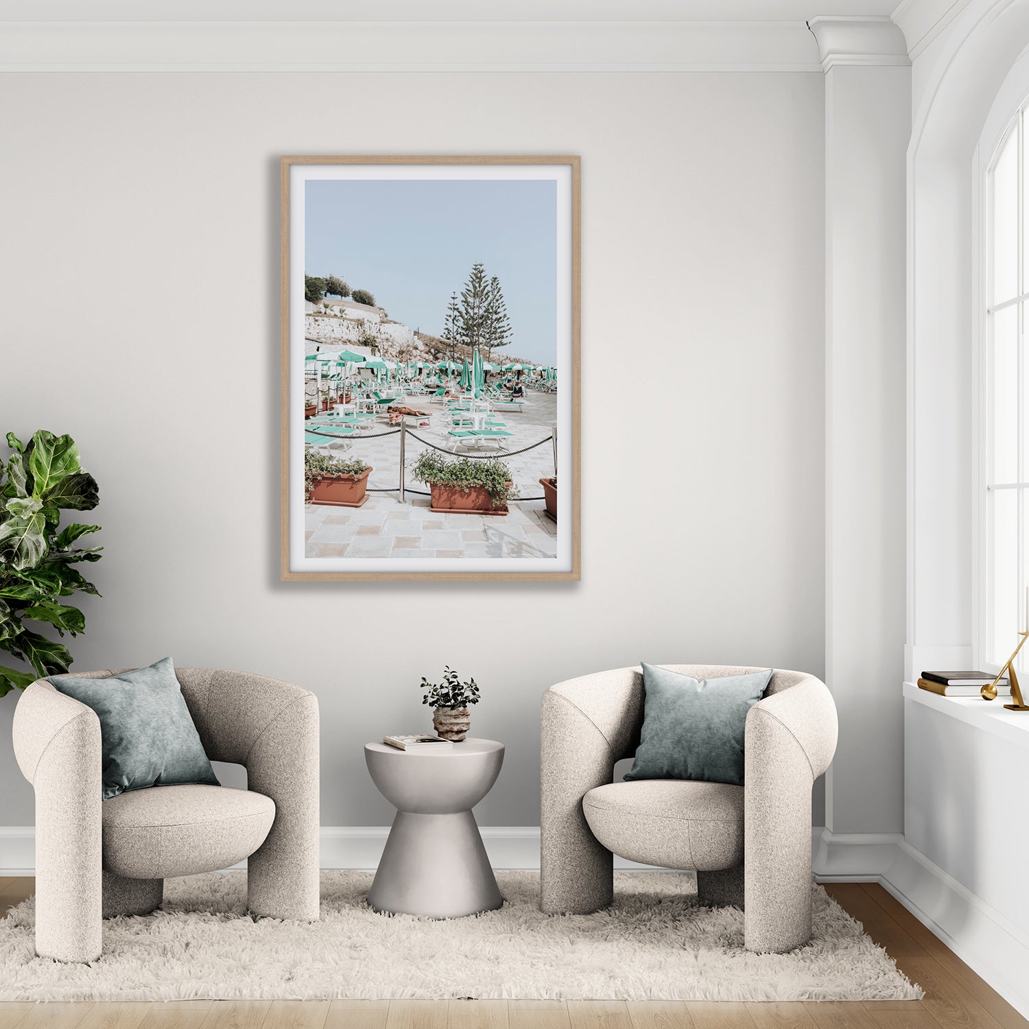
Sun-washed walls, tiled façades, shutters, stone and aged signage work naturally with timber, warm white cabinetry and tactile kitchen finishes.
Pizzeria shows an old-town façade in Gallipoli, with an arched doorway, small sign and timeworn balcony details. The subject belongs in a kitchen through atmosphere rather than an obvious food motif.
Browse Mediterranean Living wall art for related architecture, courtyards, coastal villages and everyday street scenes.
Coastal photography
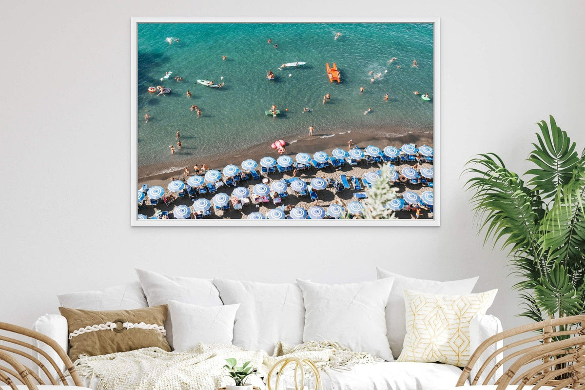
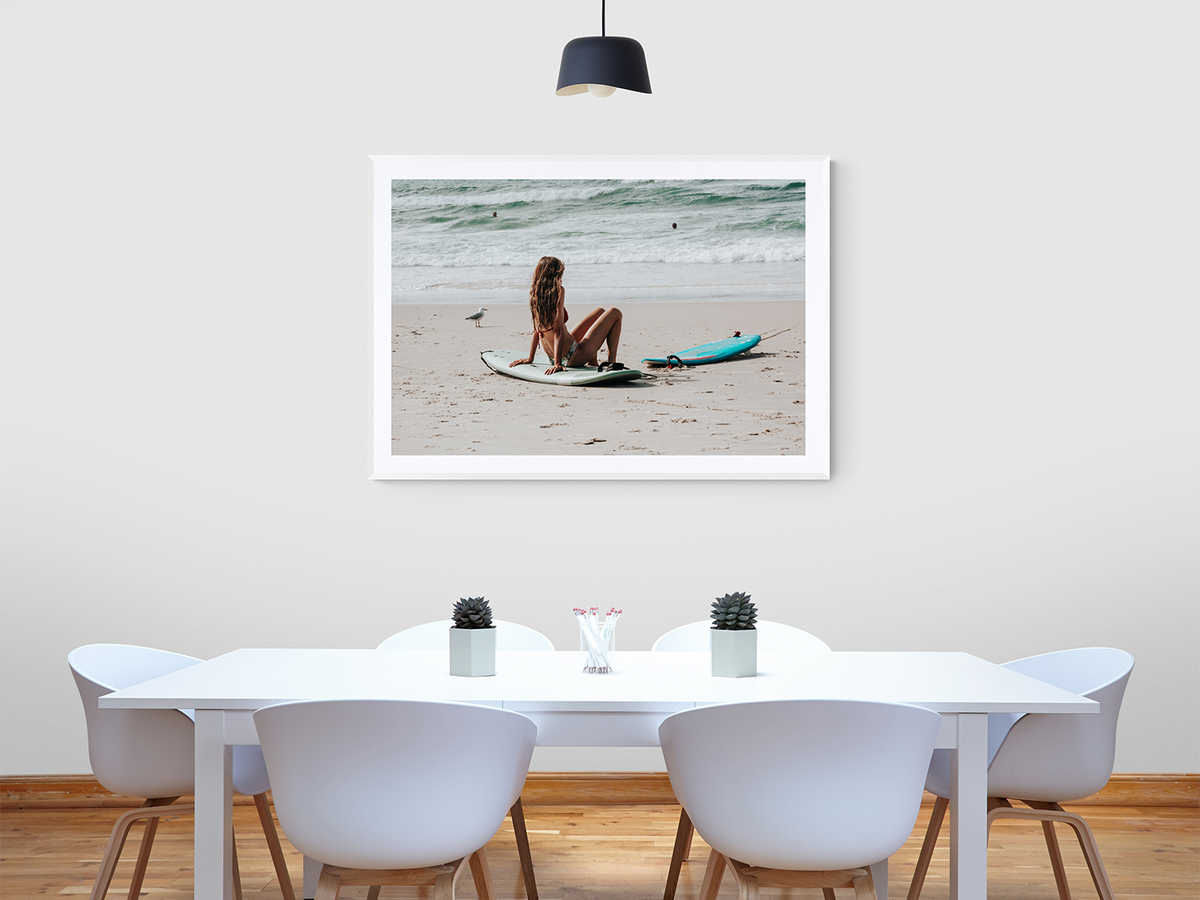
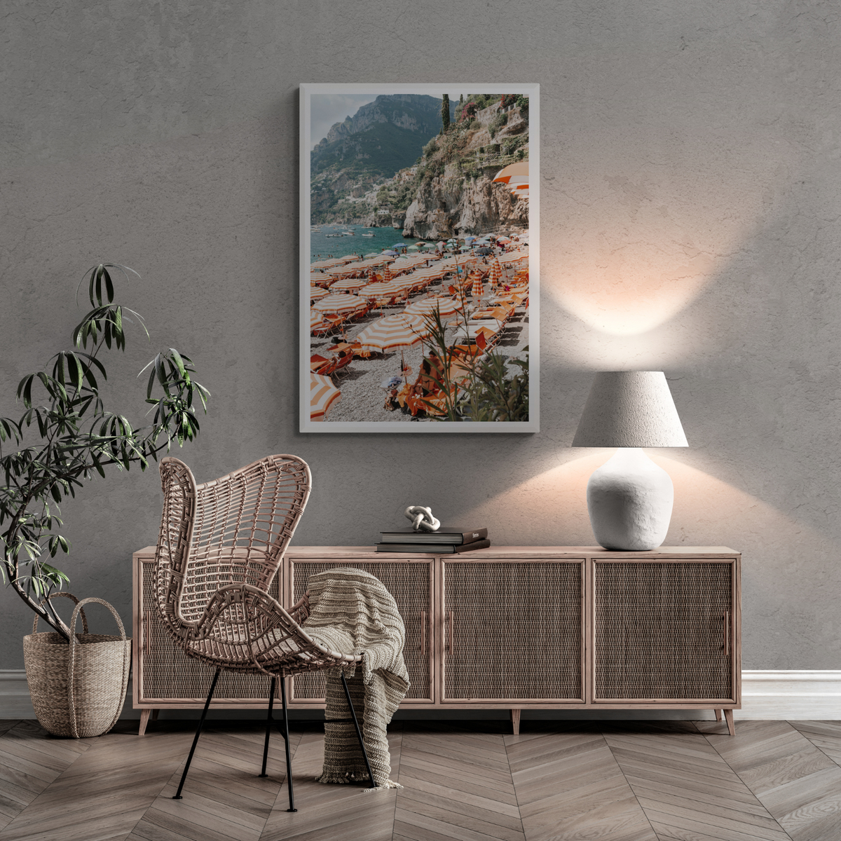
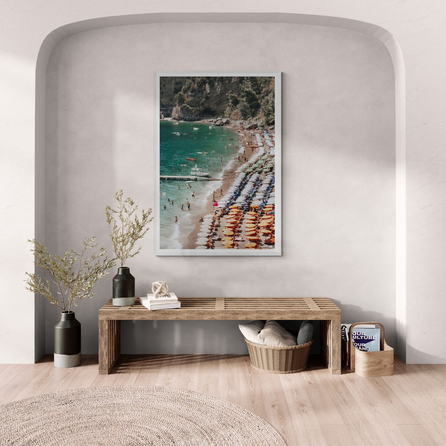
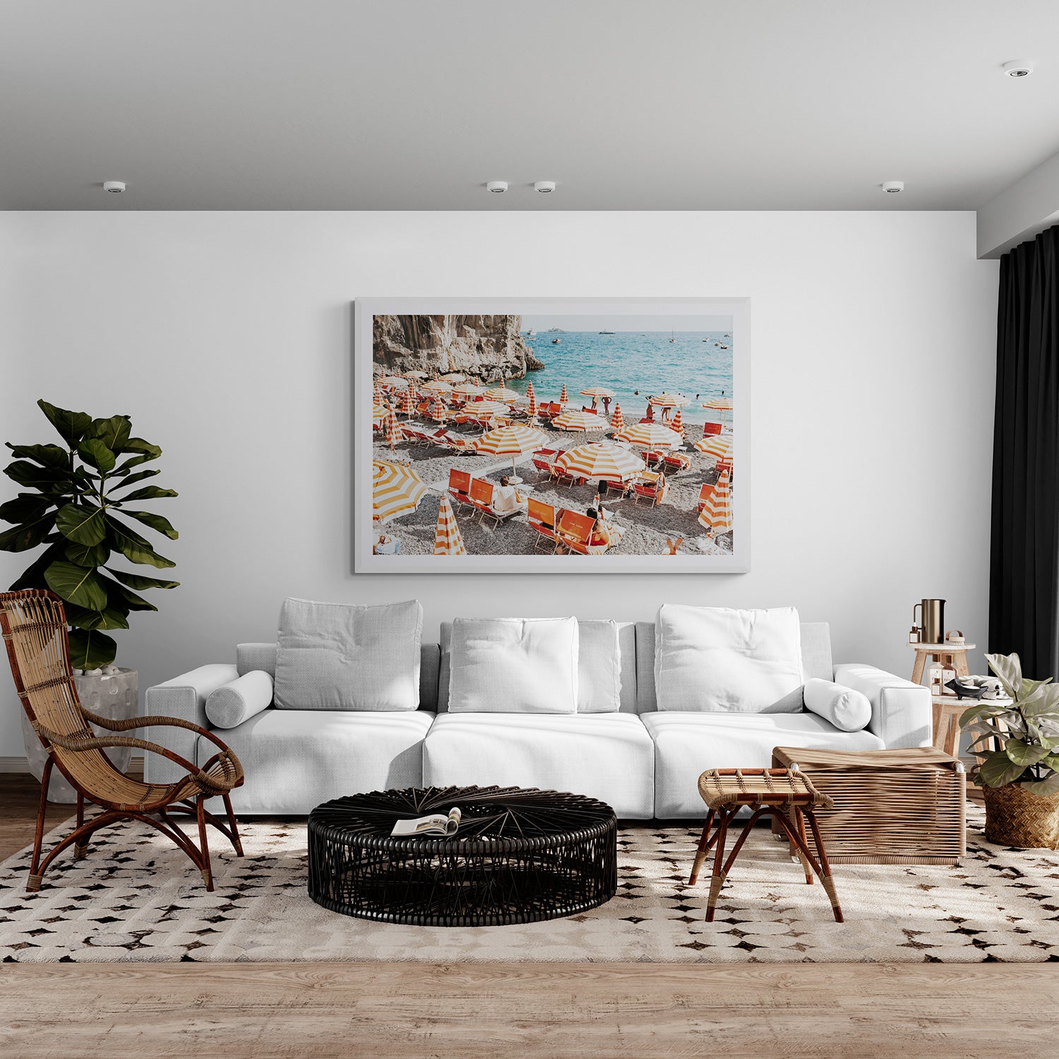
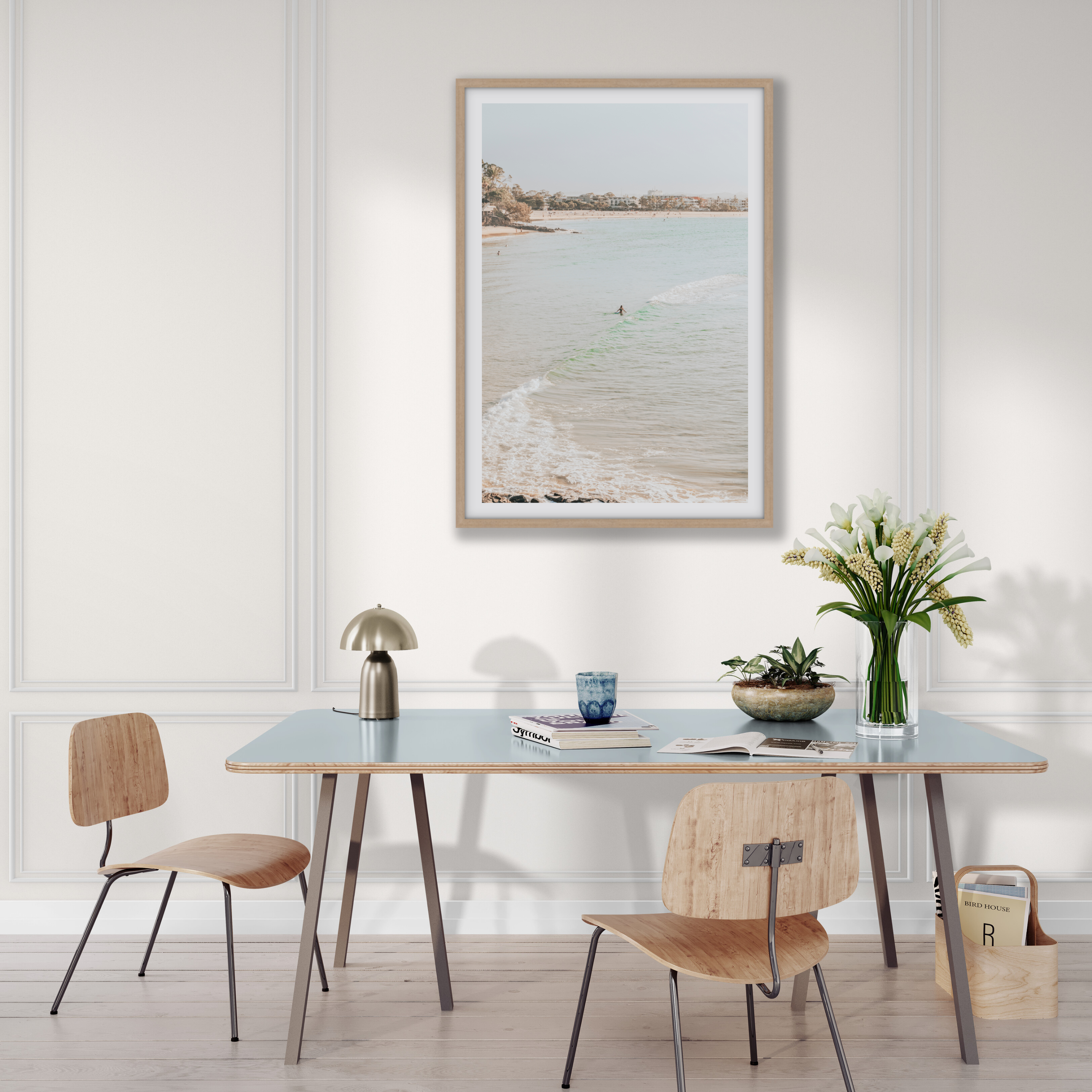
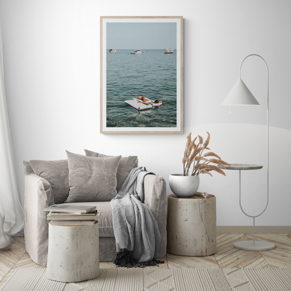
Water, sky and pale sand can visually open a kitchen filled with hard surfaces and straight lines. Coastal artwork is especially effective with white, soft grey, blue or natural timber cabinetry.
Choose a piece with enough calm space if the kitchen already contains patterned stone, open shelving and visible objects. A highly detailed image may compete with a visually busy room.
Black-and-white city photography
Monochrome art can bring definition to contemporary kitchens without introducing another colour family. It works particularly well with black tapware, steel, dark joinery or strongly veined stone.
The Urban and Cityscape collection includes architecture, street rhythm and graphic travel photography for a more metropolitan result.
Should kitchen wall art be food themed?
No. Food-themed art can be charming, but it is not more suitable simply because the room is a kitchen.
Choose literal food or drink imagery when it genuinely reflects the household. Otherwise, consider the room’s emotional function:
- café scenes for conversation and ritual;
- coastal photography for lightness;
- Mediterranean streets for warmth and hospitality;
- city scenes for energy and structure; or
- quiet architecture for a calm, minimal kitchen.
The artwork should make the room feel more personal, not label its purpose.
Match the artwork to the kitchen palette
Begin with the permanent finishes: cabinetry, benchtop, splashback, flooring and metal hardware.
White or pale kitchens
Almost any palette can work. Use warm stone, terracotta or sun-washed colour to prevent the room feeling clinical; blue and coastal tones for freshness; or black-and-white photography for definition.
Timber kitchens
Natural oak, walnut and warm veneers respond well to Mediterranean stone, olive, faded red, ochre and deep blue. The frame does not need to match the cabinetry exactly. A related warmth is enough.
Dark kitchens
Choose artwork containing pale sky, white architecture, water or generous negative space so it remains readable. A white frame gives the strongest outline; Natural Oak softens the contrast.
Colourful kitchens
Repeat one cabinet or tile colour within the photograph rather than attempting a perfect match. If the room already has several strong colours, choose quieter artwork and let the kitchen lead.
If you are still defining the wider aesthetic, the Amichi Co Design Style Quiz can help narrow the mood, palette and collections that suit you.
Choose the right size and orientation
Kitchen walls are often interrupted by cabinetry, doors and appliances, so size the artwork to the usable wall area, not the room.
For an empty wall
Mark the complete outer frame with low-tack painter’s tape. The piece should have clear space around it and should not look as though it was fitted into the last available gap.
Above a table or banquette
Use the visible furniture width as the reference. A single artwork or complete arrangement spanning roughly 60–75% of that width is a useful starting point, then adjust for the wall, chairs and viewing distance.
For a narrow wall
One portrait piece usually looks more intentional than several tiny frames. Check the complete finished dimensions, including Matboard and frame.
For a pair
Use consistent frame finishes and a gap of approximately 5–10 cm or 2–4 inches as a starting point. Calculate the pair as one composition:
first frame + gap + second frame = total arrangement width
Framed print or canvas in a kitchen?
Both can work on a suitable kitchen wall. Neither belongs in direct steam, heat or spray.
Framed fine art print
A framed print creates a defined, gallery-style presentation. Amichi Co framed prints use UV-resistant acrylic glazing and acid-free foam core. The glazing protects the front of the print, but the complete frame should still remain in a stable, dry position.
Matboard provides more visual breathing space around the image. Full Bleed feels stronger and more contemporary, which can suit clean-lined cabinetry.
Fine art canvas
Canvas creates a softer, more textural result and avoids mirror-like glazing reflections. Amichi Co canvas receives a protective finish with resistance to water, UV and dust, but it should still be kept away from concentrated steam, grease and splashes.
Read the full canvas versus framed print guide before choosing the presentation. The safest kitchen wall matters more than the format.
Choose a frame that connects the room
- White feels light and integrated with pale cabinetry.
- Black repeats dark hardware and creates the clearest boundary.
- Natural Oak introduces warmth and relates naturally to timber, stone and woven seating.
Avoid trying to match every material exactly. A black frame can work in a timber kitchen, and Natural Oak can soften a monochrome room.
For a fuller comparison, use the guide to choosing black, white or Natural Oak frames.
Test the artwork in the real kitchen
Before ordering:
- Photograph the wall straight on in daylight.
- Measure the clear wall area and nearby furniture.
- Note doors, cabinet handles, stools, appliances and traffic paths.
- Identify any direct steam, heat, splash or strong-sun exposure.
- Mark the complete frame dimensions with painter’s tape.
- View the outline from the kitchen entrance and adjoining room.
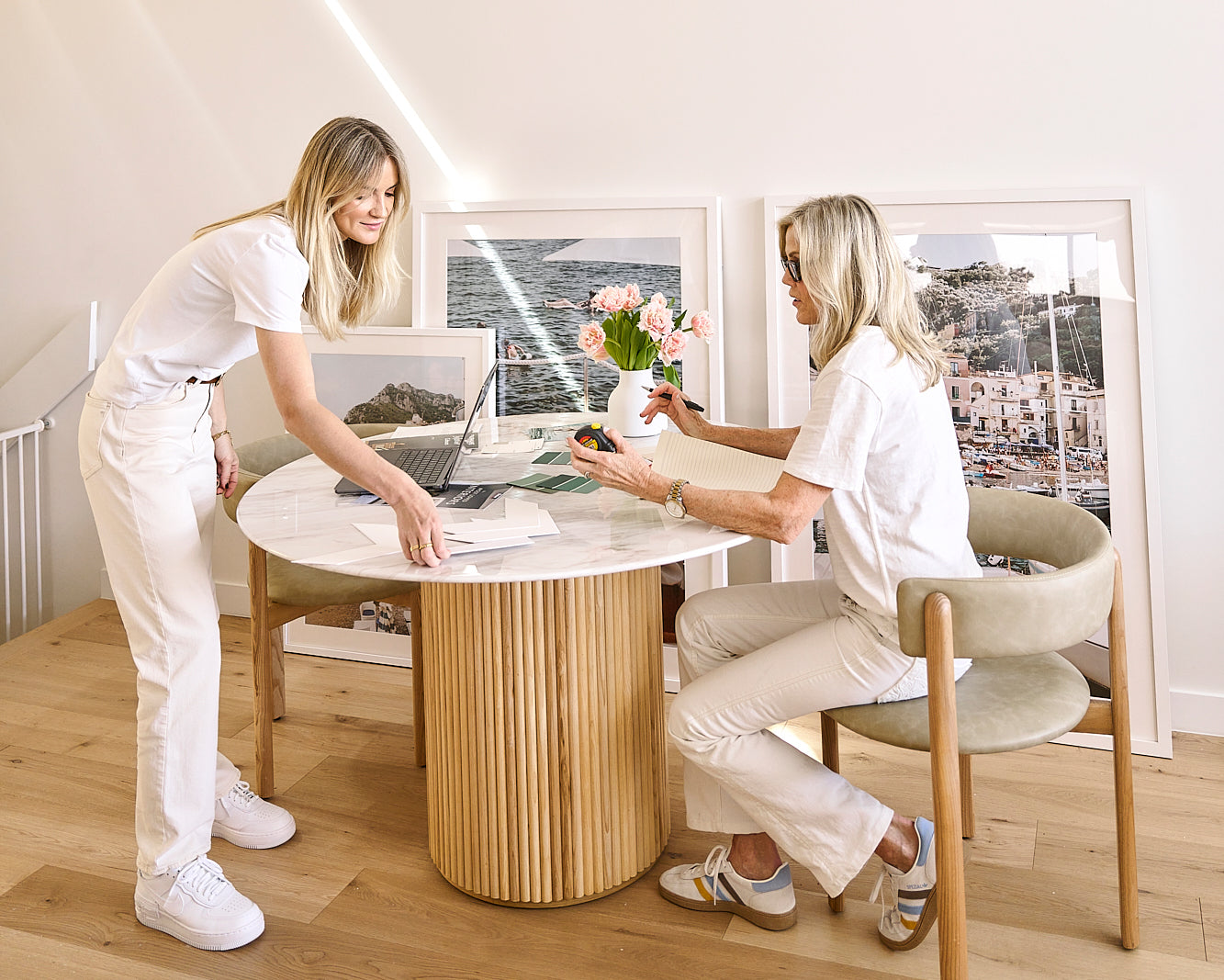
Amichi Co’s Complimentary Styling Service can compare artwork, size, orientation and frame on a photograph of the actual kitchen wall before you order.
Common kitchen wall art mistakes
Hanging artwork where it must be washable
If the wall regularly needs degreasing or splash cleaning, it is not the right position for fine art.
Choosing a novelty theme instead of a lasting image
The kitchen already announces its function. The artwork can contribute mood, memory and personality.
Ignoring cabinet and door movement
Open everything before choosing the frame position. Include chair movement and normal walking paths.
Selecting from image dimensions alone
Use the complete finished size, including the frame and Matboard.
Treating protective materials as waterproofing
UV-resistant glazing and protective canvas finishes reduce particular risks; they do not make artwork suitable for direct heat, steam or splashes.
Frequently asked questions
What kind of art looks good in a kitchen?
Café, restaurant, coastal, Mediterranean and city photography all work well. Choose a subject that supports the kitchen’s mood and palette rather than assuming the image must show food.
Where should art be placed in a kitchen?
Use a dry wall away from the cooktop, sink and concentrated steam. Breakfast nooks, open-plan dining walls, blank end walls and narrow walls beyond the cabinetry are usually the strongest candidates.
Can you hang canvas art in a kitchen?
Yes, when the wall is stable and away from direct heat, grease, moisture and splashes. A protective finish helps, but canvas should not be treated as waterproof or positioned in the active cooking zone.
Is a framed print suitable for a kitchen?
Yes. Protective glazing makes a framed print a practical presentation on a suitable kitchen wall. Keep the complete frame away from direct steam, spray, heat and prolonged direct sunlight.
How high should kitchen wall art hang?
On an empty wall, position the artwork for the main standing sightline. Above a breakfast table or banquette, hang it low enough to connect with the furniture while clearing seated heads. Test the full outline before installing.
How do you choose art for a white kitchen?
Use warm Mediterranean tones for softness, coastal blues for freshness, black-and-white photography for contrast or earth tones to connect with timber and stone. White cabinetry gives you flexibility, so choose according to the atmosphere you want.
Styling recipe
Three decisions that make the room feel finished

Start with mood
Choose the feeling first: calm, sun-washed, graphic or nostalgic. The right artwork should clarify the room before it asks for a decision.
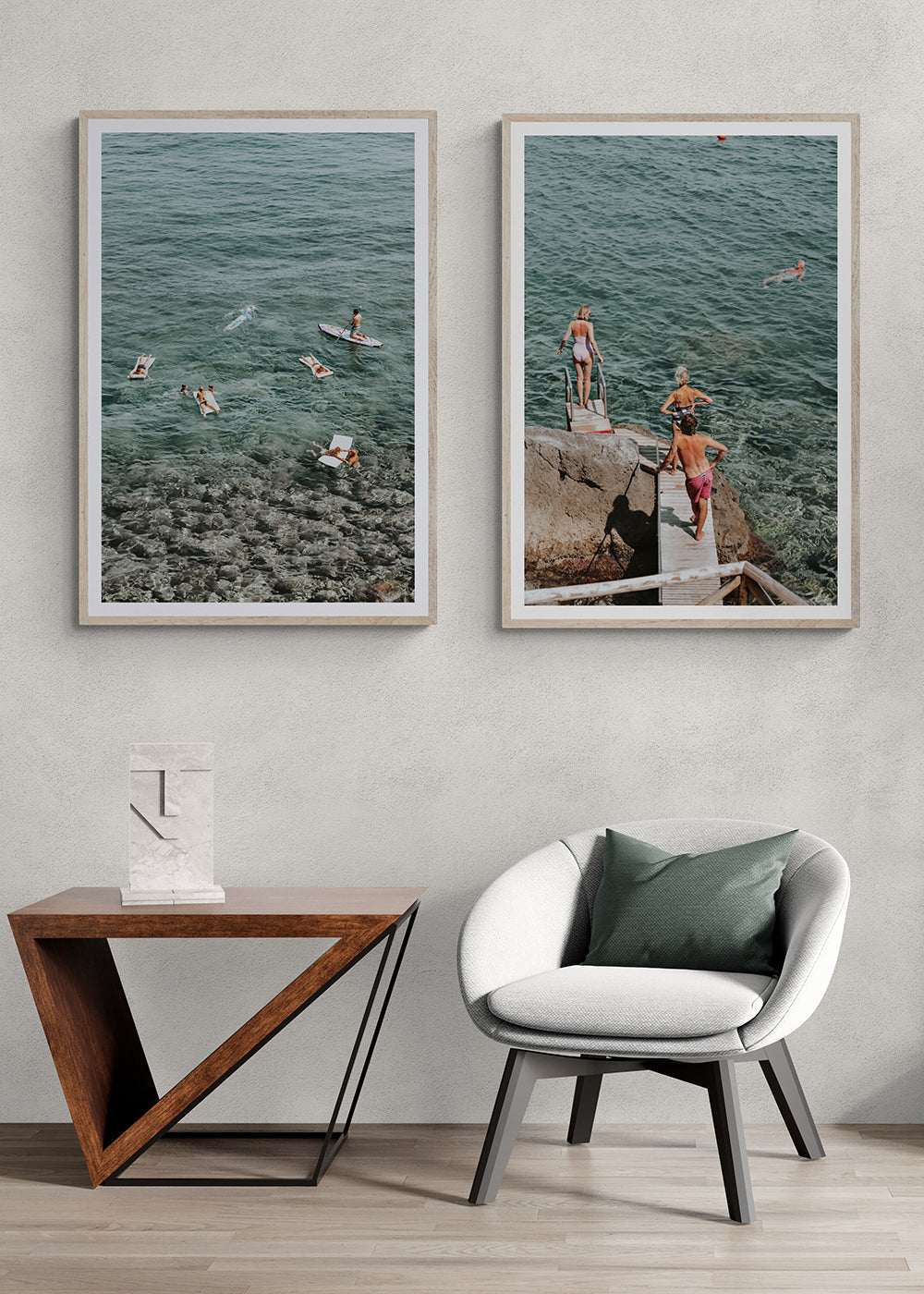
Build a pair
An artwork set can carry colour, subject or mood across the room and make the whole space feel more collected.

Choose the finish
The final edit should support the room: crisp and gallery-like for structure, softer and quieter for relaxed coastal spaces.