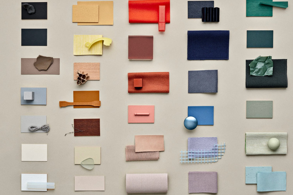

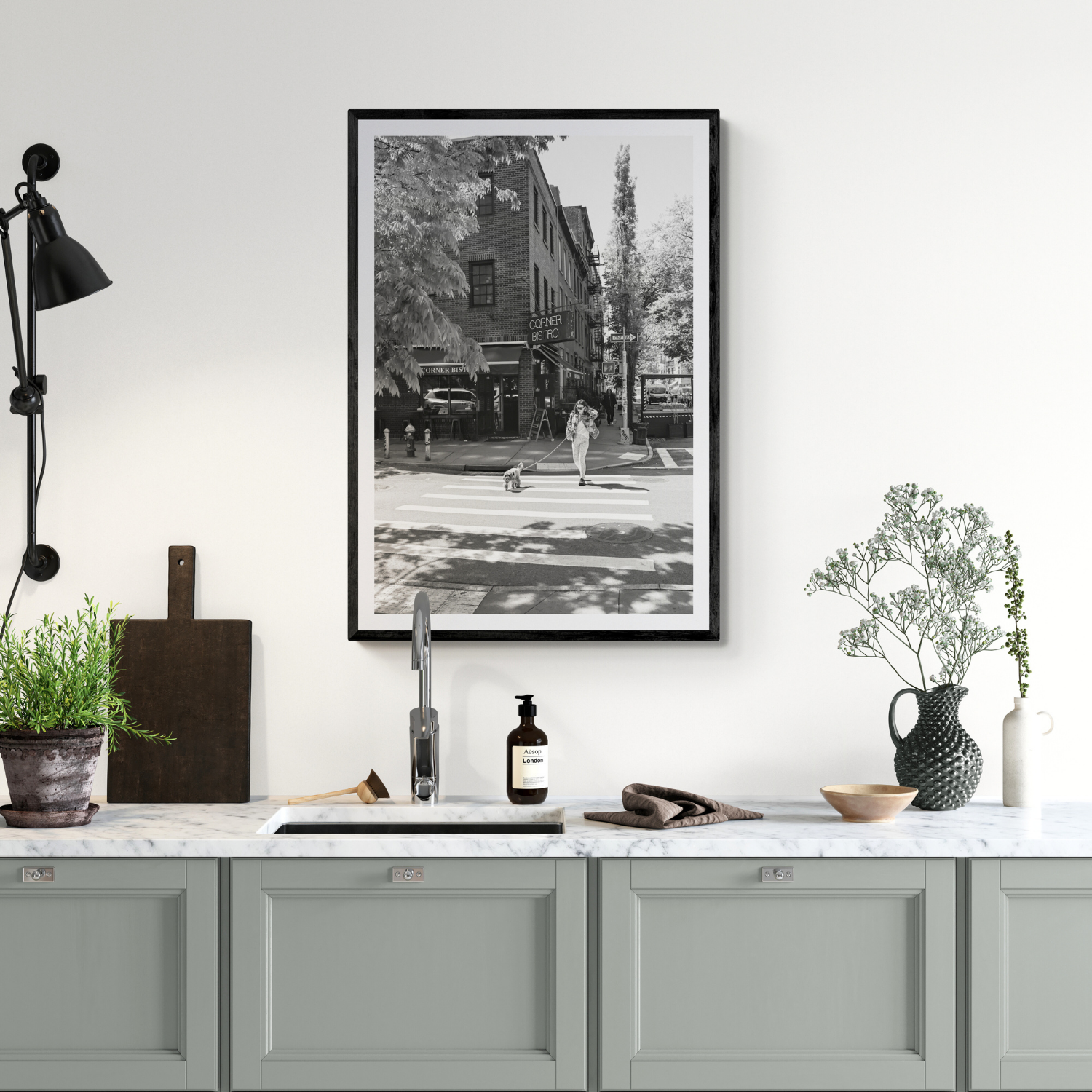
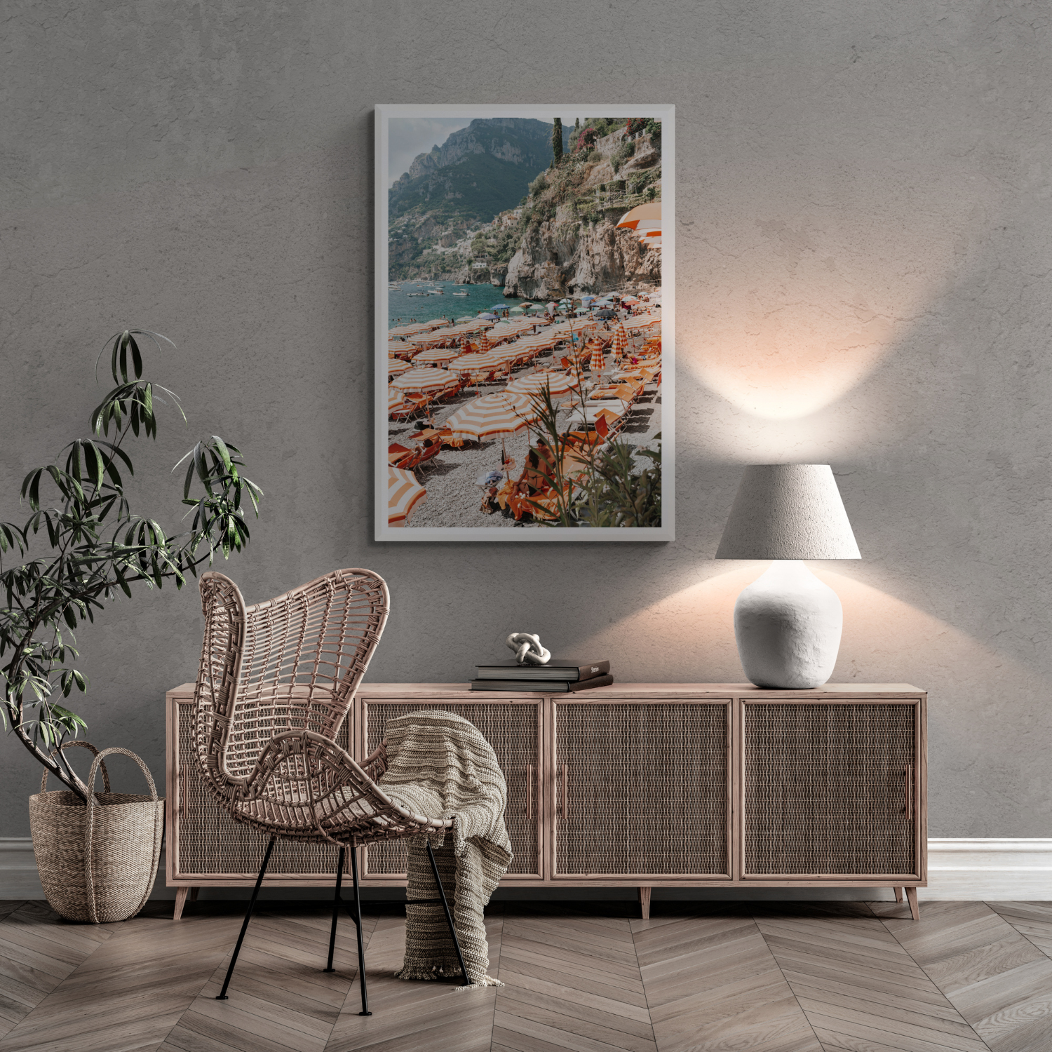
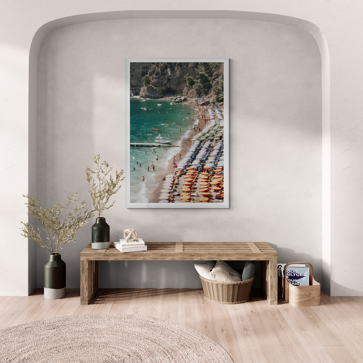
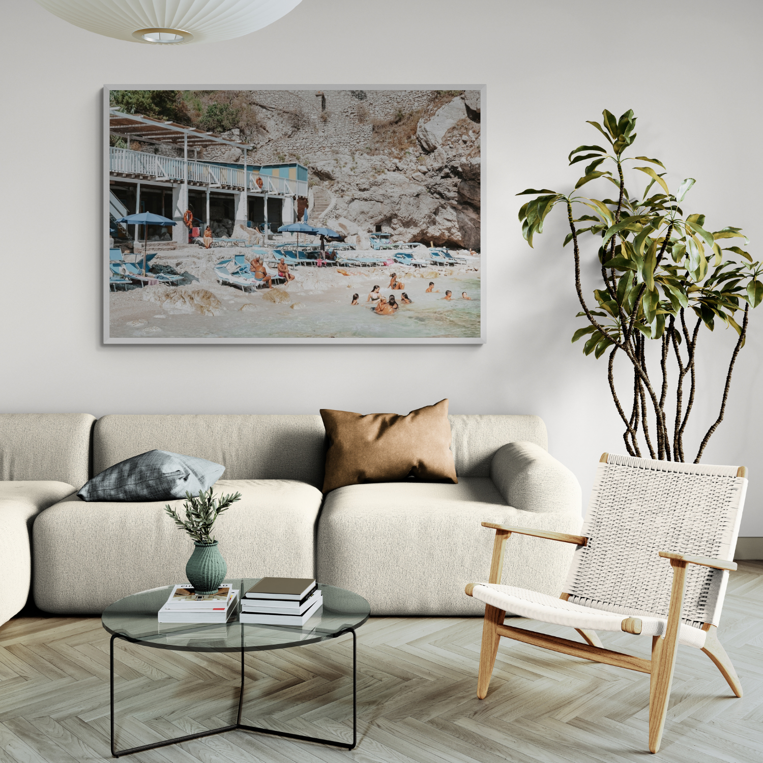


A palette is easier to choose when you begin with what will stay: flooring, cabinetry, large furniture and the natural light. Artwork can then reinforce a mood or introduce a useful counterpoint. Matching a tiny swatch in a photograph is rarely the best first step.
Read the fixed colours and undertones
Lay samples beside the floor and major furniture. A warm white wall, cool grey sofa and honey-coloured timber each push neighbouring colours in a different direction. Notice whether the room's base feels warm, cool or mixed. If it is mixed, repeat one undertone elsewhere to make the combination intentional.
Choose the feeling before the accent
A quiet room may benefit from soft contrast and natural variation; a lively space can hold a stronger colour. Name the mood you want, then pick one accent with enough depth to be seen at a distance. The accent can come from a textile, artwork or object rather than a whole painted wall.
Test in real light
View colours in the room at different times. North- and south-facing light can change how a shade appears, and lamps may shift it again after dark. Put paper or fabric samples against the actual wall, not just the shop's sample board. A screen image of a print is a guide, not a guarantee of how the physical work will look under your lights.
Relate artwork without forcing a match
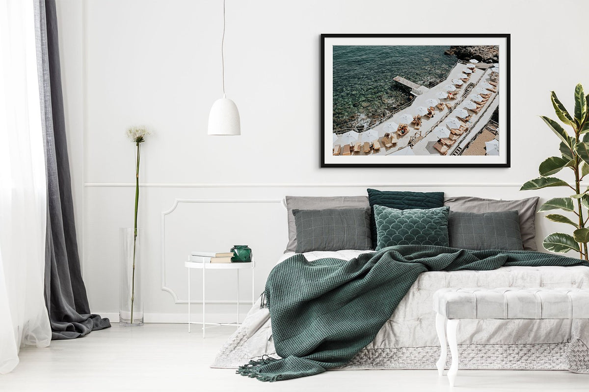
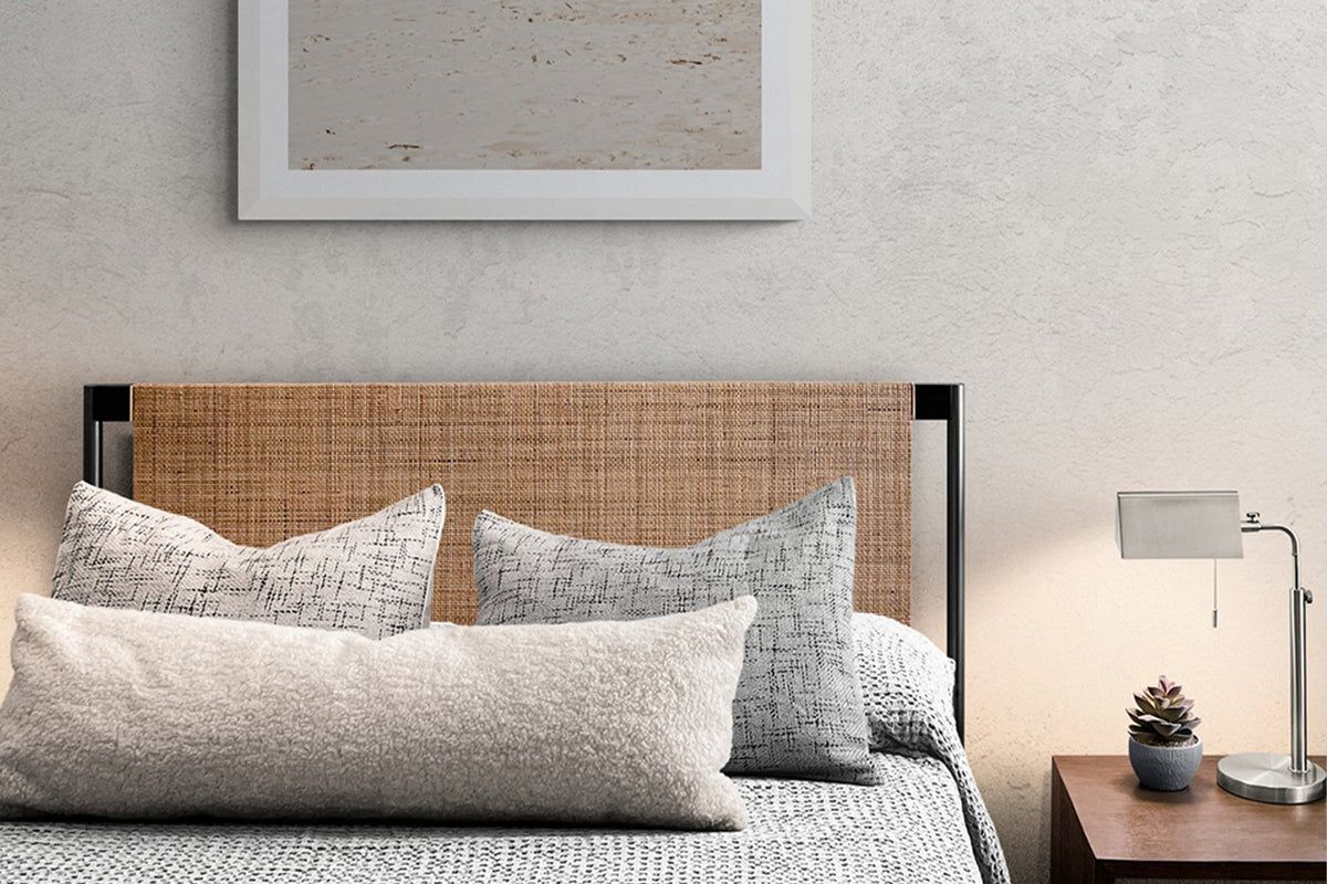
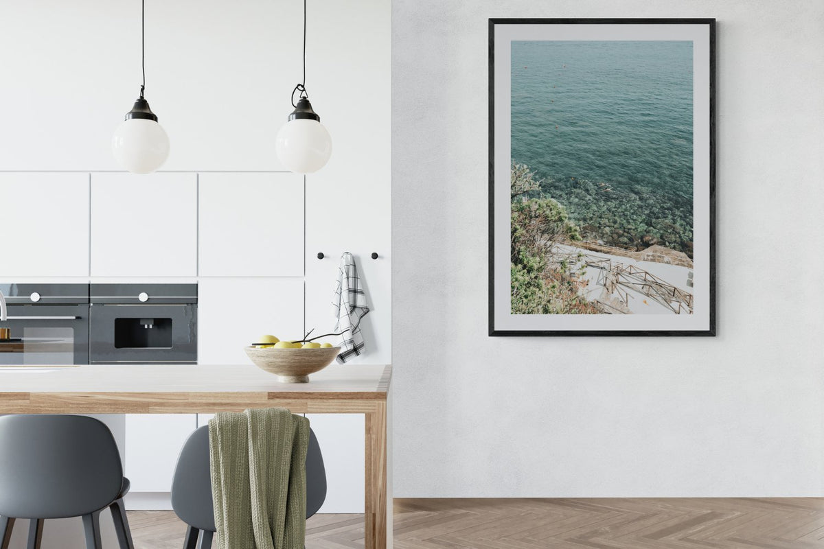
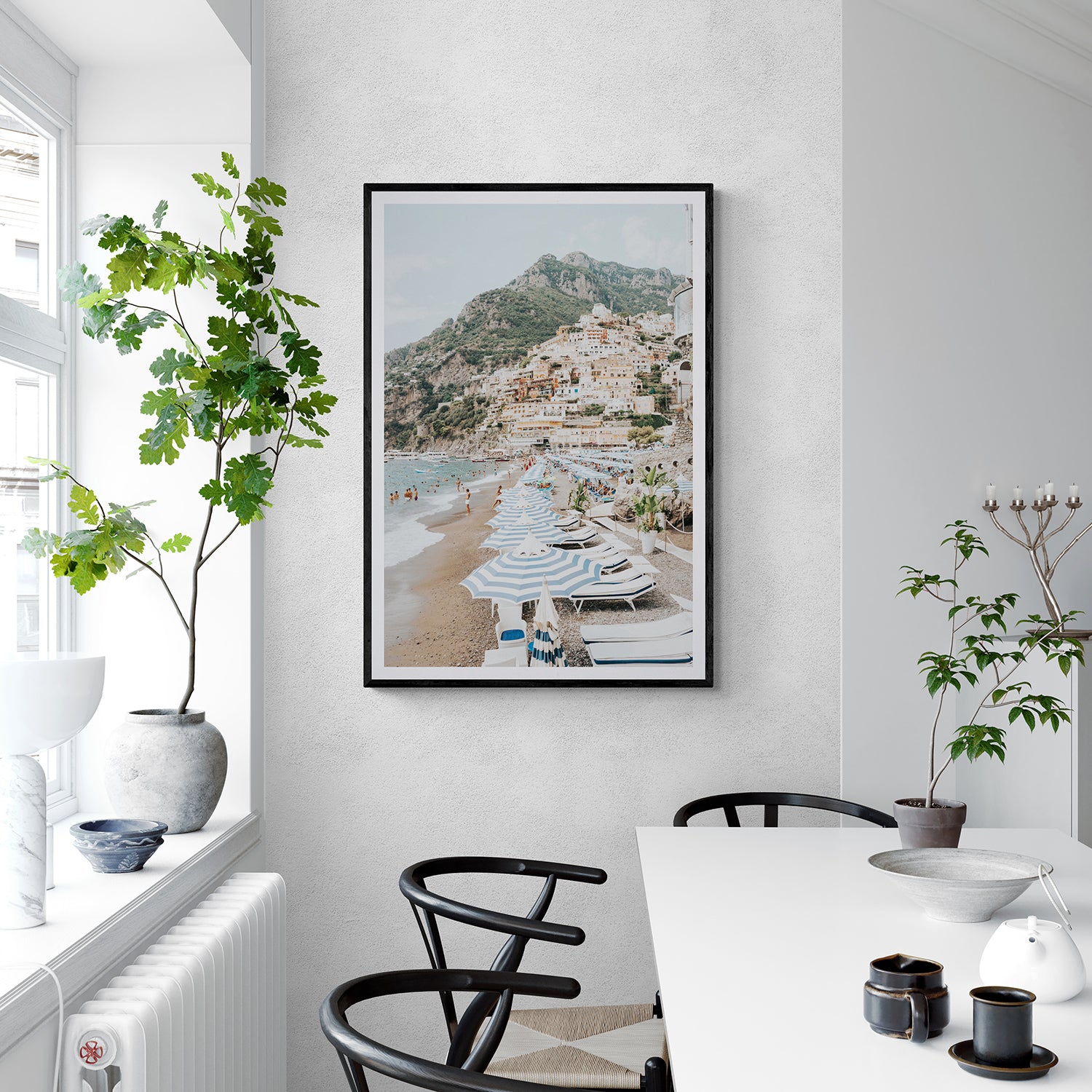
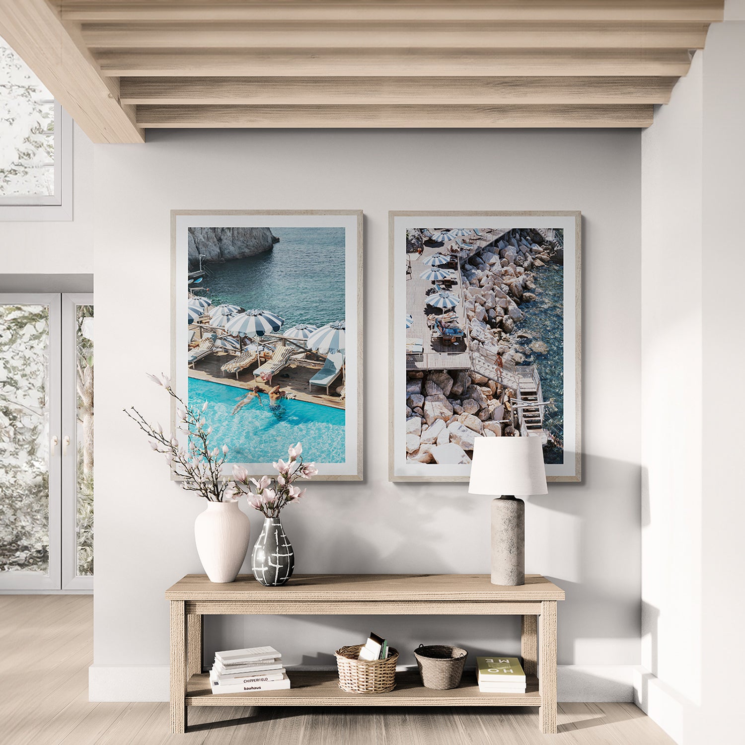
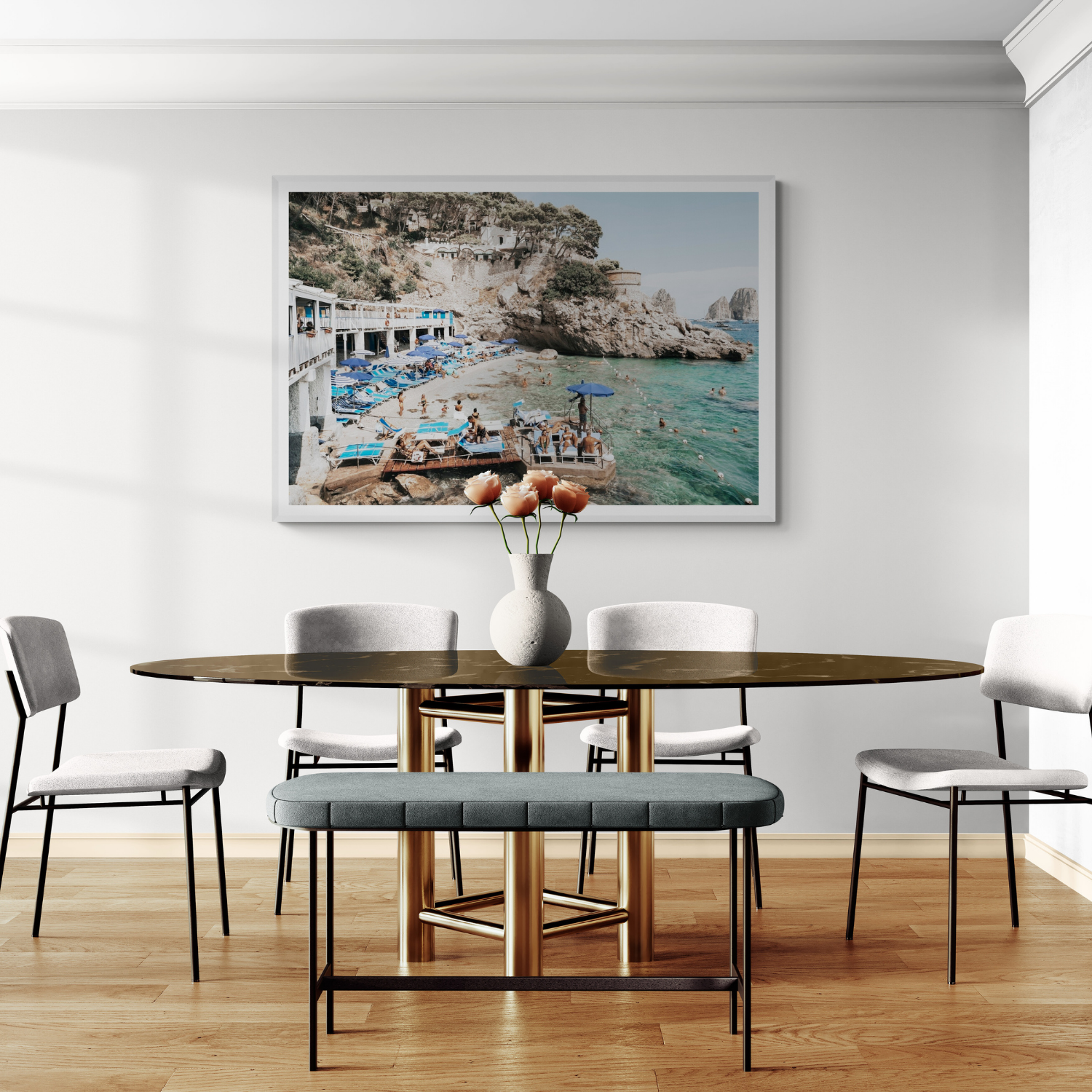
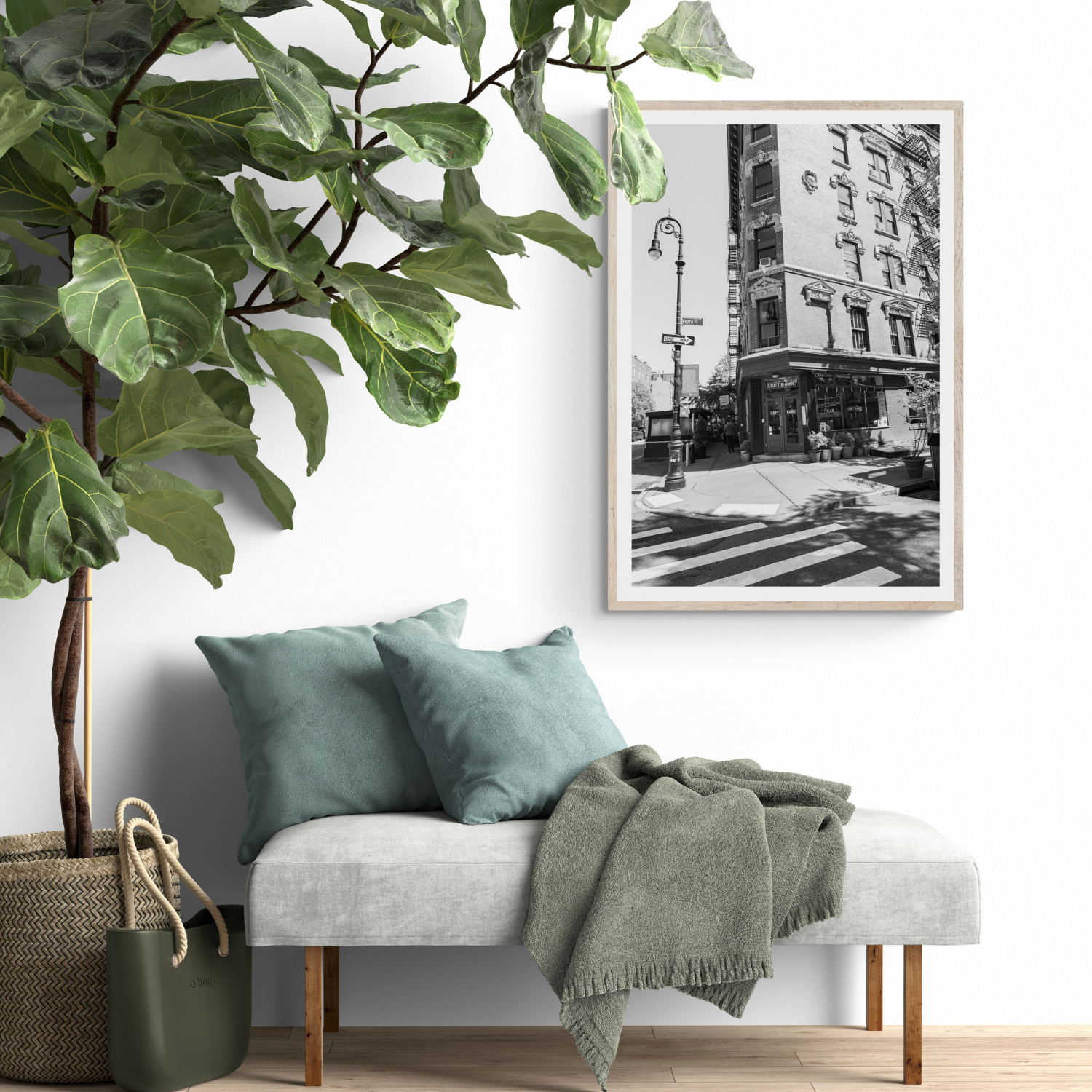
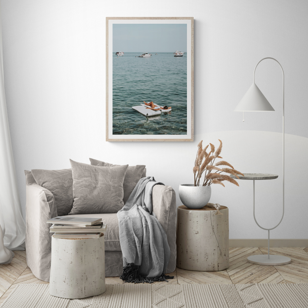
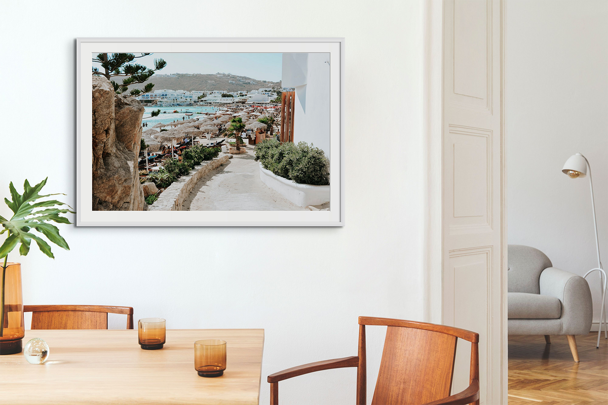
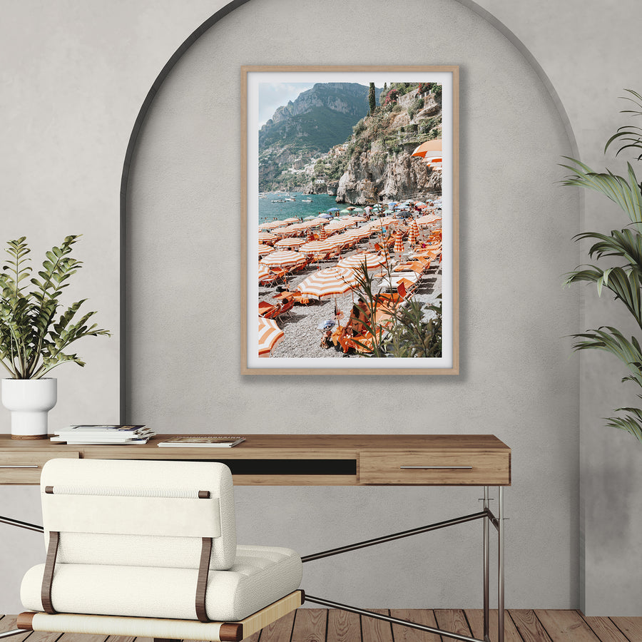
Find one connection: a repeated blue, warm stone, soft green or overall tonal weight. Then allow the artwork its own range of colours. A photograph of pale water can calm a room with stronger upholstery; an architectural scene can give a quiet palette more structure. Compare several images together rather than searching for an exact cushion colour.
Balance the whole composition
Consider the frame and matboard as part of the palette. Black defines an edge, white blends with a light wall, and oak adds warmth. Step back and ask what draws your eye first. If several strong accents compete, remove one or give it more space. A room palette is successful when the art and furnishings can be appreciated together.
Colour recipe
Three decisions that make colour feel intentional

Pull one existing tone
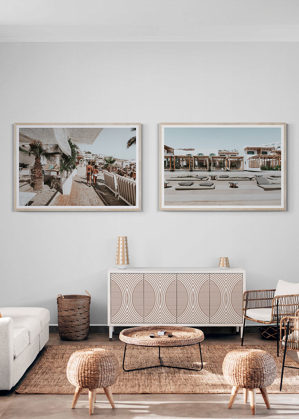
Repeat a colour from timber, stone, textiles or cushions so the print feels connected.
Add one new accent
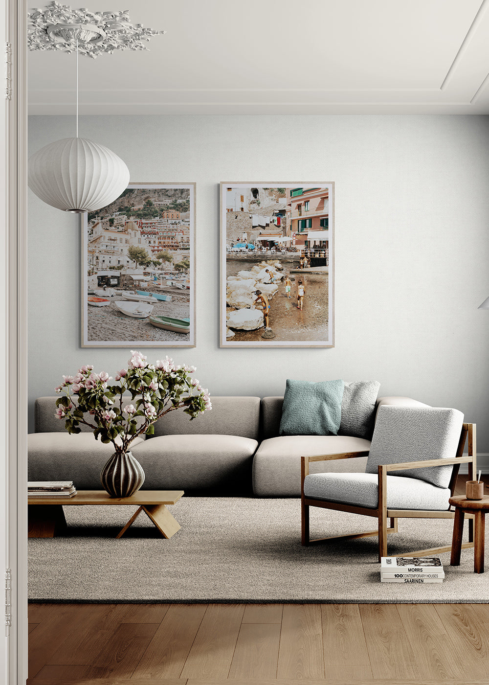
A second artwork can introduce energy, but it should still share a visual thread.
Balance colour with space
Negative space, sky, water or architecture keeps brighter palettes from feeling crowded.